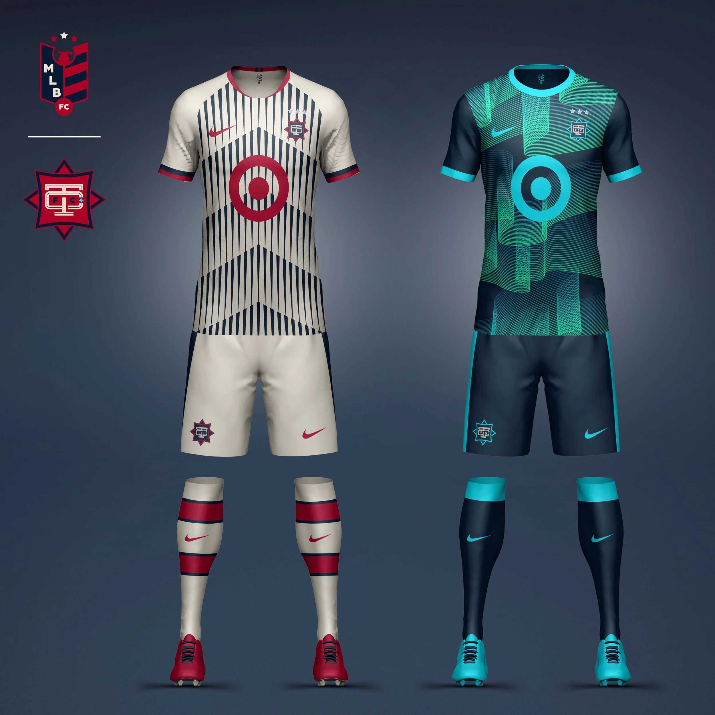
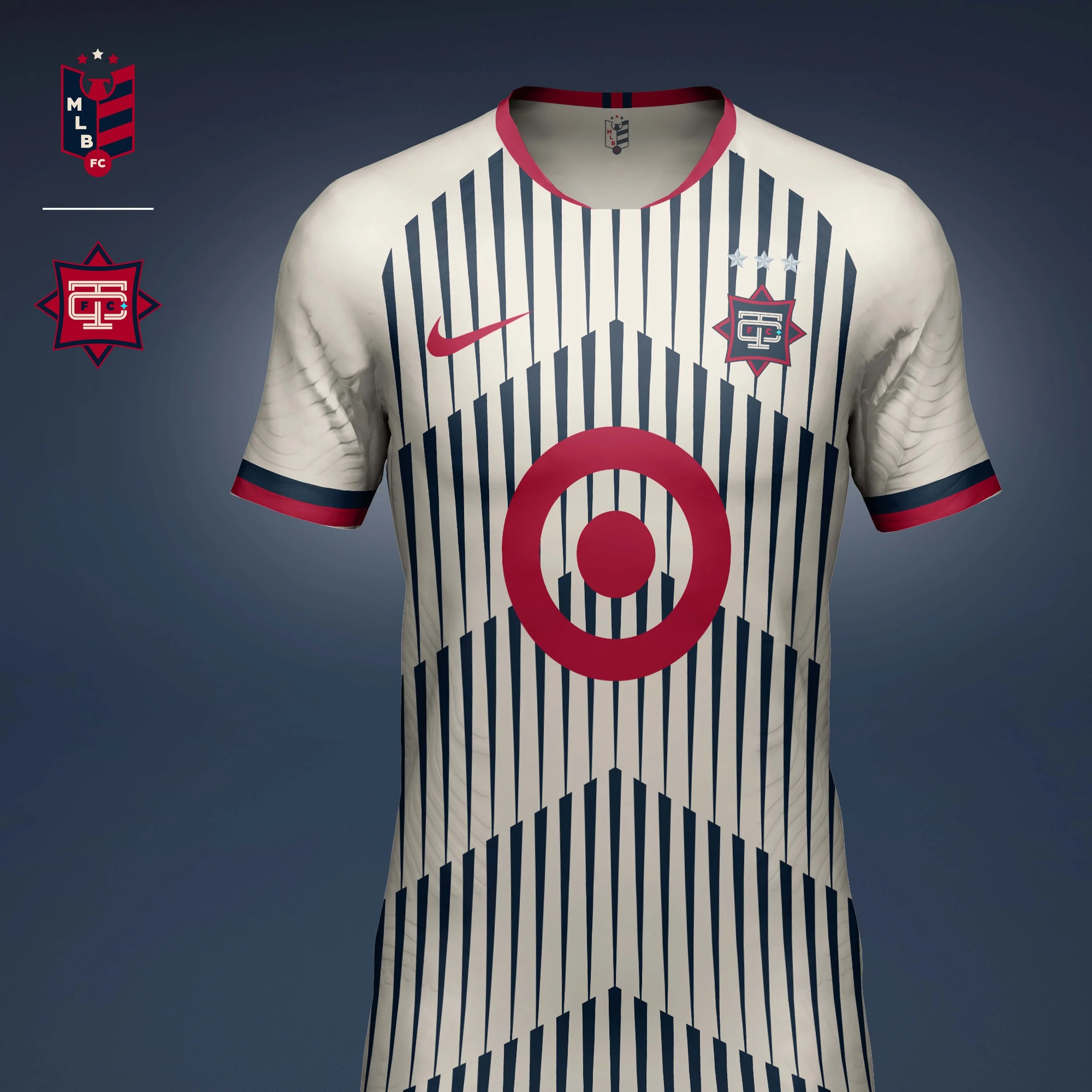
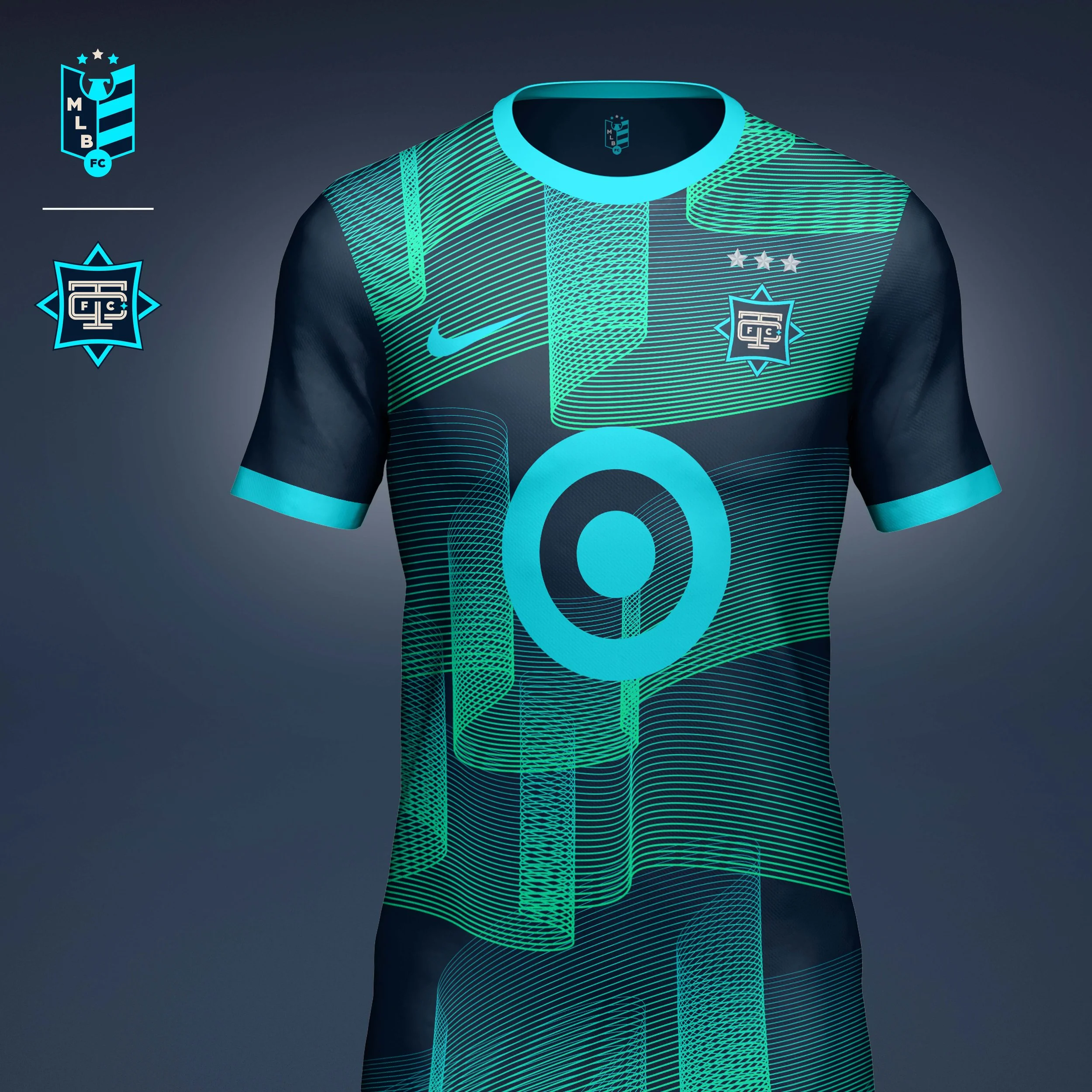
MLB FC
MLB FC is a conceptual design exploration that reimagines all 30 Major League Baseball clubs as football clubs. Inspired by the traditions of global football culture, the project examines how some of America’s most recognizable sports identities might evolve through the language of club crests, supporter culture, and kit design.
Rather than simply adapting existing team marks, each identity was rebuilt from the ground up. New club crests draw from the history, symbolism, and visual heritage of each franchise while embracing the design principles commonly found throughout football leagues around the world. Every club received a complete visual system including a custom crest, home and away kits, color strategy, and supporting details.
The goal was not to replace existing MLB identities, but to explore how sports brands can retain their heritage while adapting to entirely new cultural contexts. The result is a collection of 30 club identities that celebrate the intersection of baseball tradition and football culture.
Services
Identity Design
Jersey Design
IDENTITY SYSTEM
Every club identity was guided by three principles:
Heritage First
Each crest was rooted in existing team history, local culture, or franchise symbolism rather than relying solely on existing logos.
Authentic Football Language
Crests, stars, typography, and kit construction were inspired by the visual traditions of football clubs around the world.
Designed For Supporters
Kits were design as lifestyle products as much as performance uniforms, with an emphasis on wearability, culture, and fan expression.
Championship stars are a long-standing tradition in football, serving as a visible representation of club success. To create consistency across the league, I developed a star system that translated World Series championships into football-inspired hierarchy, allowing each club’s achievements to become part of its identity while maintaining visual balance across all 30 crests.

NL WEST
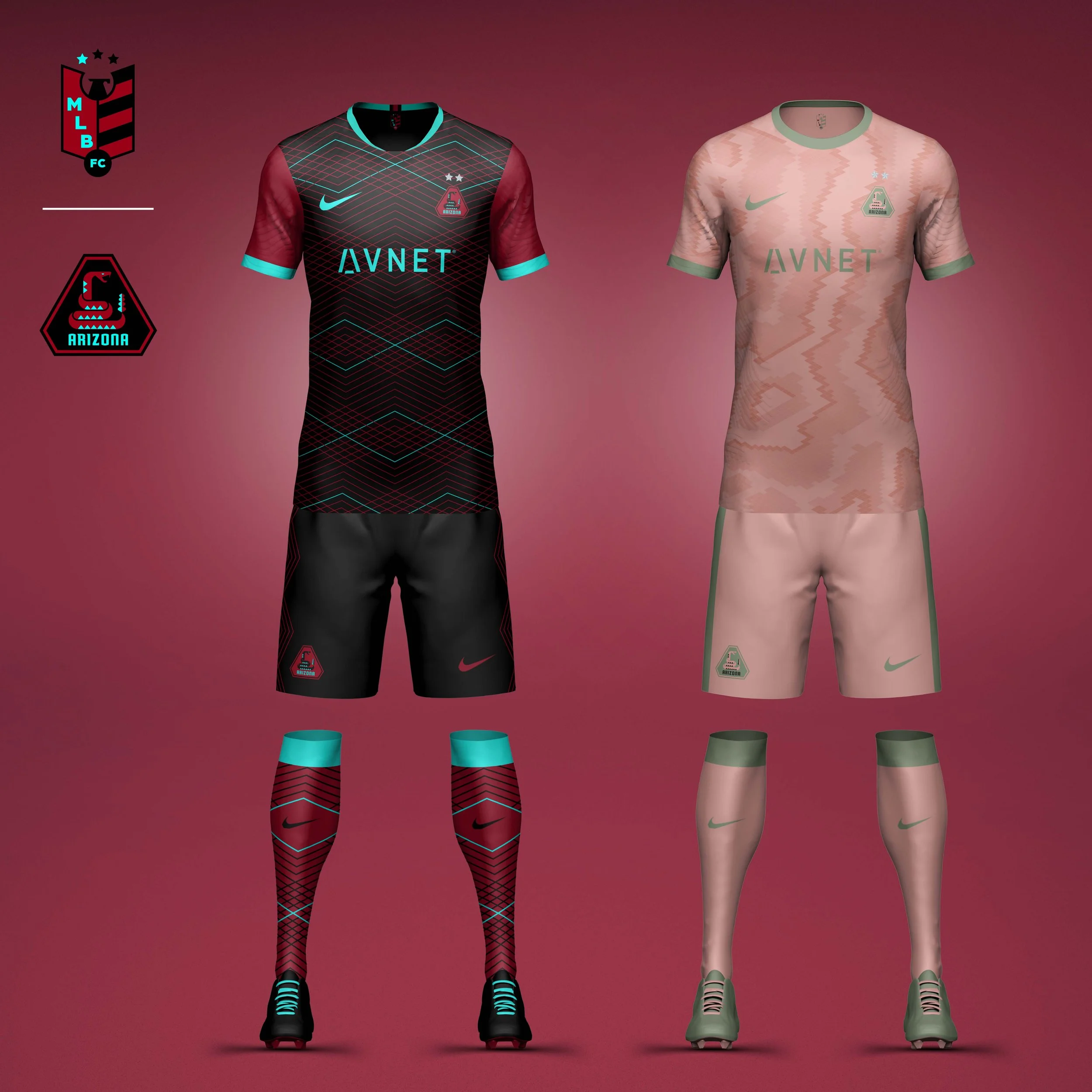
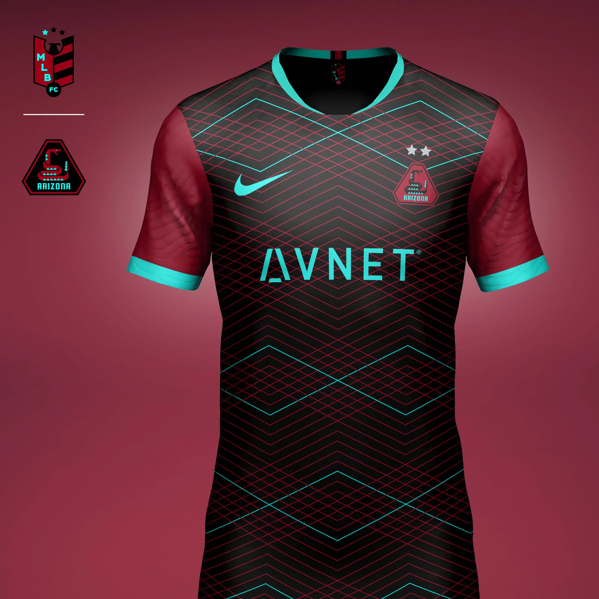
Arizona Diamondbacks
I chose to darken the red to help differentiate the DBacks from other teams that use red as a primary color. I also wanted to incorporate more of the neon teal the team implemented a few years ago (and seems to be slowly moving away from).
Home kit uses a diamond pattern to be a graphic representation of snakeskin. I choose to do a contrast color on the sleeve as a nod to the sleeveless jerseys worn by the team early in its history.
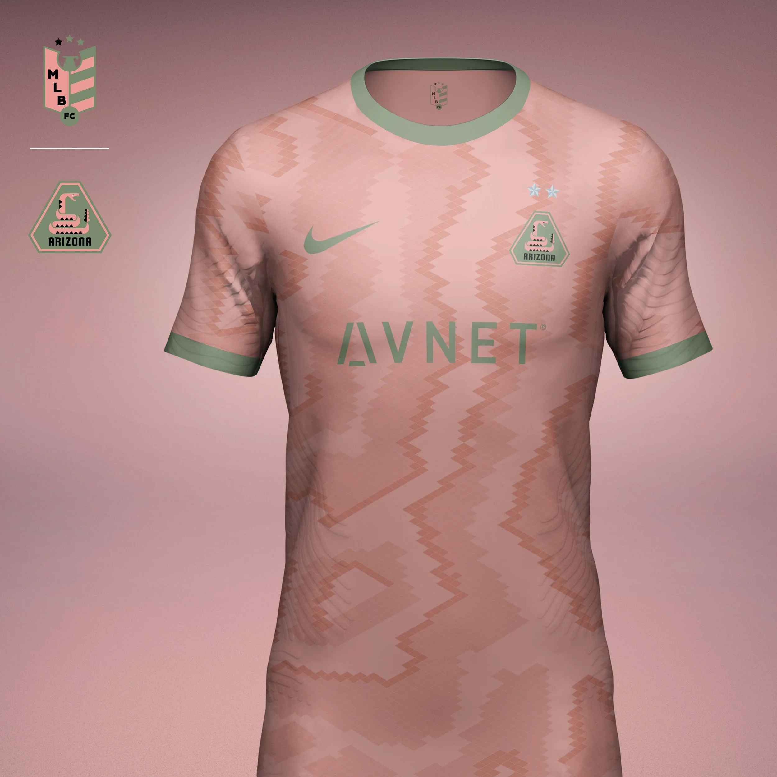
Away kit uses a more literal interpretation of a snakeskin pattern. The pink/green colorway is a nod to the Sonoran Desert and the Saguaro Cactus, both National Parks in Arizona.
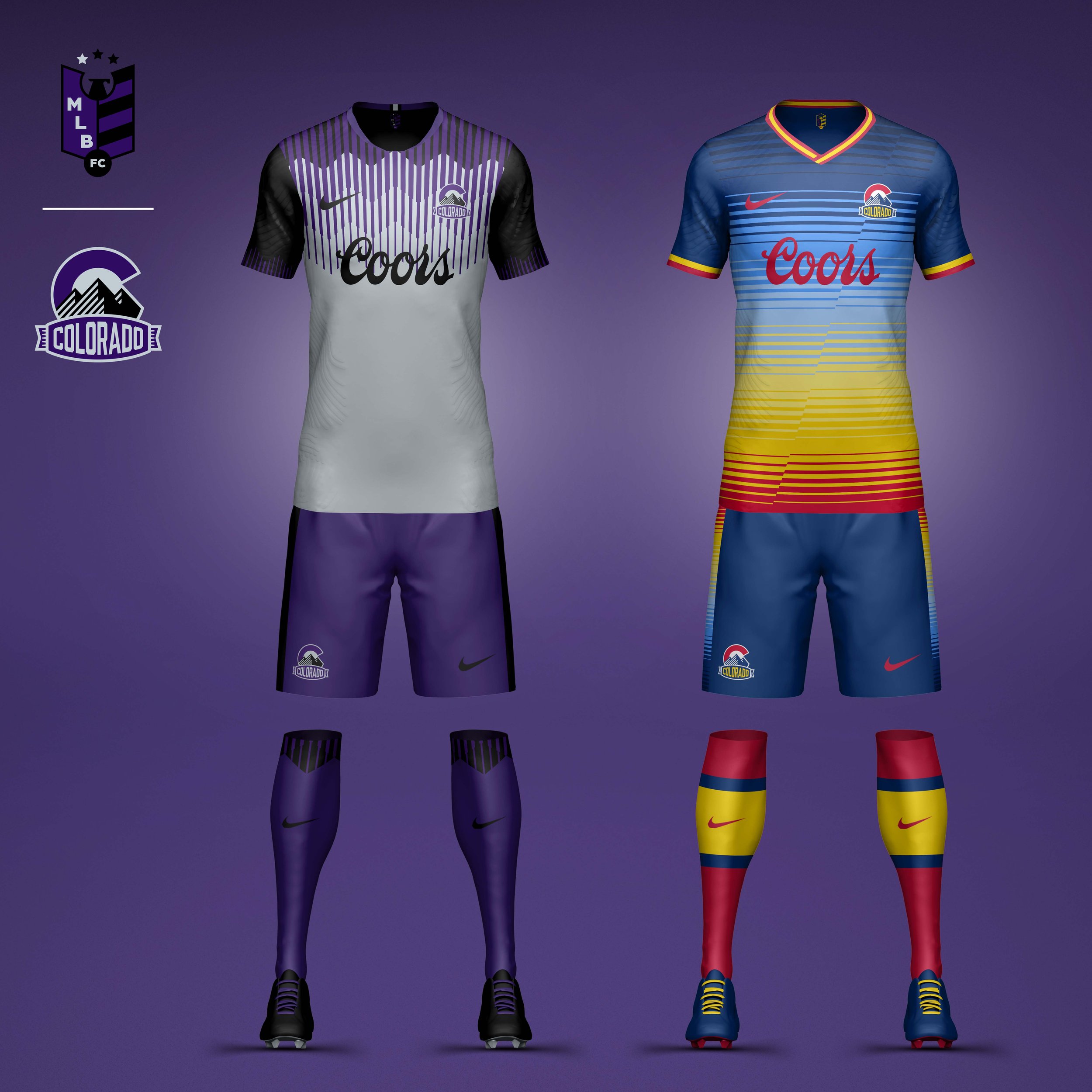
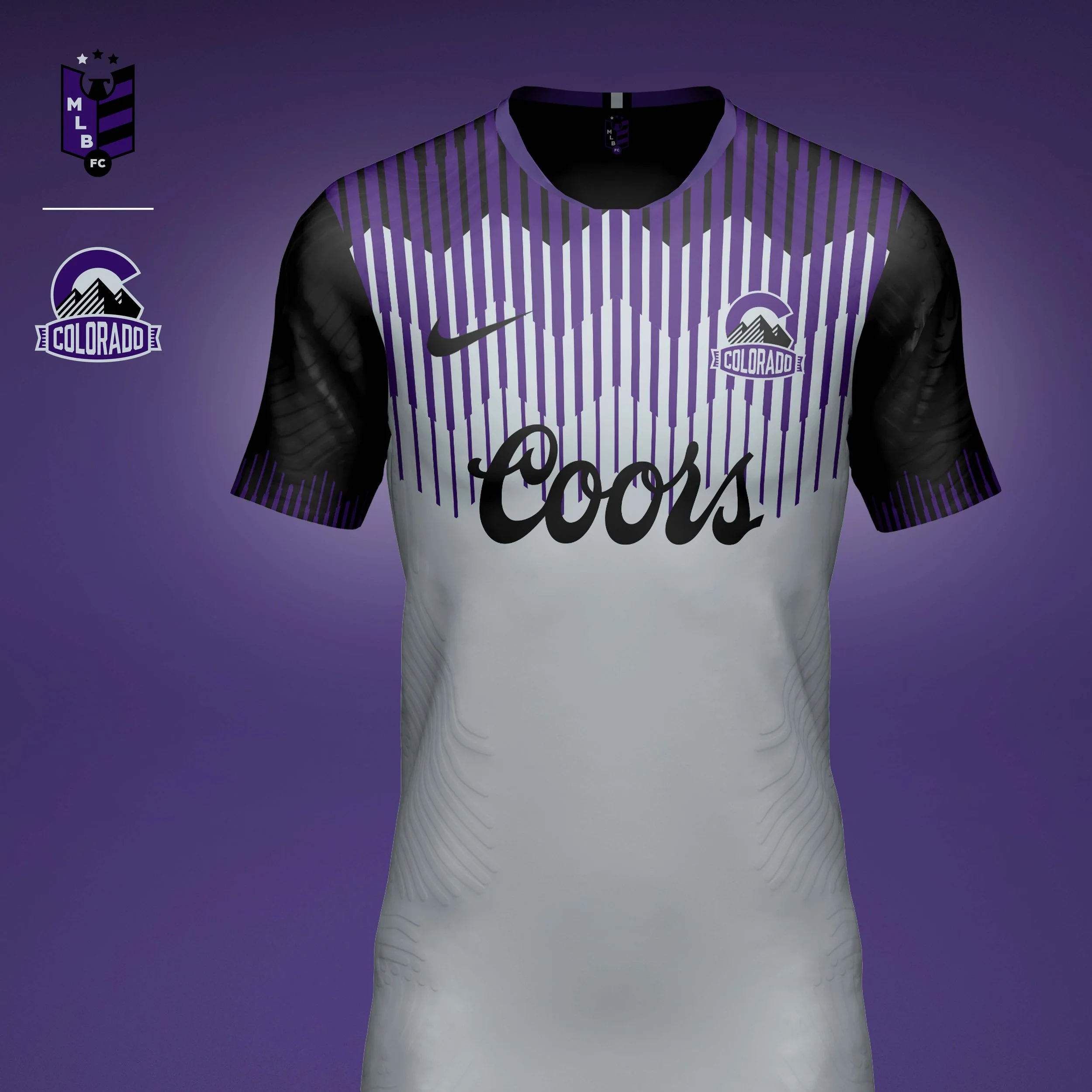
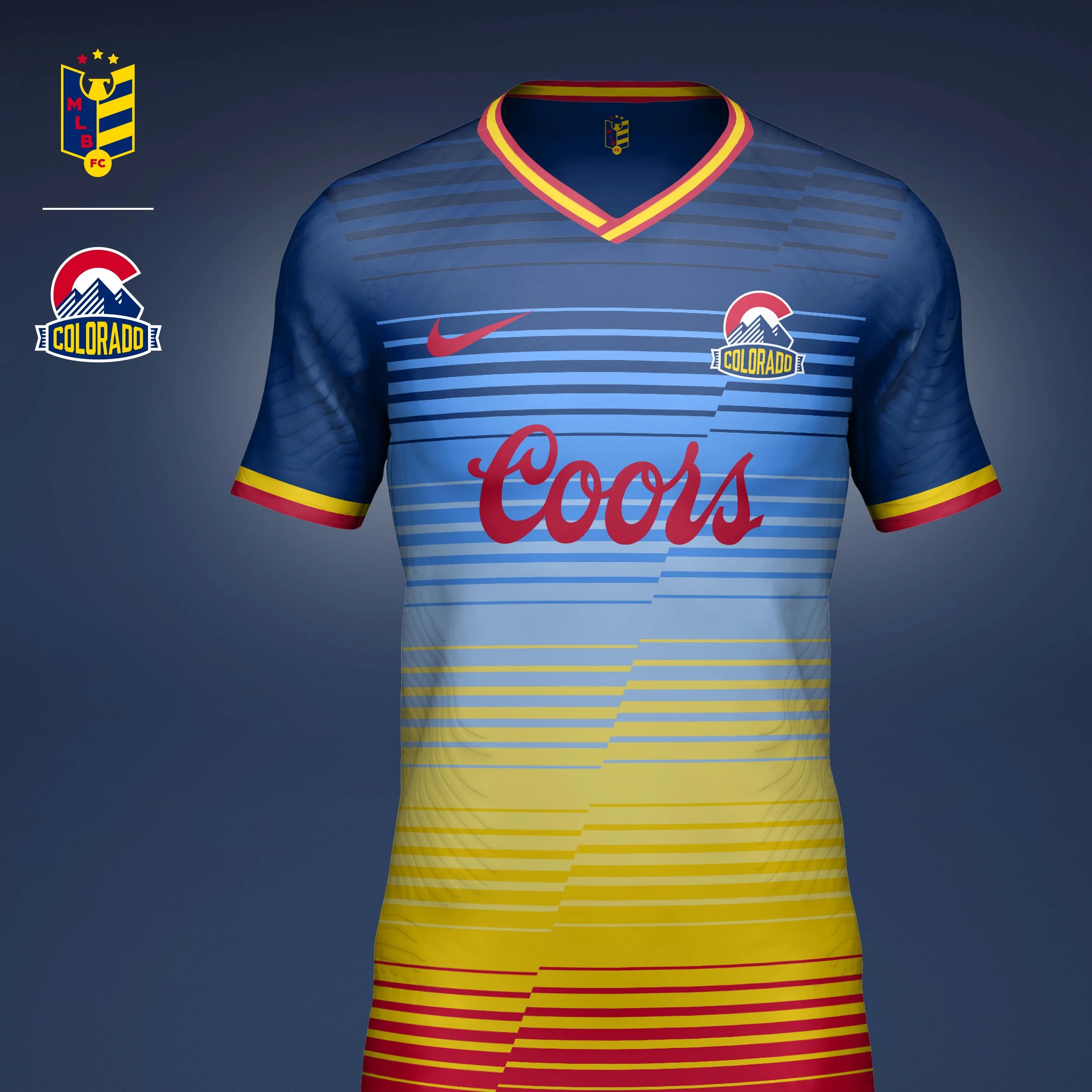
Colorado Rockies
The Rockies crest was inspired by the Colorado state flag. Blending the C from the flag and a graphic interpretation of the Rocky Mountains, I included a line detail that was inspired by the lines used in the original Rockies logo.
Home kit references the lines in the logo and puts a spin on the Rockies pinstripe jerseys creating a mountain pattern at the top.
Away kit I call the "Continental Divide" jersey takes the color palate from the Colorado state flag and the gradient line pattern is broken up creating the "divide."
Los Angeles Dodgers
Crest
The Dodgers identity balances the club’s Los Angeles present with its Brooklyn roots. The crest incorporates track-inspired lines that reference the streetcars fans once crossed on their way to Ebbets Field, paying homage to the origin of the “Trolley Dodgers” nickname.
Home Kit
One of baseball’s most timeless uniforms served as the foundation for the home kit, which modernizes the club’s iconic look while preserving its simplicity.
Away Kit
The away kit introduces a subtle zig-zag pattern inspired by the mid-century architecture and scoreboards of Dodger Stadium, creating a contemporary expression of one of baseball’s most recognizable venues.
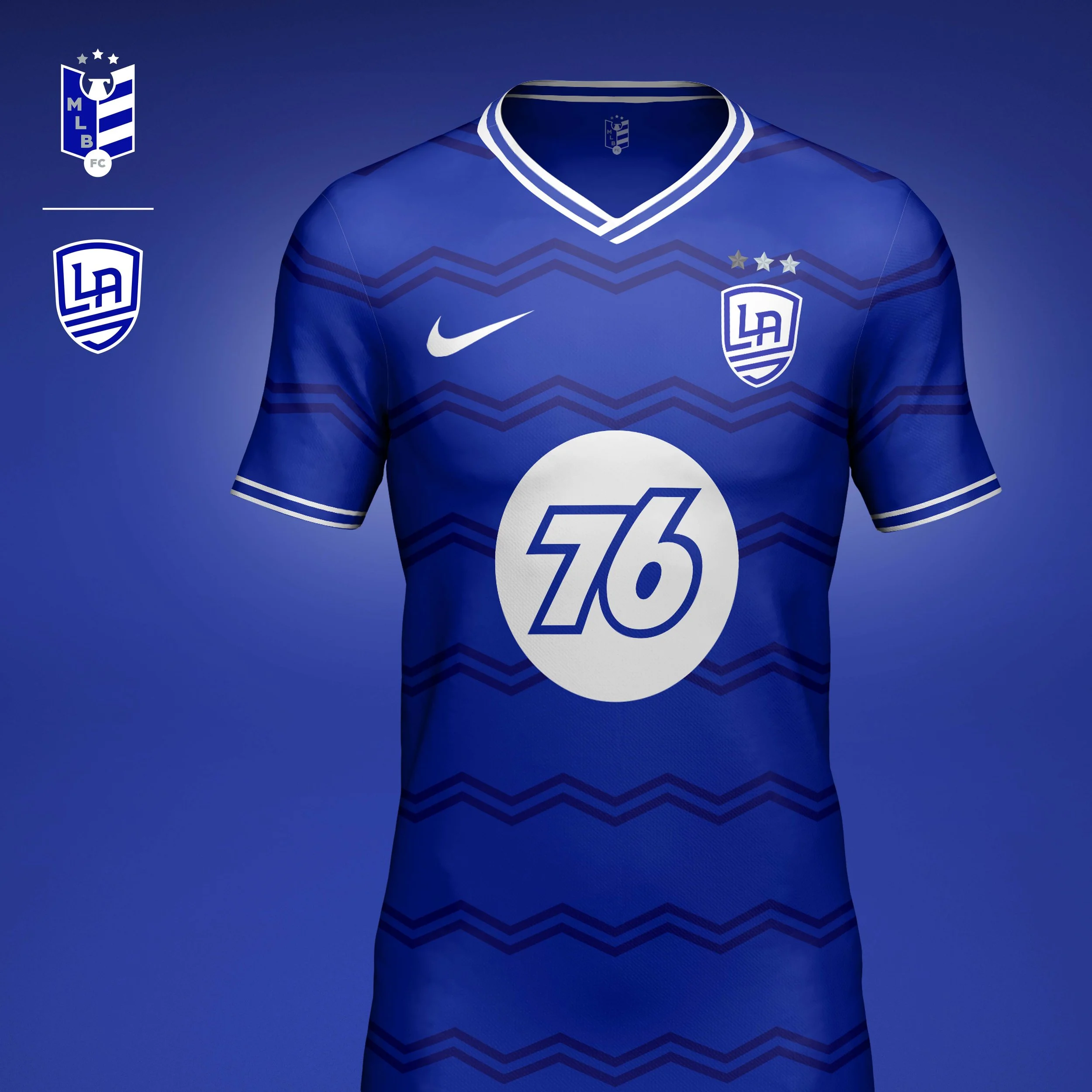
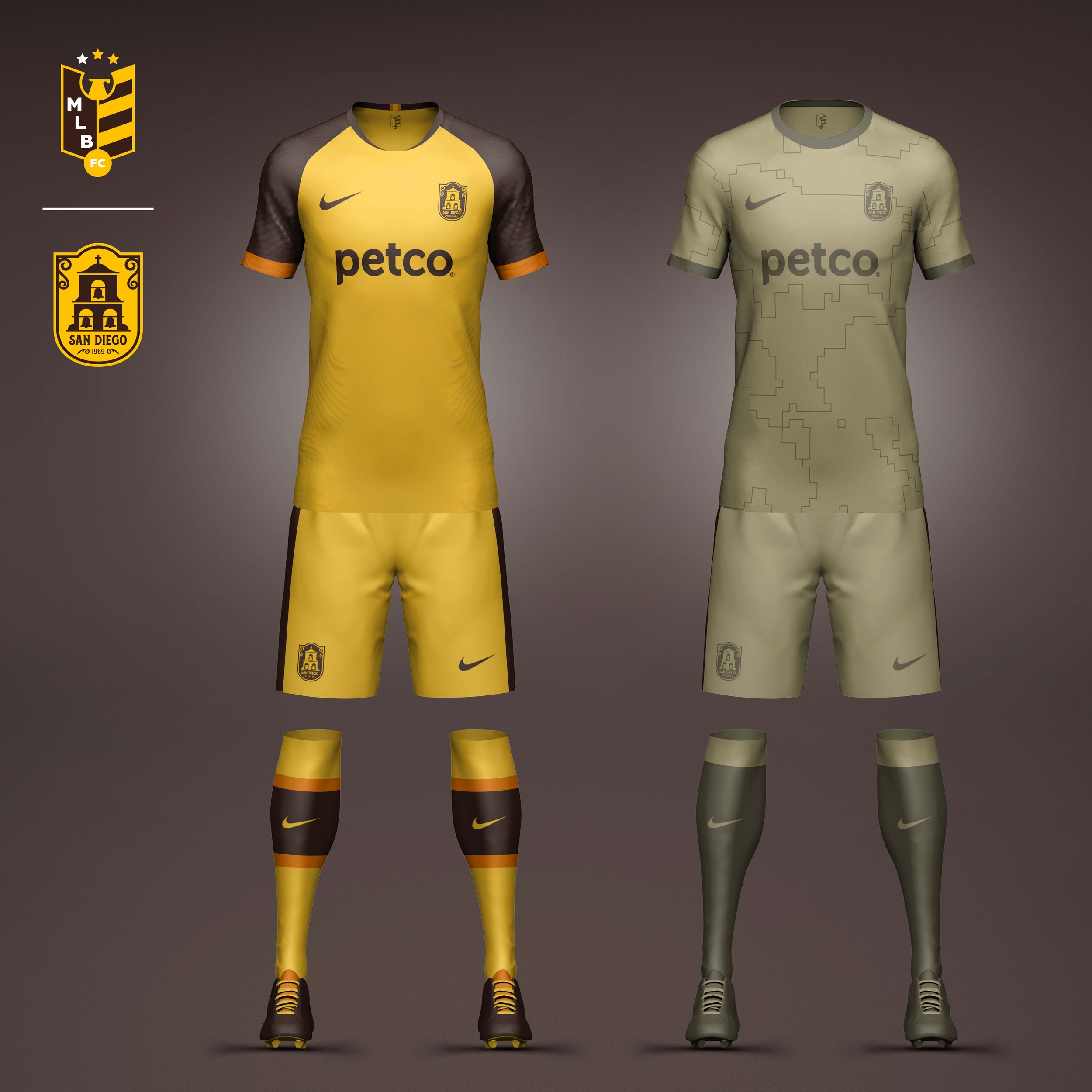
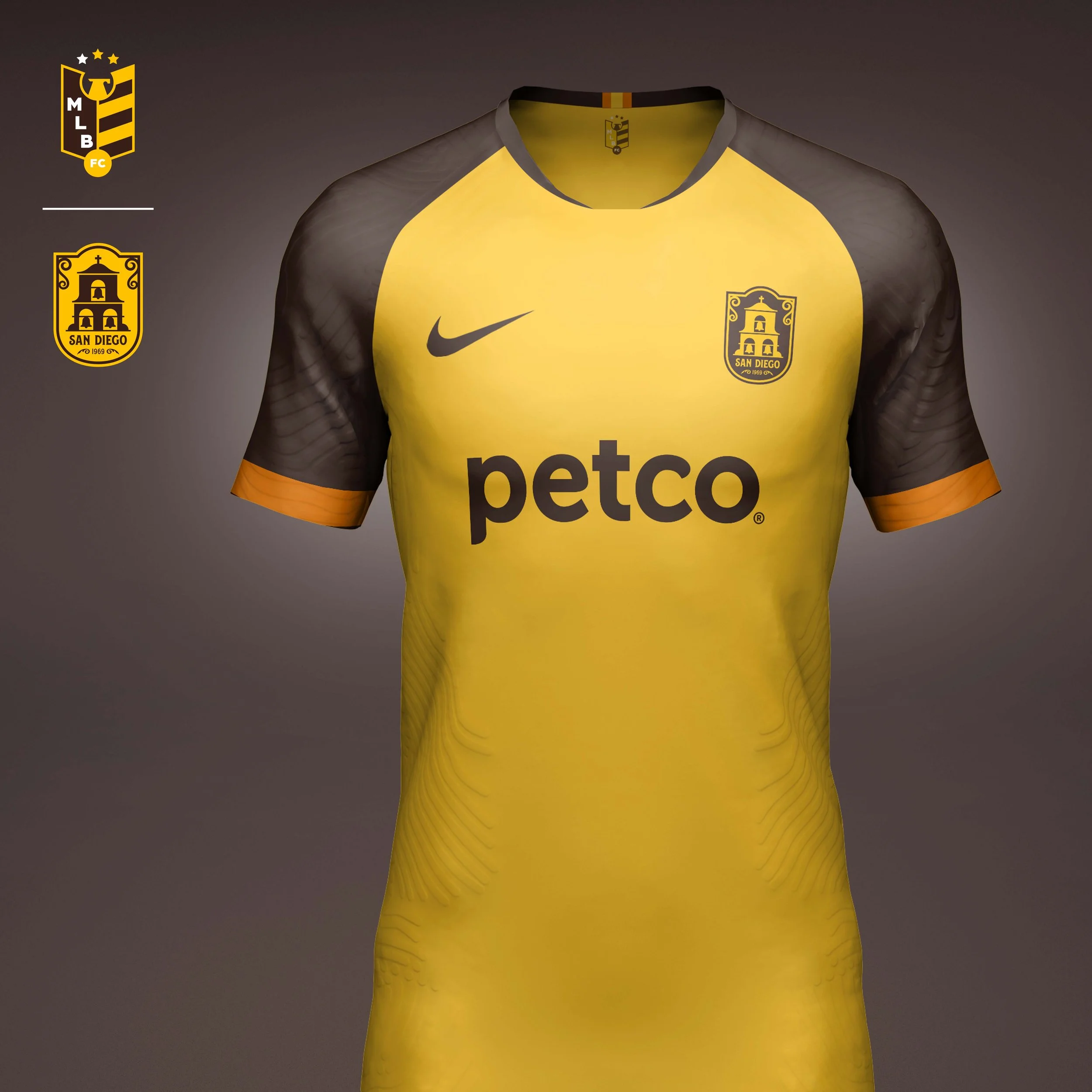
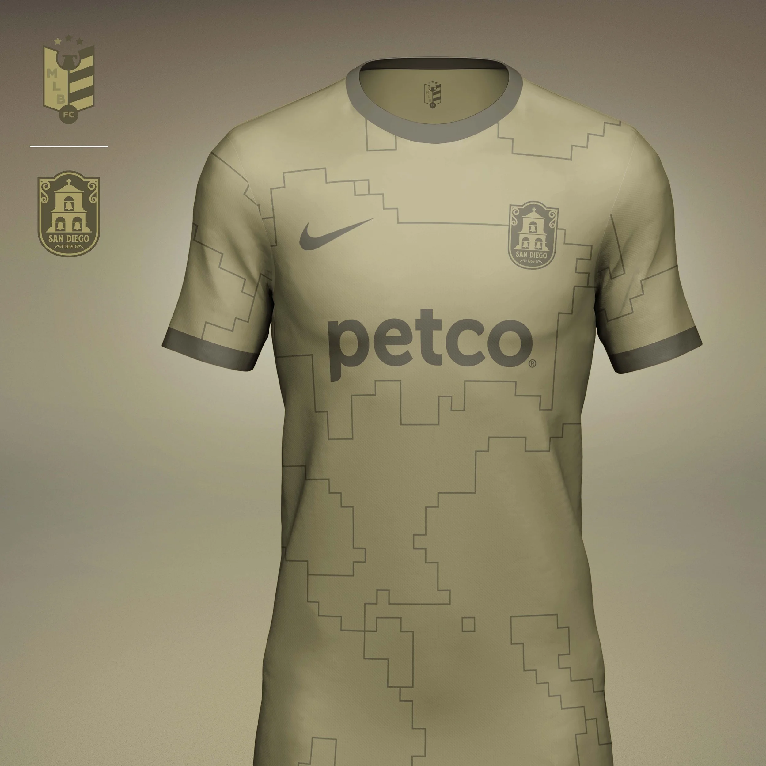
San Diego Padres
With a team name like the Padres and all the Spanish architecture in San Diego it wasn't hard to get inspiration for this crest. The crest features the bell tower from the San Diego Mission and filigree inspired from signs around the Gaslamp District.
Home kit is inspired by the Padres "Taco Bell" uniforms of the 80s.
The Padres have a long standing tradition of a camo alternative as a tribute to nearby Camp Pendleton. I wanted to do a more minimal take on camo, reducing a digi-camo print to a simple outline. This gives the away kits a more modern nod to the military rather than a direct reference.
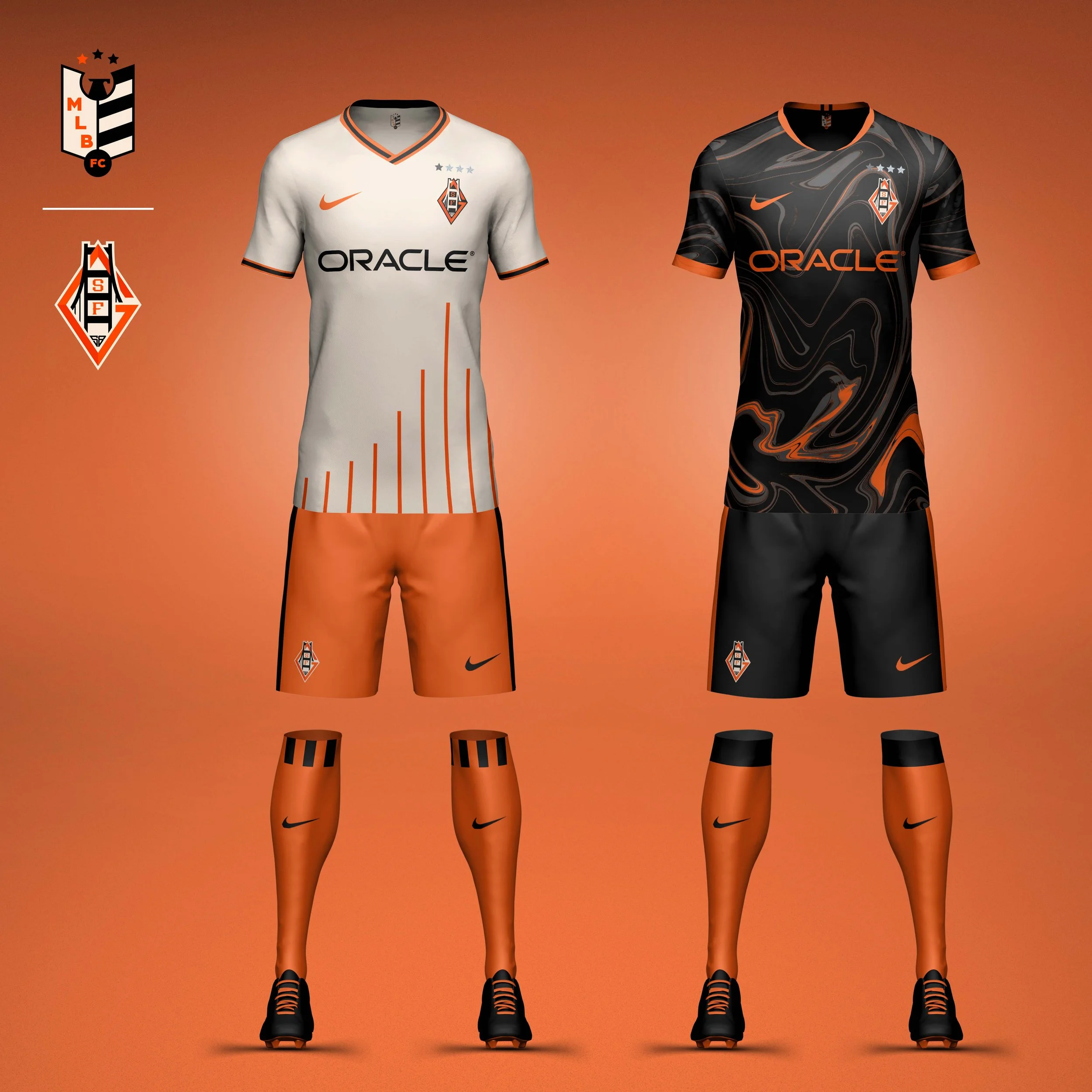
San Francisco Giants
Crest
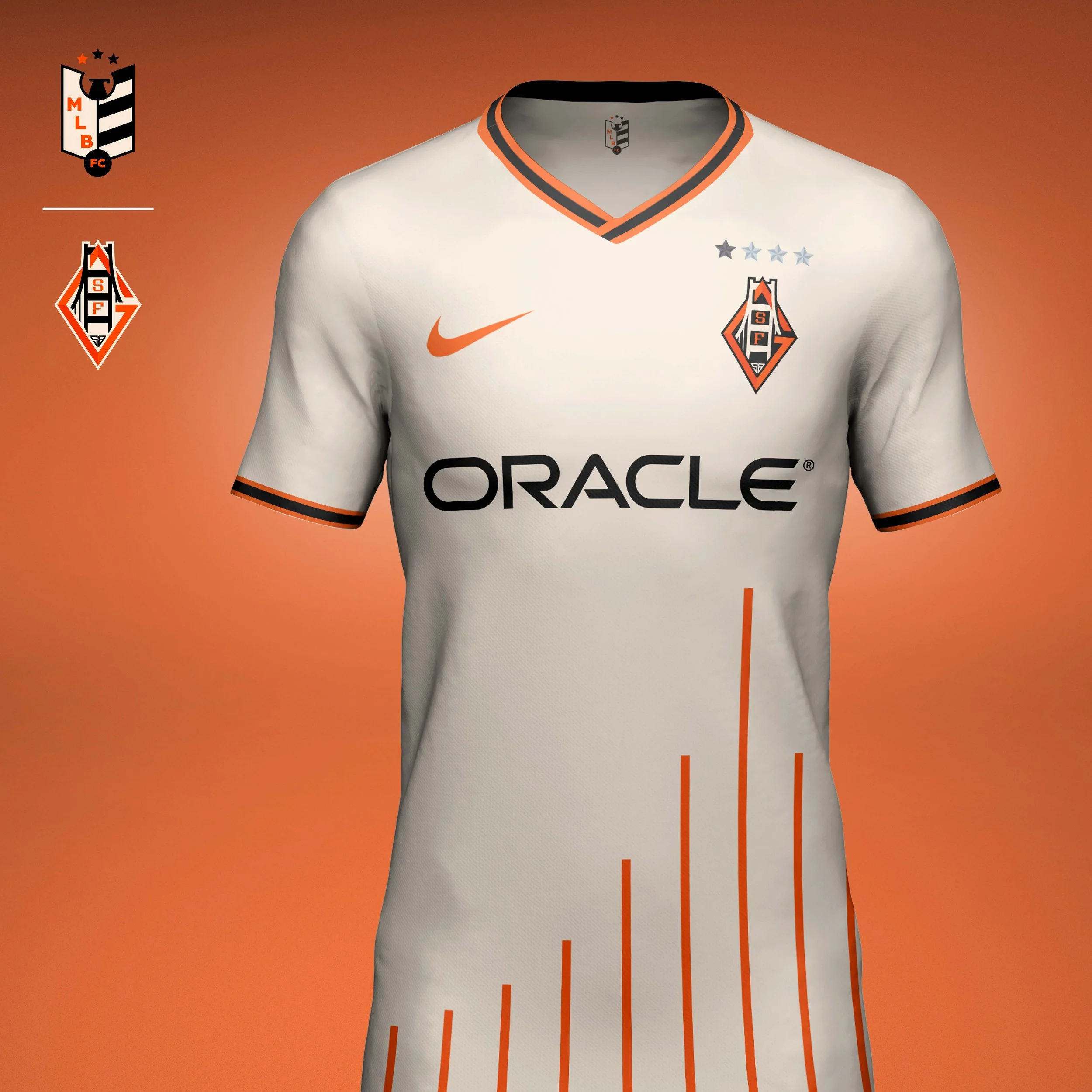
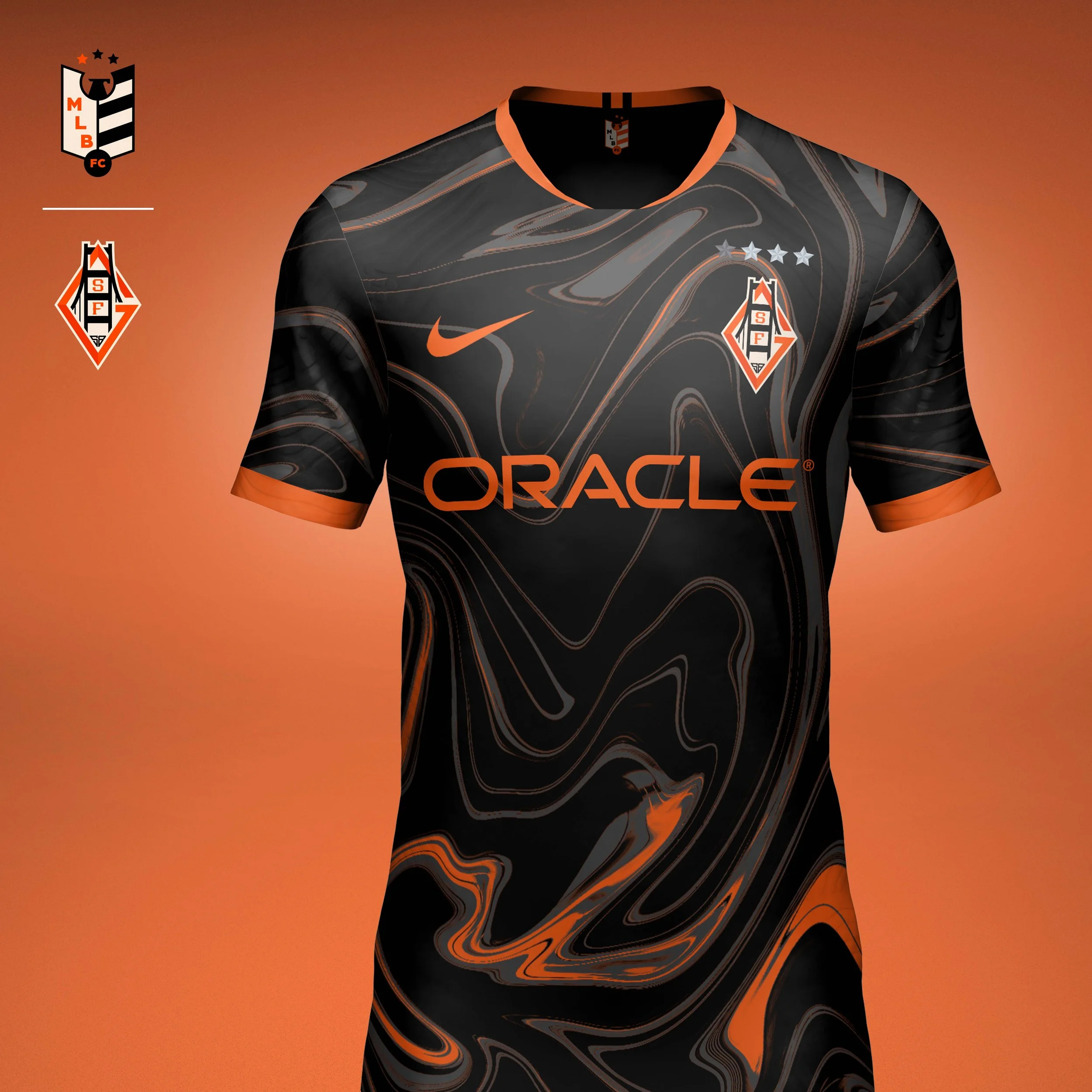
The crest draws inspiration from one of the most recognizable landmarks in the city: the Golden Gate bridge. Its suspension towers intertwine with an abstracted G that feels equally rooted in football culture and Giants history. The custom letterforms are integrated into the bridge structure, while the founding year of the San Francisco era is subtly incorporated into the design.
Home Kit
The home kit builds upon the bridge concept by transforming its suspension cables into a series of vertical pinstripes. Set against the Giants’ iconic cream base, the pattern creates a fresh interpretation of a baseball classic while maintaining the club’s traditional color palette. The result is a clean, heritage-driven kit that feels distinctly San Francisco.
Away Kit
For the away kit I looked beyond baseball and into one of the city’s most influential cultural movements. Inspired by the psychedelic posters, music, and visual experimentation of Haight-Ashbury and the Summer of Love, the kit features flowing marbled graphics in black and orange. It celebrates a different side of San Francisco’s identity while creating a bold contrast to the more traditional home look.
NL CENTRAL
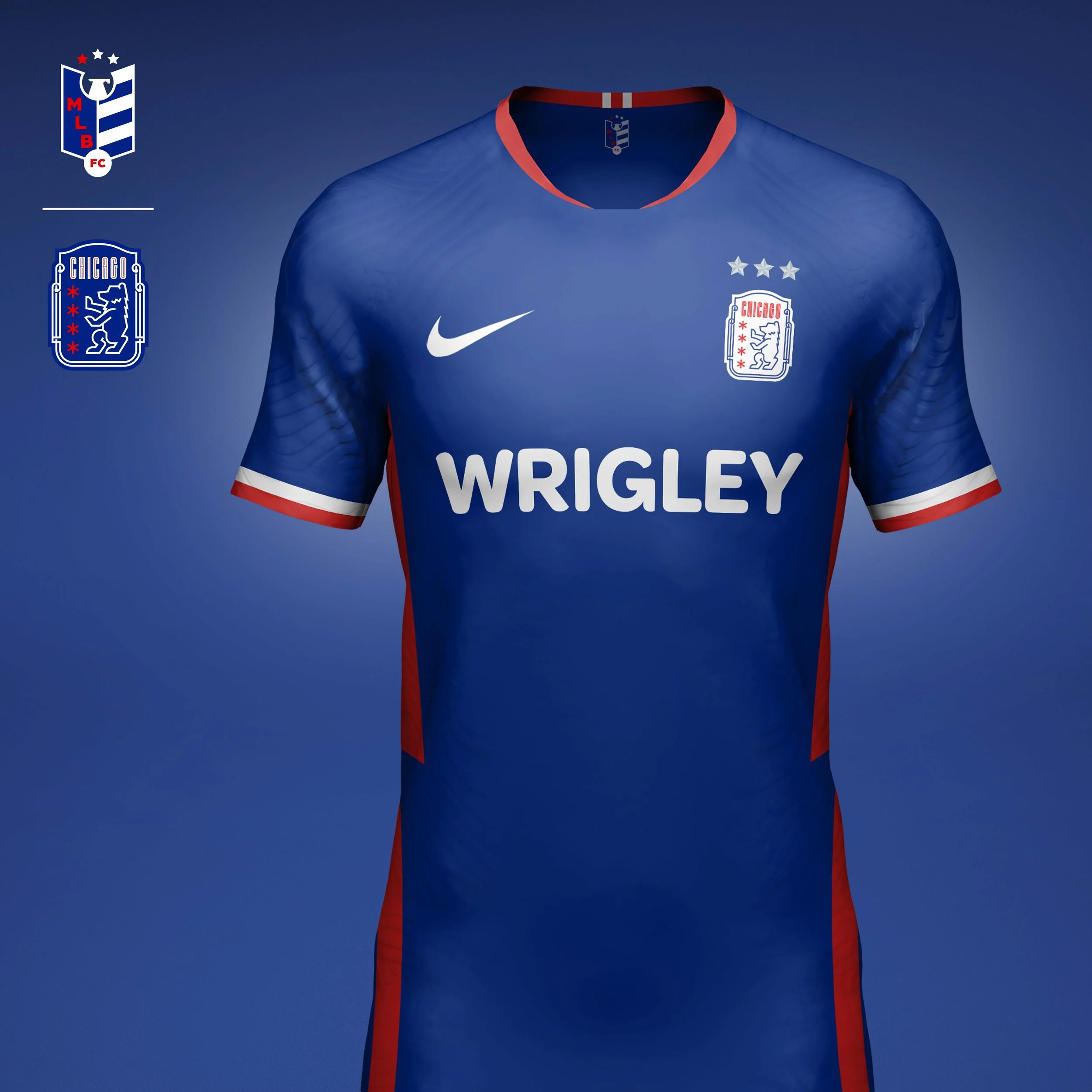
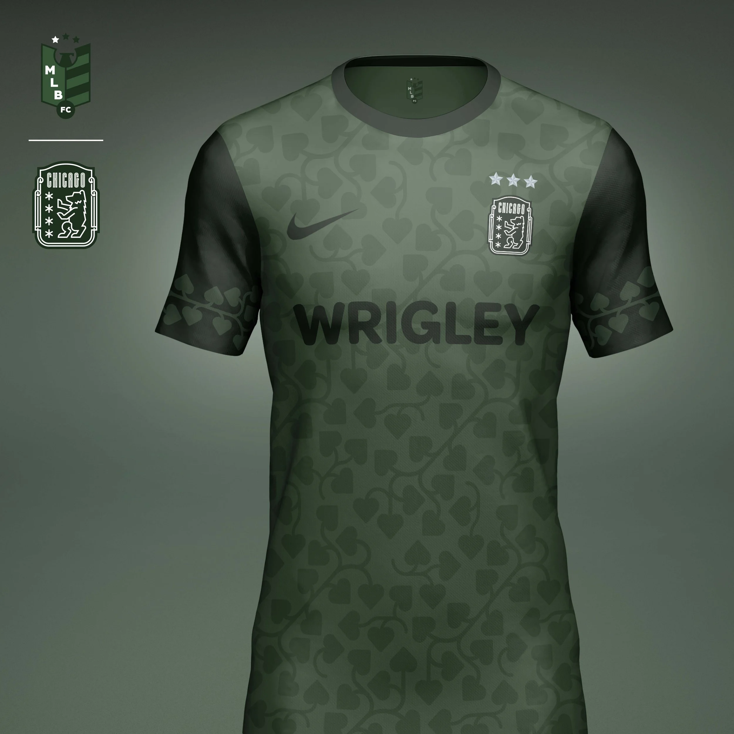
Chicago Cubs
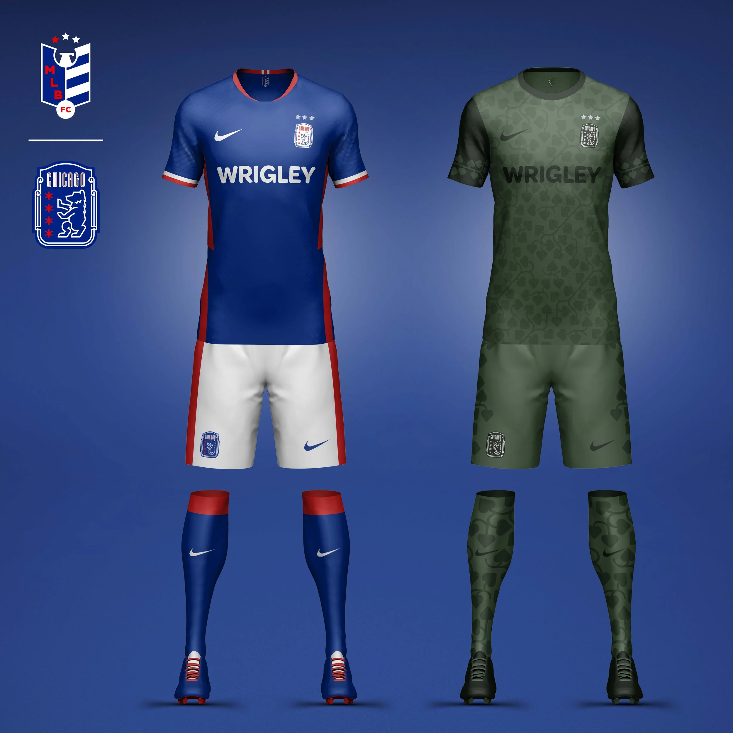
Inspired by the iconic Wrigley Field marquee, the crest combines Chicago’s four stars with a regal bear emblem that reflects the stature of the franchise. The home kit draws from the Cubs’ classic blue alternate uniforms. The away kit transforms Wrigley’s famous ivy into a tonal green pattern that covers the entire kit.
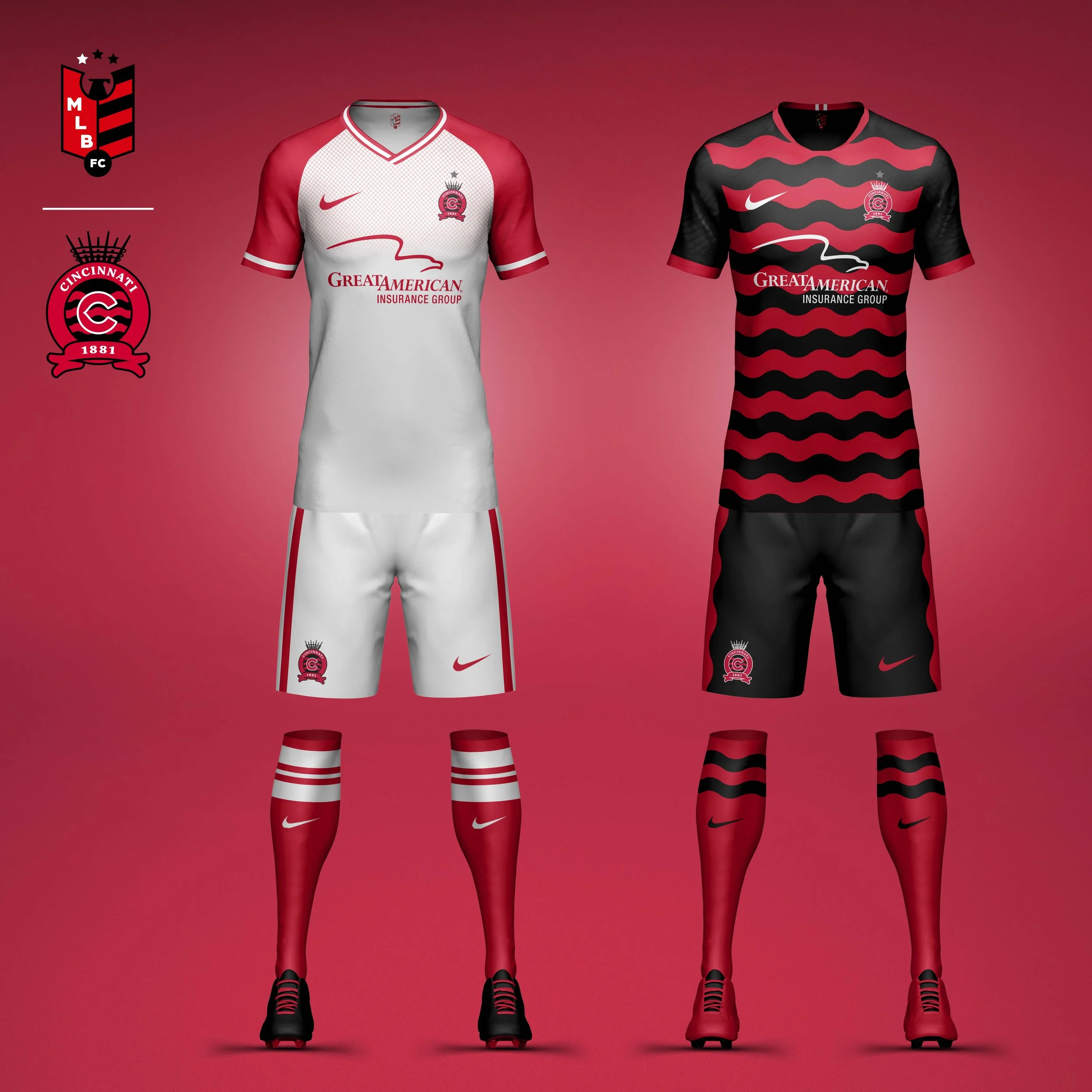
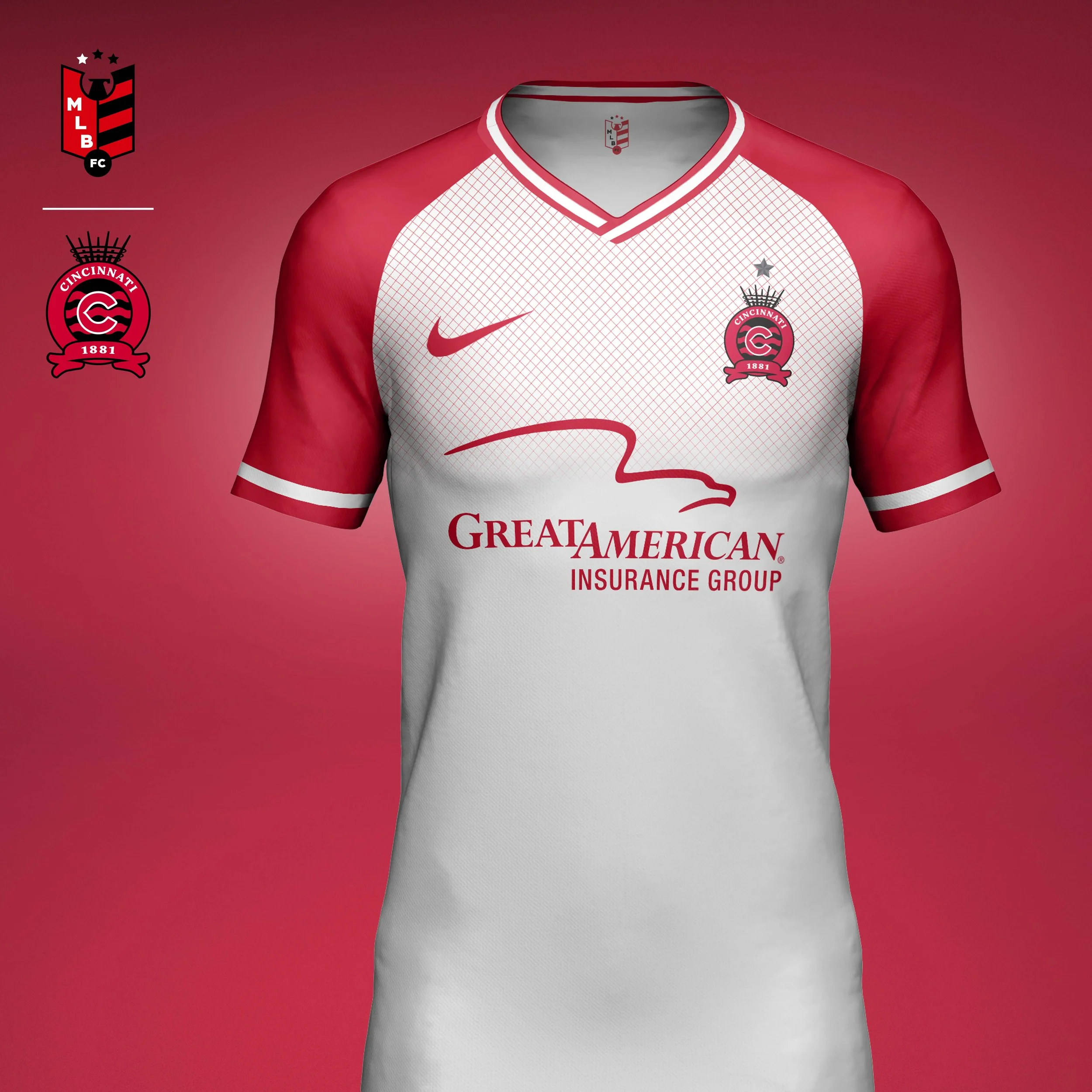
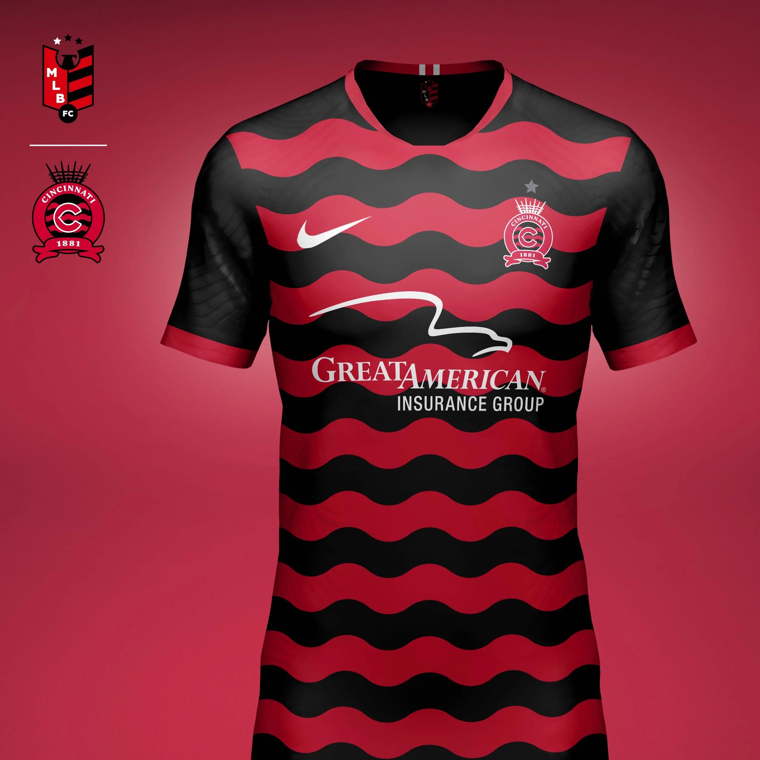
Cincinnati Reds
The crest blends the Reds’ classic wishbone C with references to Cincinnati’s riverfront heritage, incorporating elements inspired by the city flag, Ohio River, and Queen City nickname. The home kit pays tribute to the Big Red Machine era through clean white and red execution with subtle texture. The away kit expands the river-inspired graphics into bold wave patterns across the jersey.
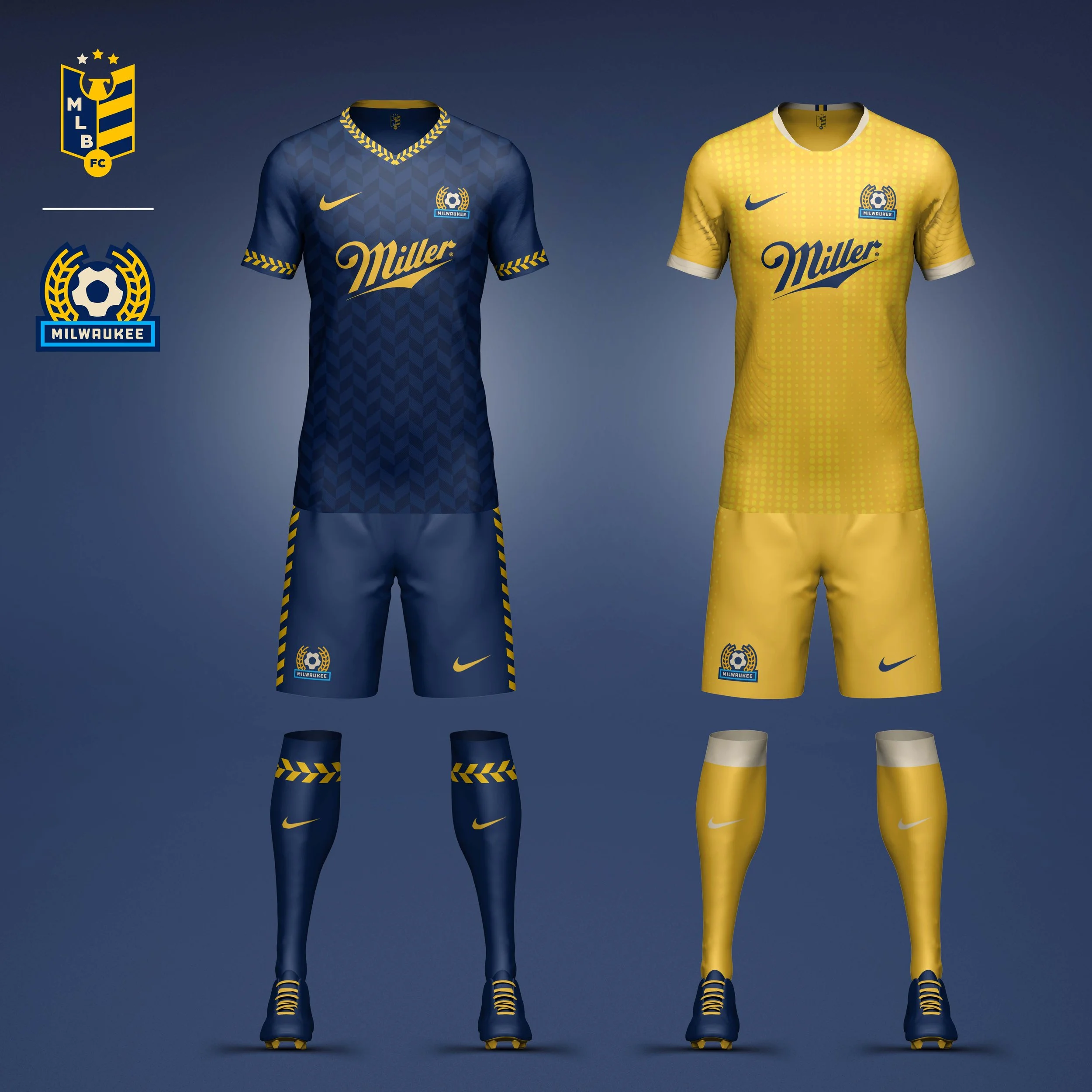
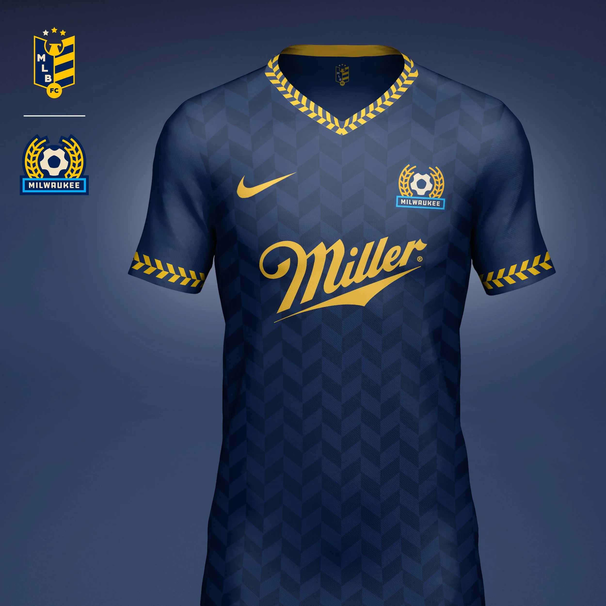
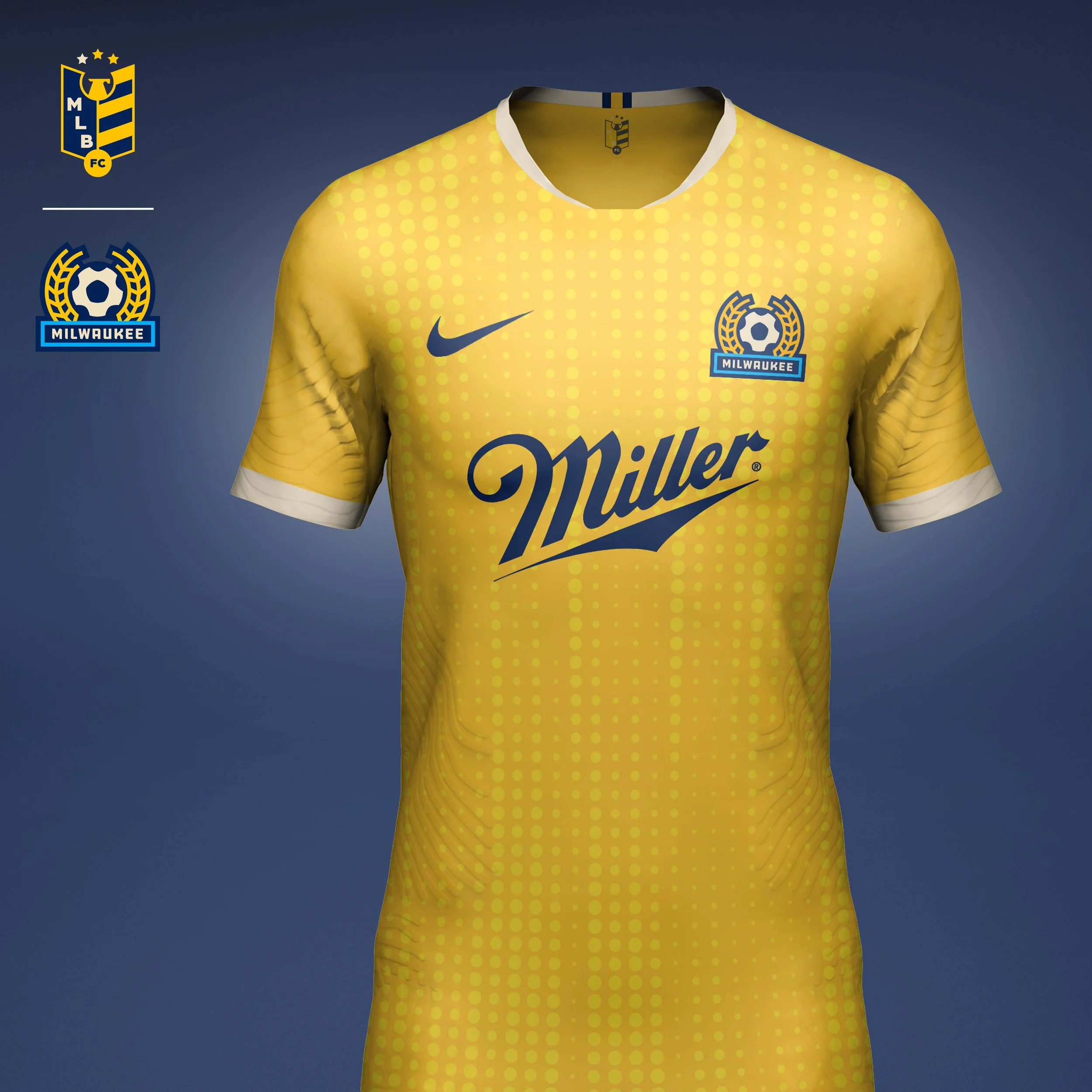
Milwaukee Brewers
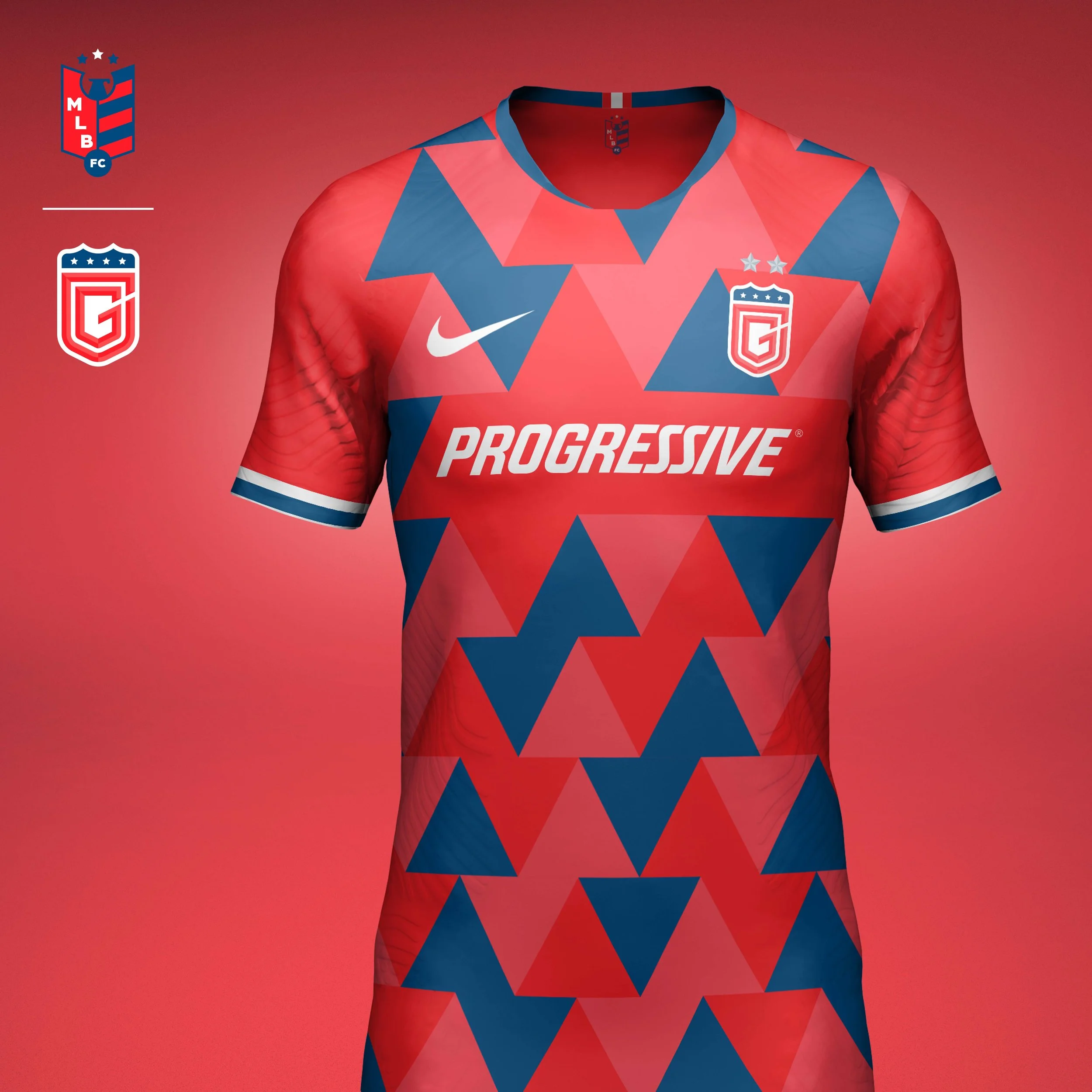
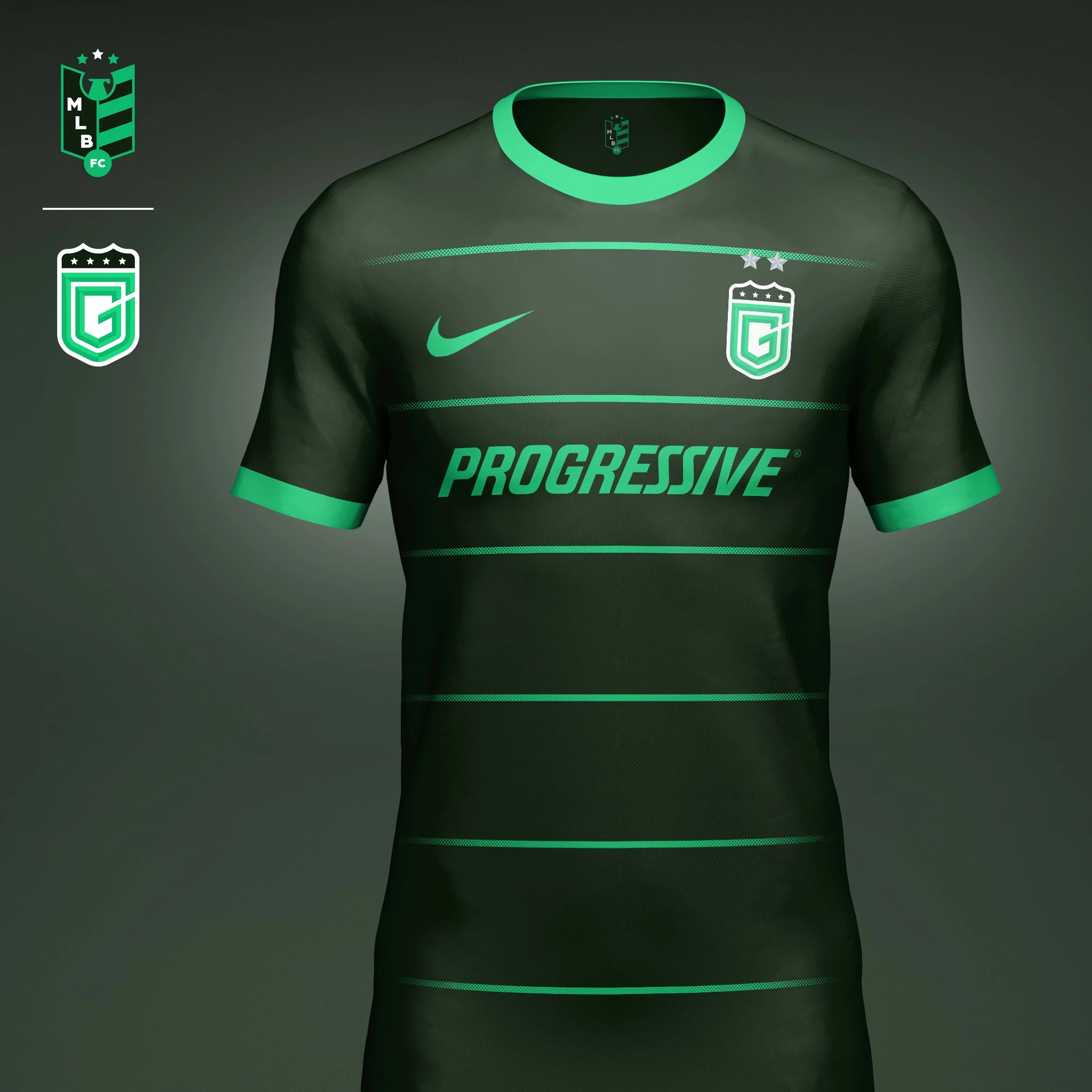
At the center of the crest stands a soccer ball that has a secondary read as a gear to speak to Milwaukee's rich history as a working class city of industry. On either side it is flanked by laurels of wheat. The study type provides the base to the crest to represent the team's commitment to the city and the fans.
Home kit uses the wheat pattern as a tonal pattern for the jersey and trim. I liked how it also gave a Bavarian-esque look to the kit that felt perfect for the Brewers.
The Away kit was inspired by a Brewers finished product, a frosty pint of beer. The lager colored kit has a effervescent pattern and is topped off with a frothy head colored trim.
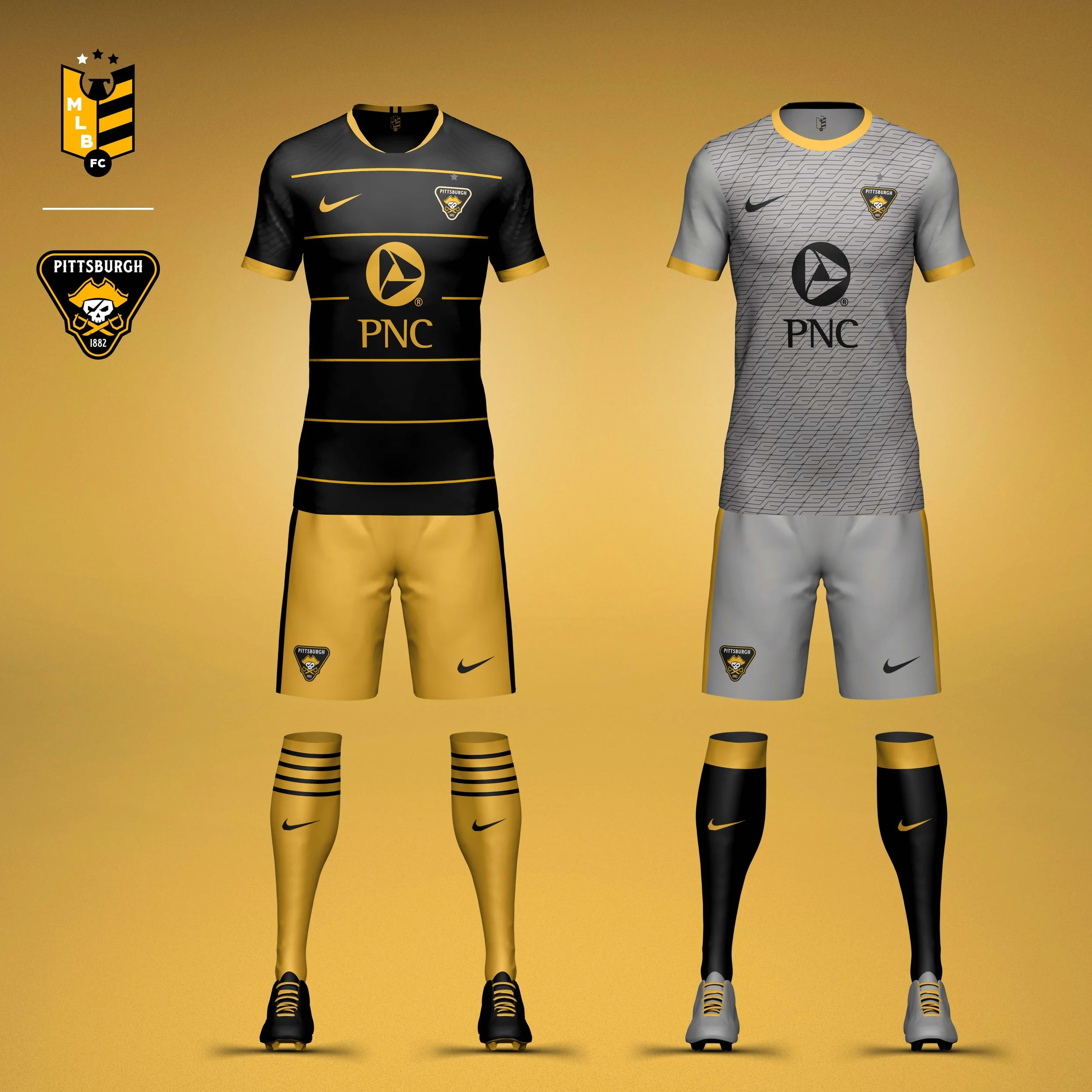
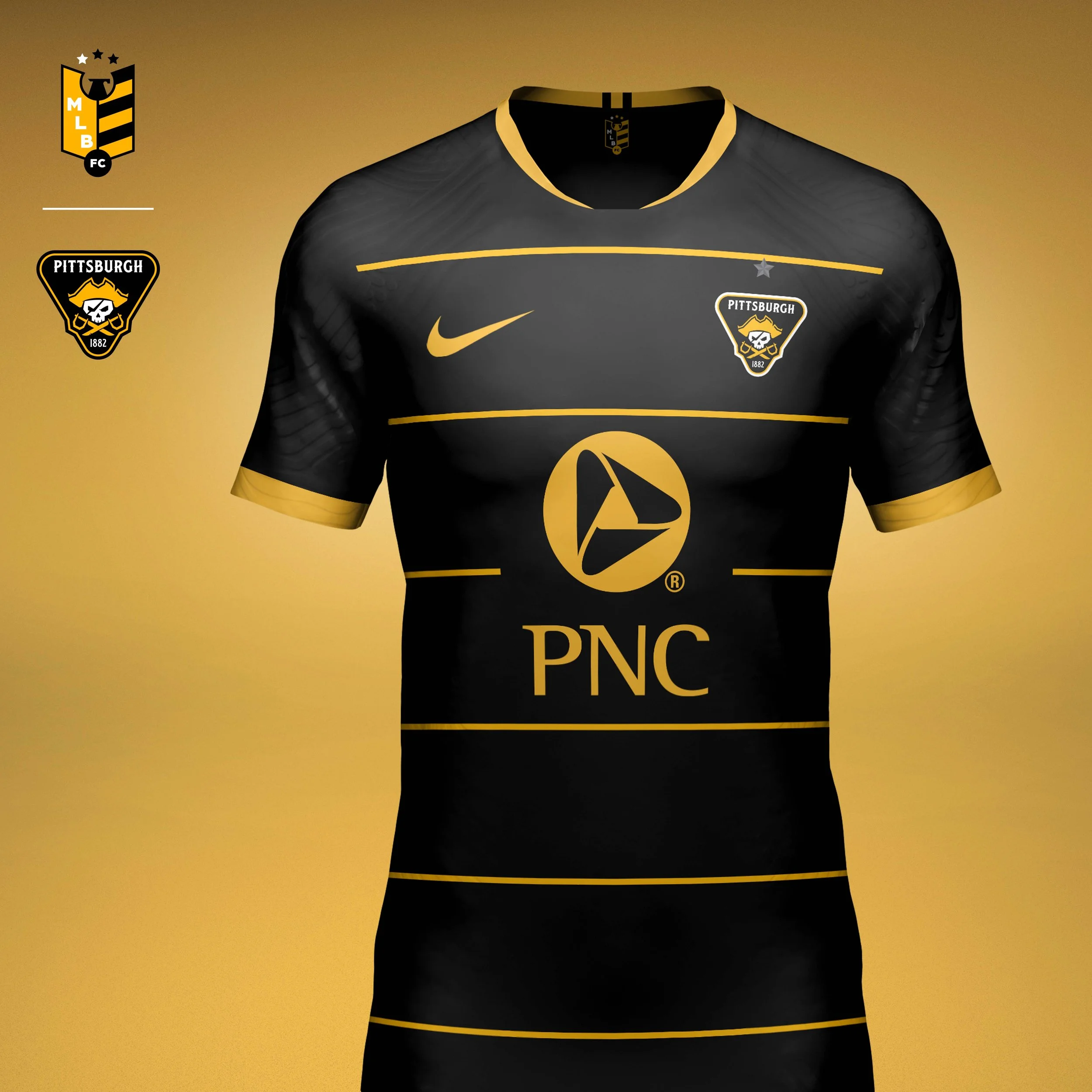
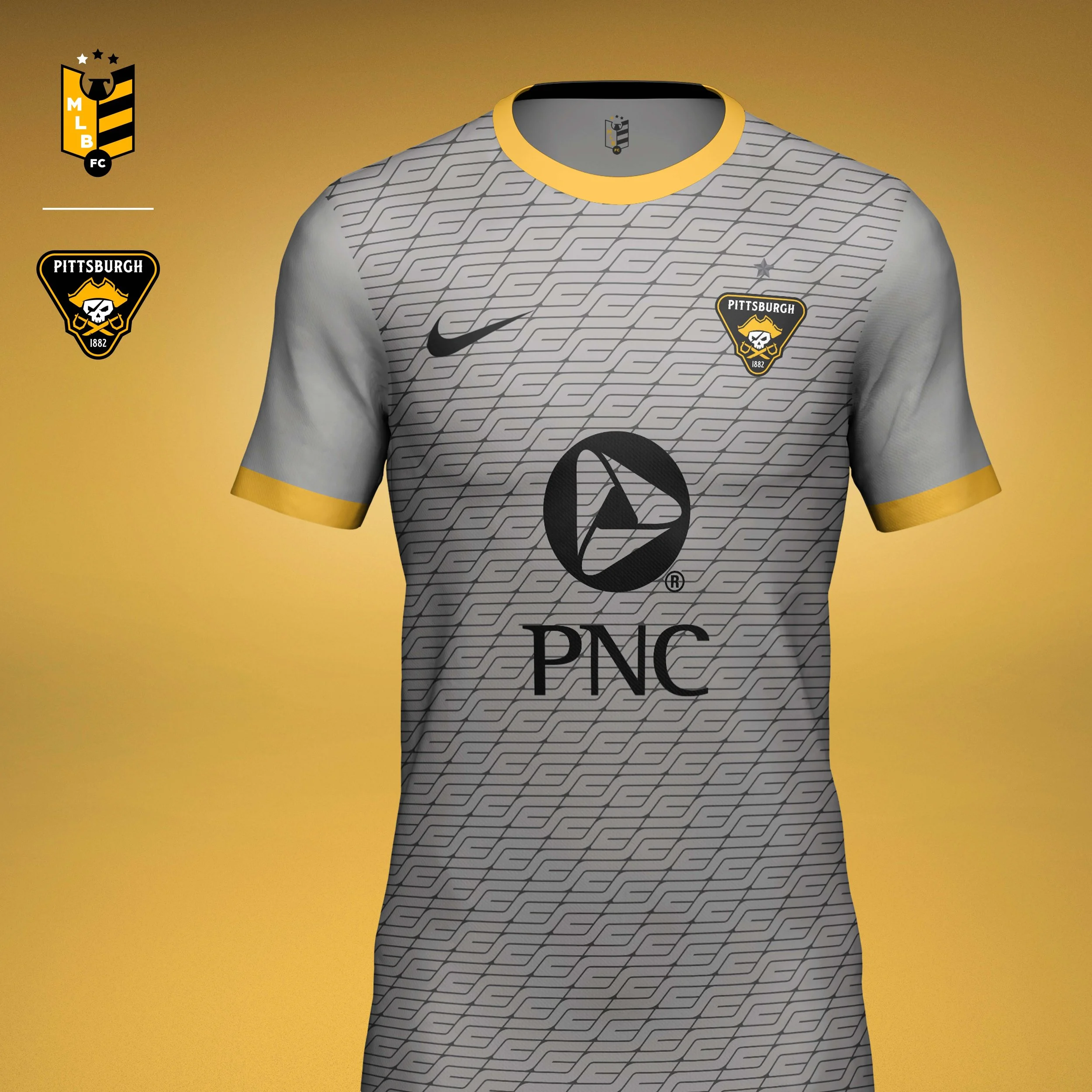
Pittsburgh Pirates
It's hard to not think of a skull and crossbones when you think of pirates. I decided to swap the crossbones for some swashbuckling swords where the hilts make a PP for Pittsburgh Pirates. The crest is done in a triangle to represent where the Allegheny and Monongahela Rivers meet to form the Ohio.
Home jersey is inspired by the iconic pillbox hats the Pirates wore in the 70s.
Away kit I call the "Steel City" jersey. Adorned with a custom pattern made from an interlocking SC gives the jersey a chainmail look.
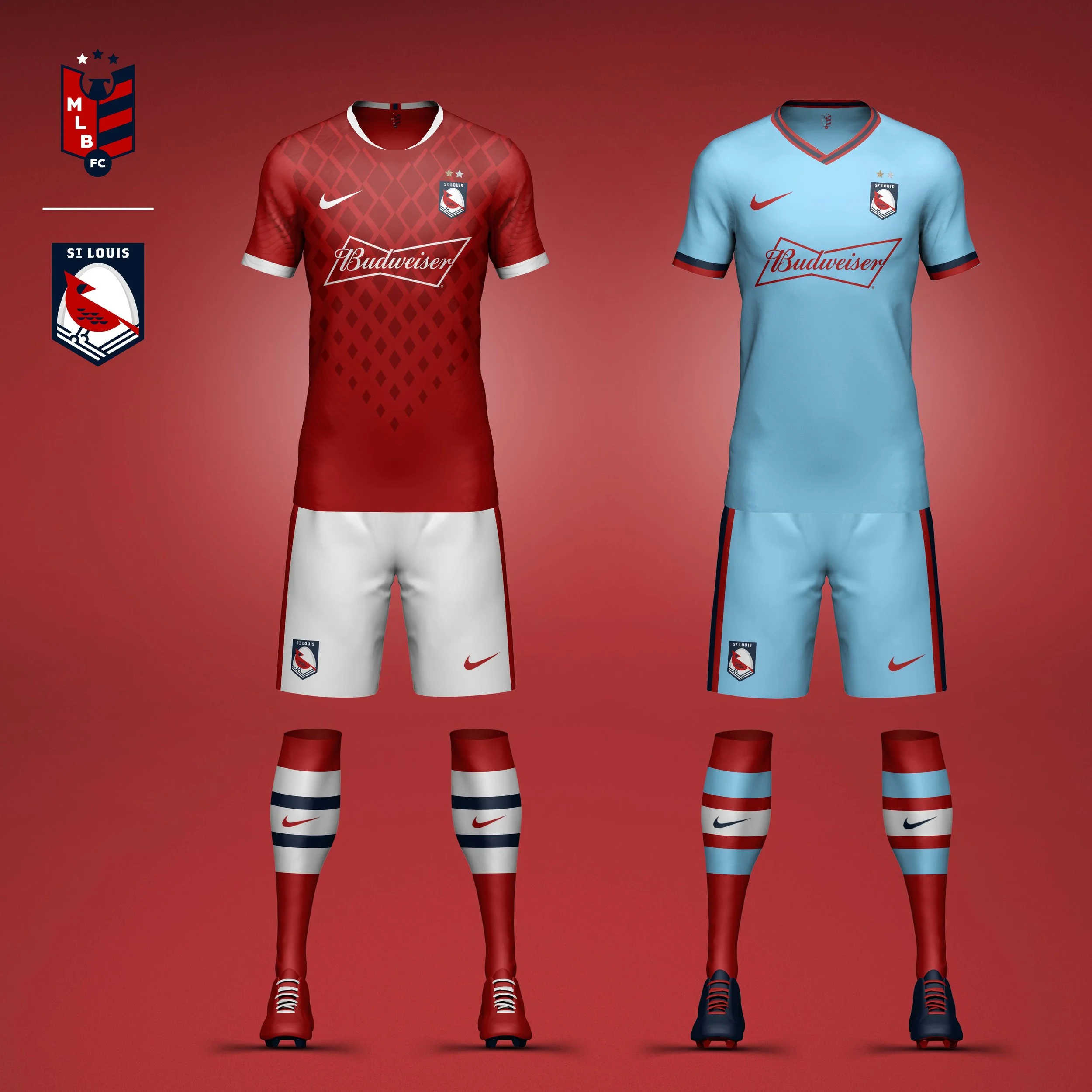
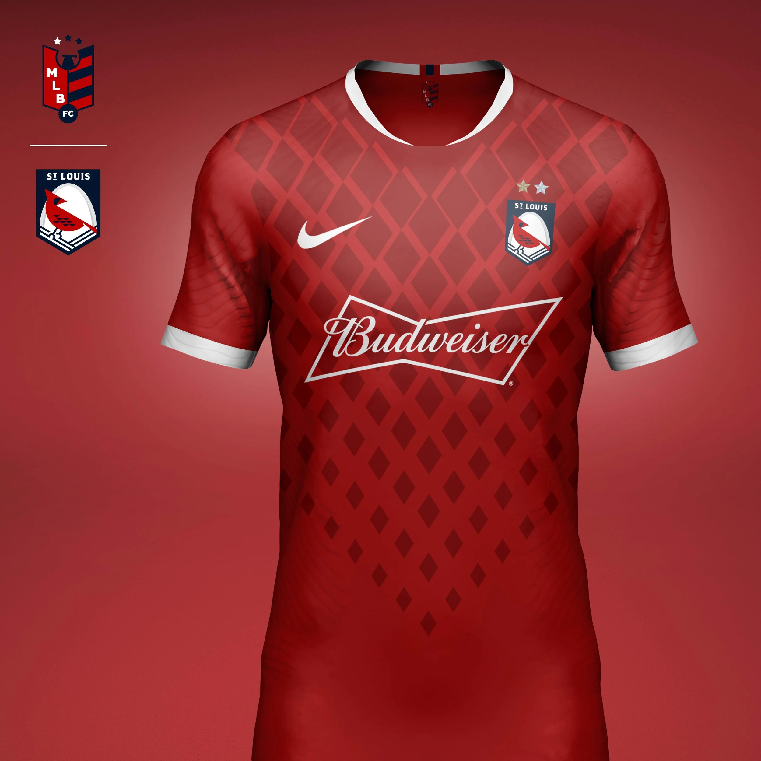
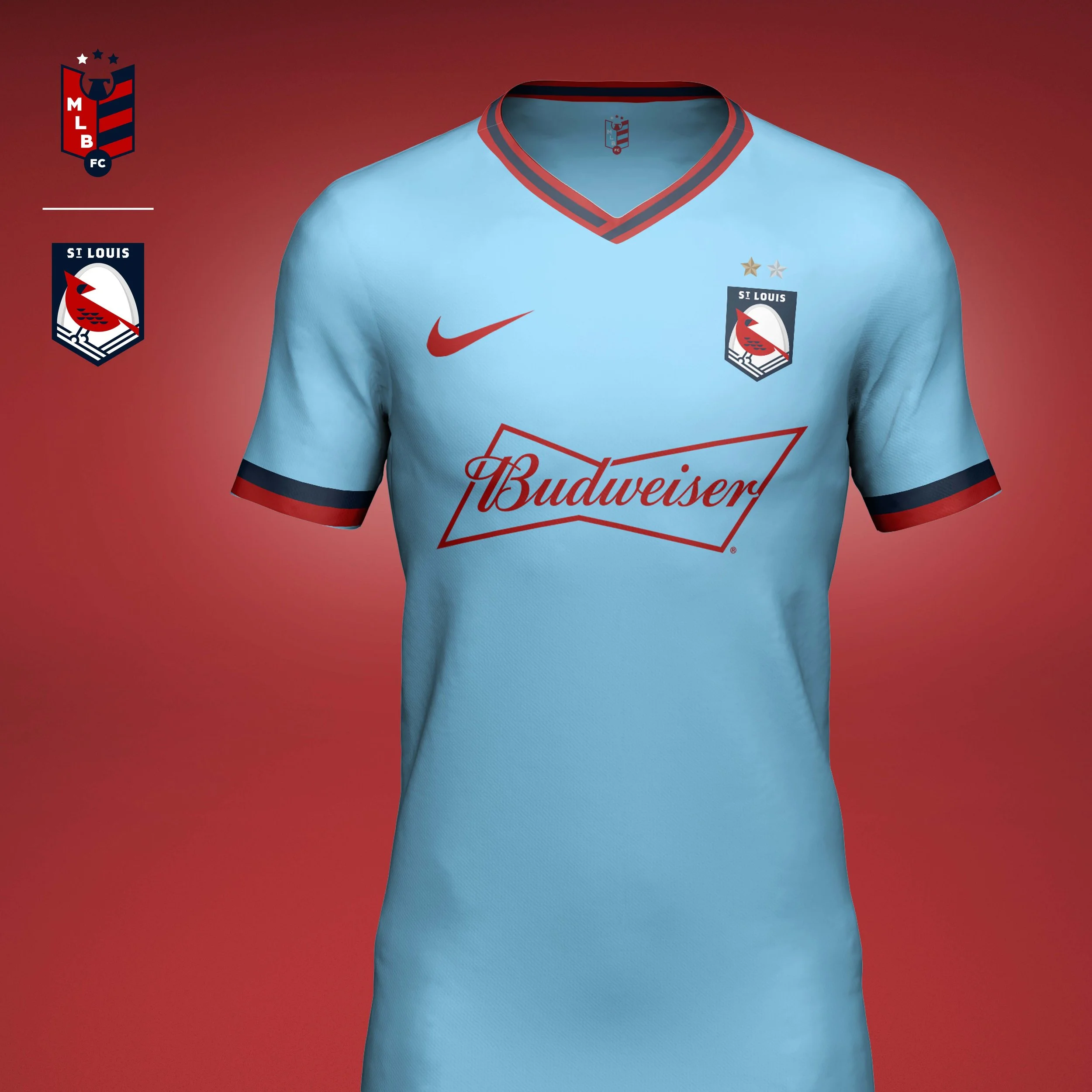
St Louis Cardinals
The Cardinals are the second most decorated team in MLB. I wanted to give them a modern crest, but still retain a classic look. That's shown in the shape of the crest and the heritage type. The storied franchise has had success through all decades and is always in the hunt for their next championship, so the bird's head is turned to look towards the future. The bird is framed by the Gateway Arch signifying the team is backed by the city and its amazing fans.
Home kit features a diamond pattern that eludes to the feathers of the cardinal.
Away kit is inspired by the powder blue jerseys the Cardinals wore in the late 70s and early 80s.
NL EAST
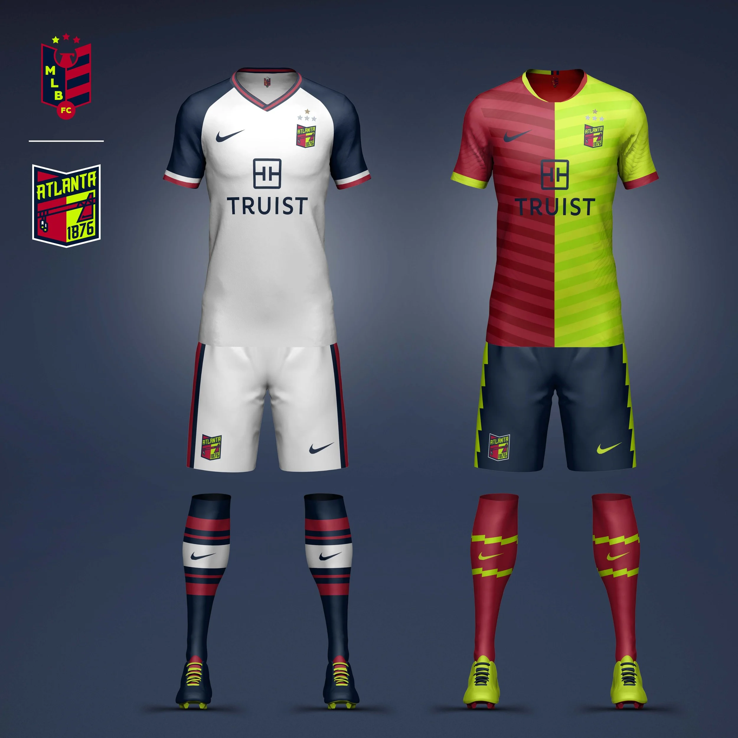
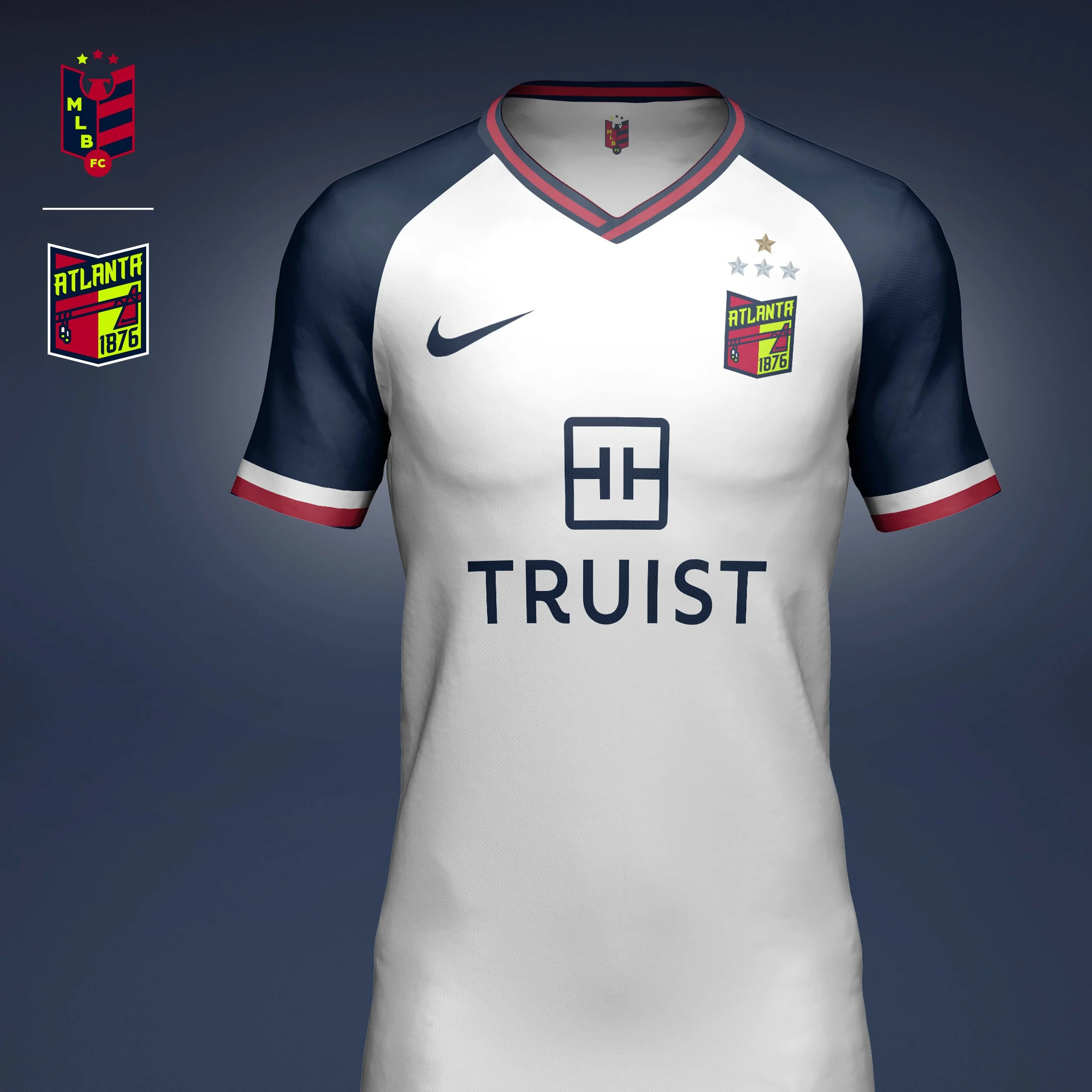
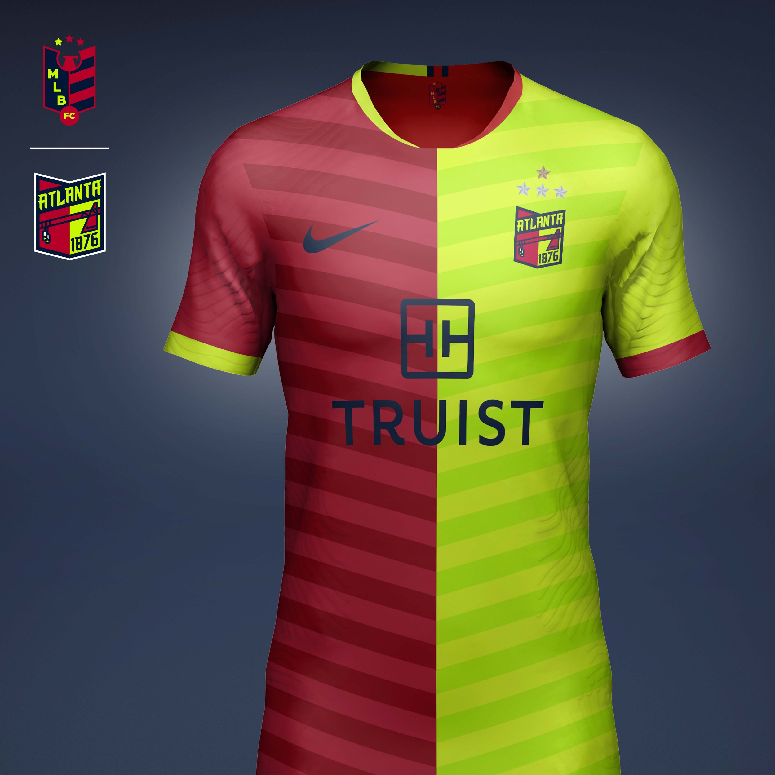
Atlanta Braves
While the Braves are the longest continuously operated professional franchise in MLB they also are always trying to stay at the forefront, whether that's being the first team to move "west" (moving to Milwaukee in 1953) or leading with young stars (teams of the 90s or today's young stars). I wanted to represent that modernity by updating their type and their colors, bring in a vibrant yellow to match the product on the field.
Home kit is a more traditional kit representing the history of the team (celebrating their 150th anniversary). The kit is based on the jerseys of the 1970s that Phil Niekro and Hank Aaron wore, but updated with the modern colors.
The away kit is a more modern look taking the two-tone split from the crest and heavily featuring the new bright yellow.
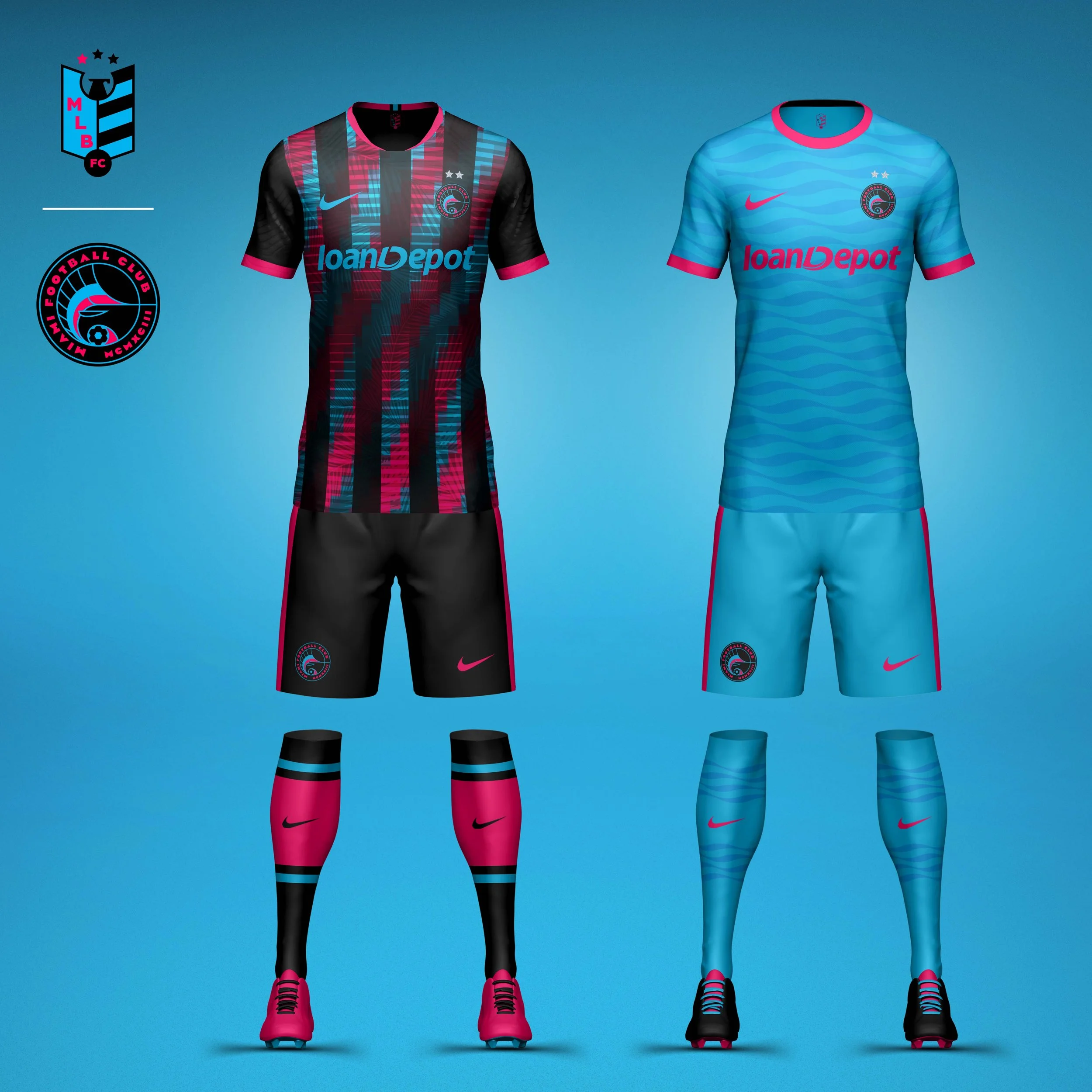
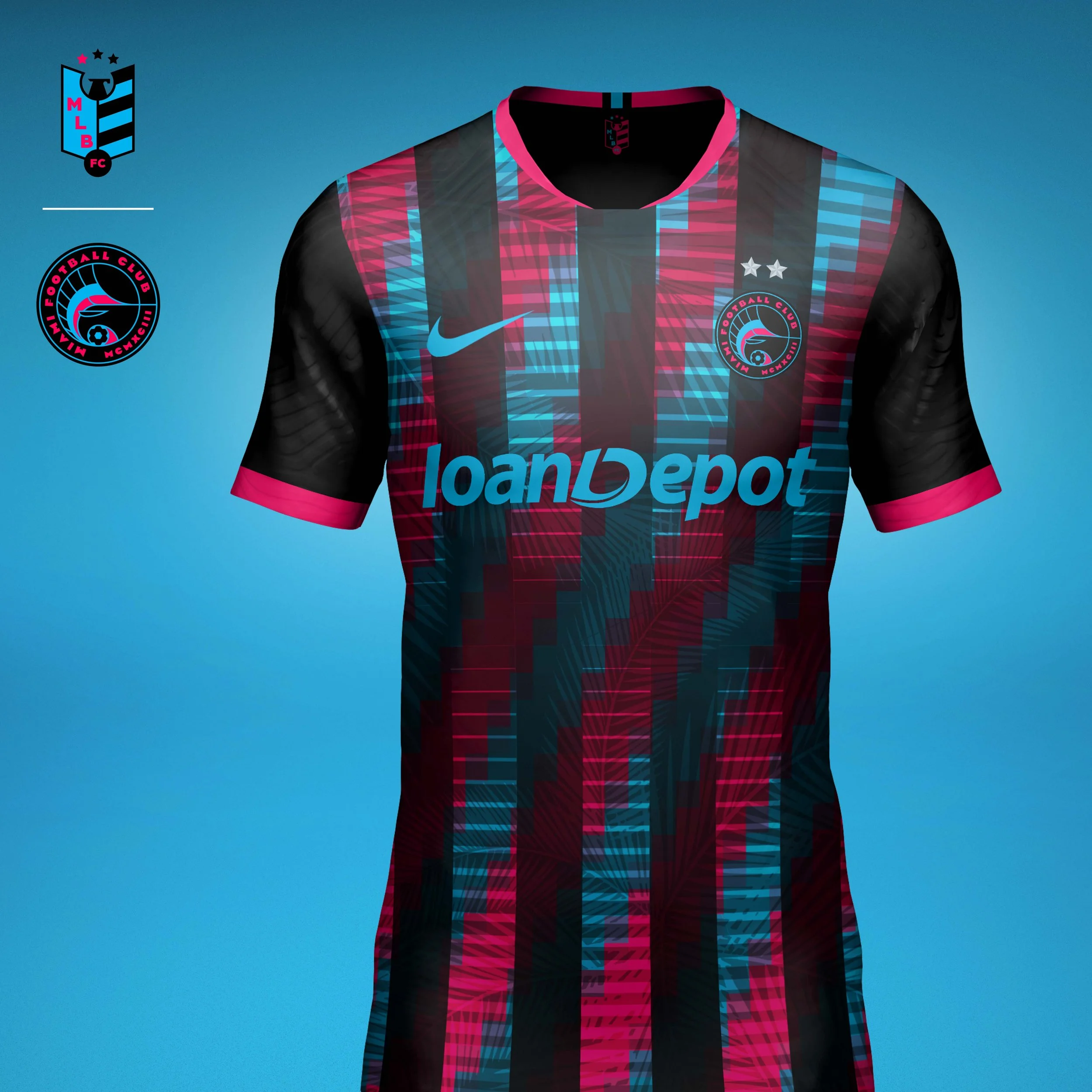
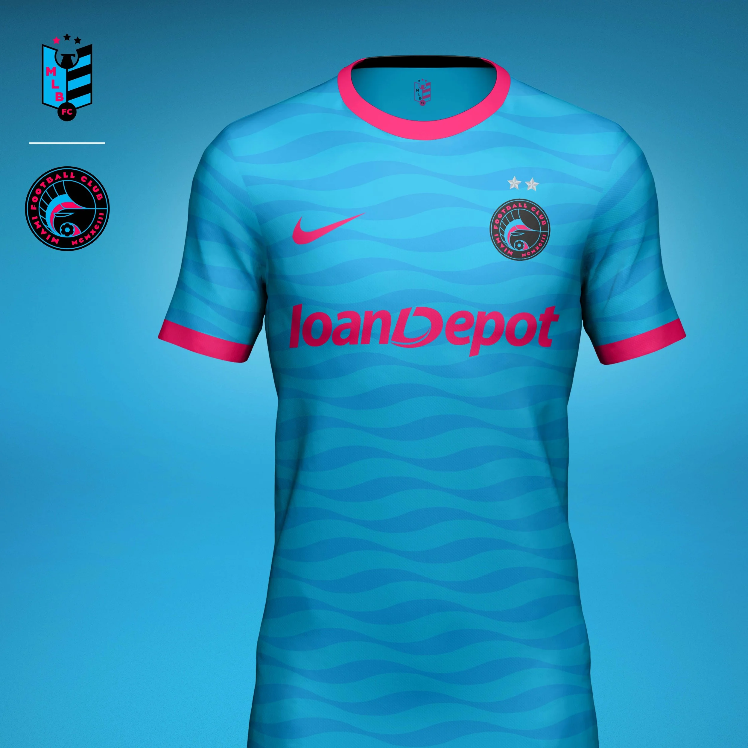
Miami Marlins
For the Marlins logo I wanted to bring in the Art Deco vibe that Miami's architecture had. The clean lines and geometric typeface pair with the bright neon pink and blue that give the crest that Miami Vice look that fans love so much. I also expressed the established date in roman numerals to bring in another element from the architecture.
Home kit brings the Miami night alive with alternating stripes of the team's neon colors that have been pixelated to give it an LED sign look. A palm print subtly peaks its way through the lights.
Away kit is awash in the neon blue with a wave pattern that evokes the crisp waters of the Atlantic that attract marlins and other large fish.
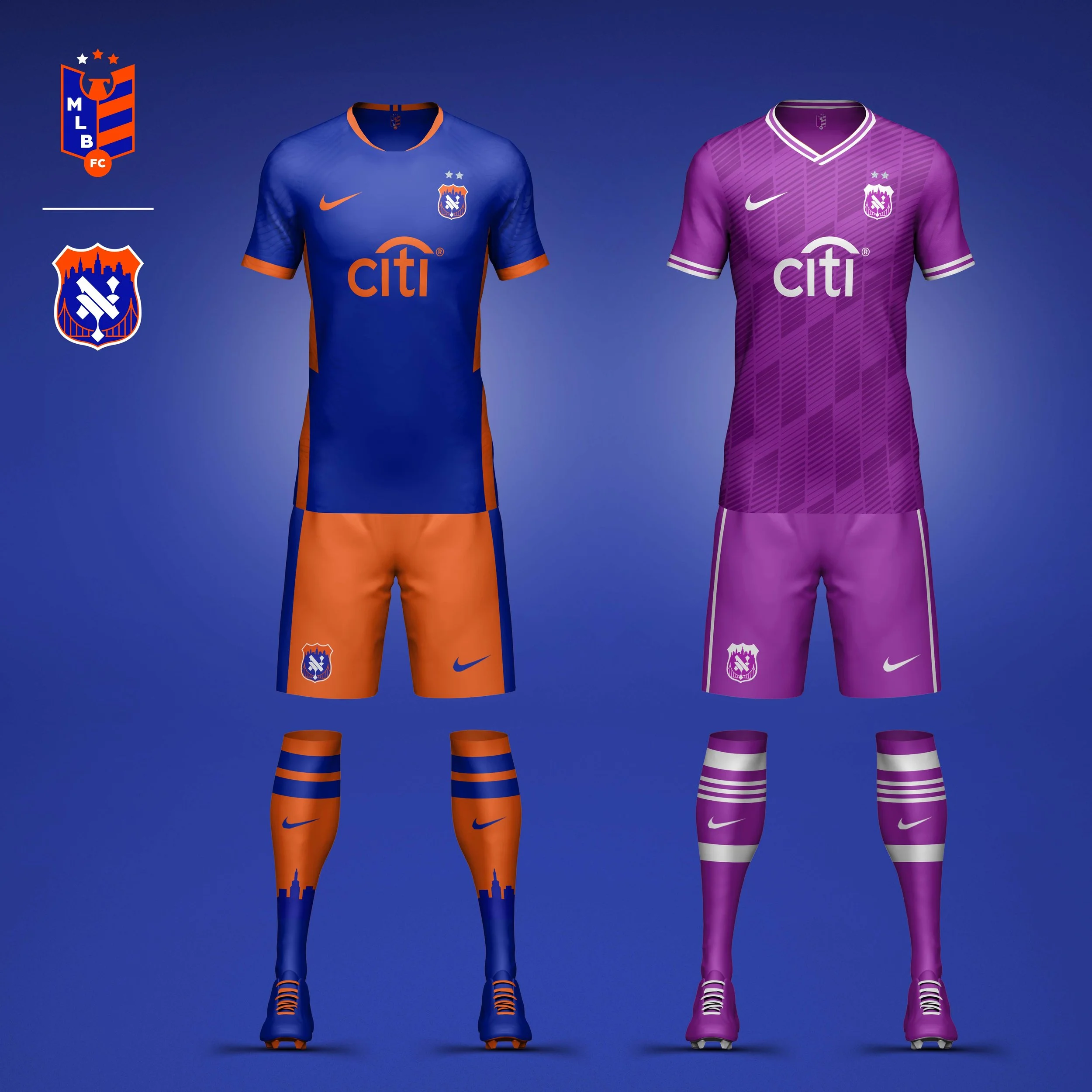
New York Mets
Crest
The Mets crest combines an updated gothic NY monogram with visual references to the city that gave the club its identity. Framed by the New York skyline and suspension bridges, the crest celebrates the boroughs, architecture, and blue-collar spirit that have defined the franchise since its founding.
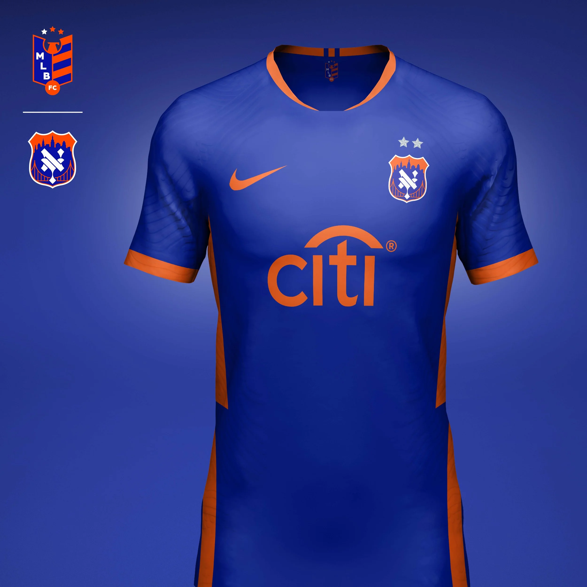
Home Kit
The home kit leans into the bold blue and orange color palette that emerged from the departure of New York’s former National League clubs. Orange accents and skyline-inspired sock details reinforce the club’s connection to the city while creating a confident, unmistakable Mets look.
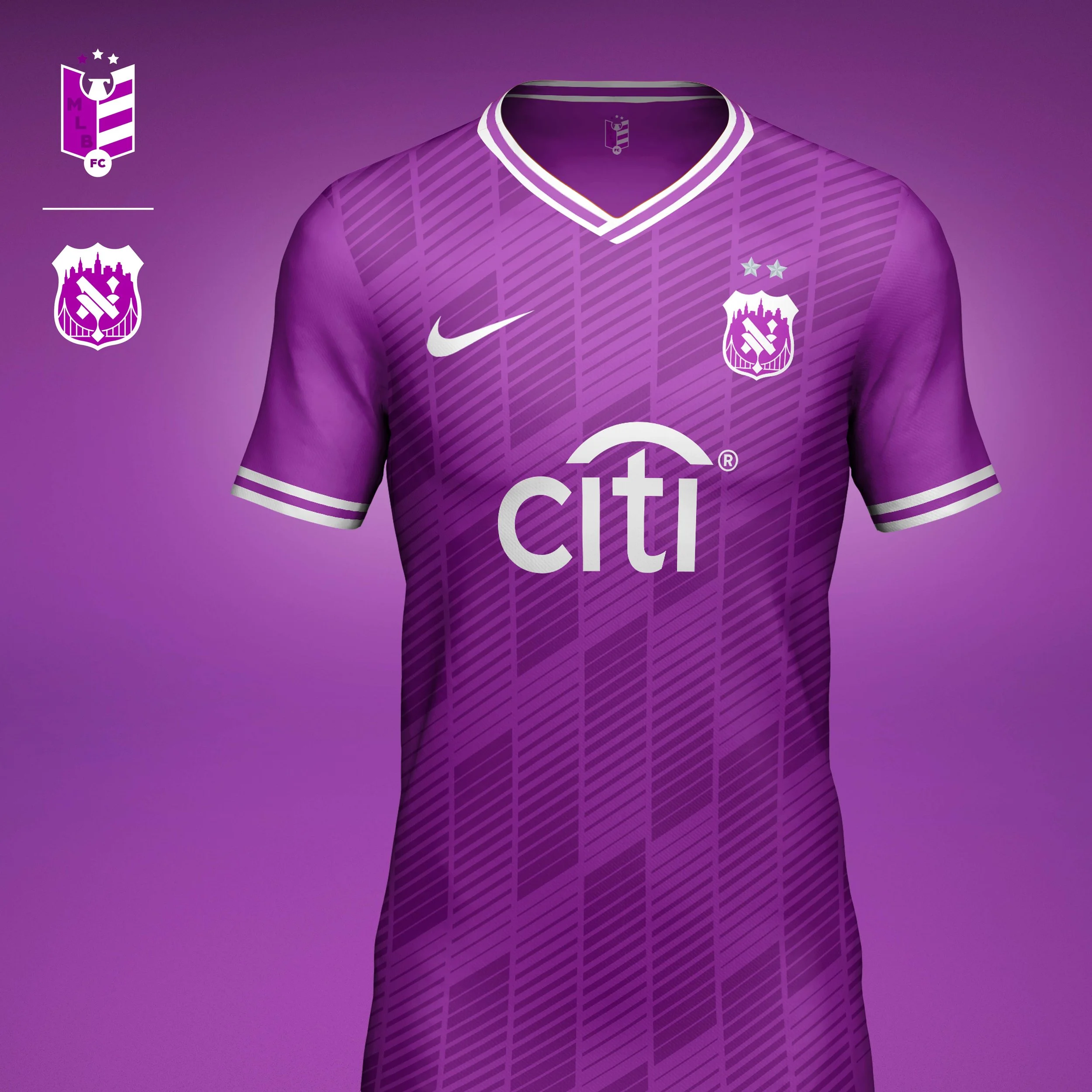
Away Kit
Inspired by the iconic 7 train that carries supporters from across the city to Queens, the away kit adopts the line’s signature purple colorway. Dynamic striping references both the club’s baseball pinstripes and the motion of trains moving through the city, transforming an everyday piece of New York infrastructure into a symbol of fan culture and connection.
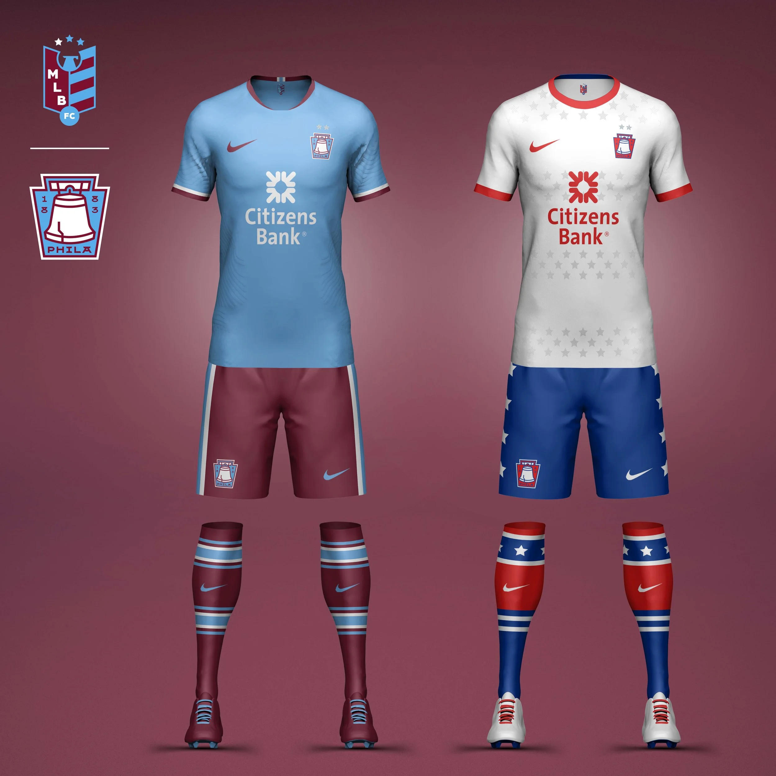
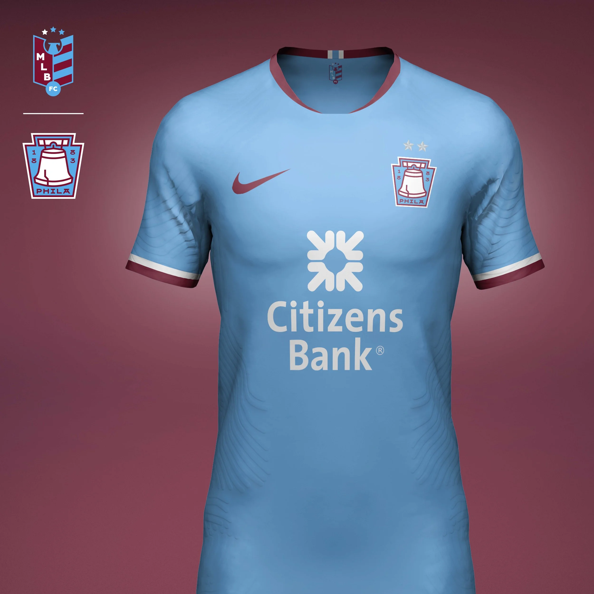
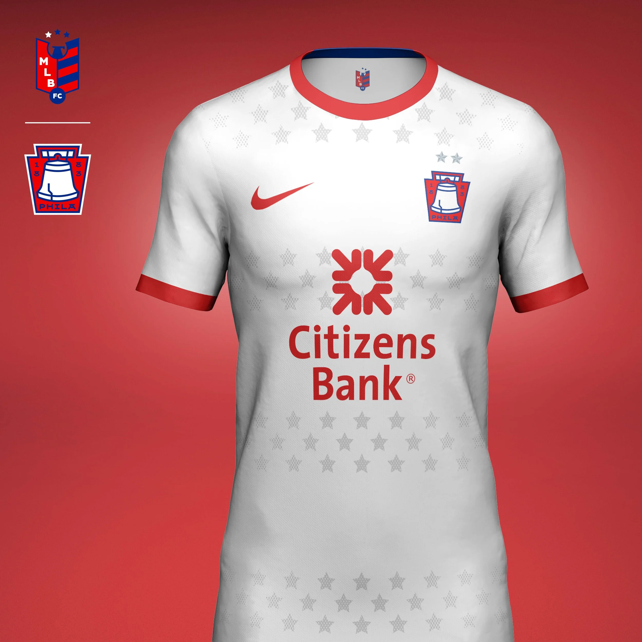
Philadelphia Phillies
Crest
Philadelphia’s identity is inseparable from American history, making the Liberty Bell a natural focal point for the crest. The bell is housed within a keystone silhouette, a reference to Pennsylvania’s nickname as the Keystone State. Returning to the Phillies’ iconic burgundy and powder blue color palette helps establish a distinct visual identity while celebrating one of the most beloved eras in franchise history.
Home Kit
The home kit fully embraces the revived color palette, pairing powder blue with burgundy in a modern football interpretation of the Phillies’ late-1970s uniforms. A simple two-tone execution allows the color story to take center stage while maintaining the clean, timeless feel associated with the club’s heritage.
Away Kit
The away kit explores Philadelphia’s place at the heart of American sports and culture. Drawing inspiration from the city’s patriotic iconography and the visual language of classic baseball uniforms the design incorporates stars and bold red, white, and blue accents throughout the kit. The result is a contemporary expression of Philadelphia’s role as one of America’s great sports cities.
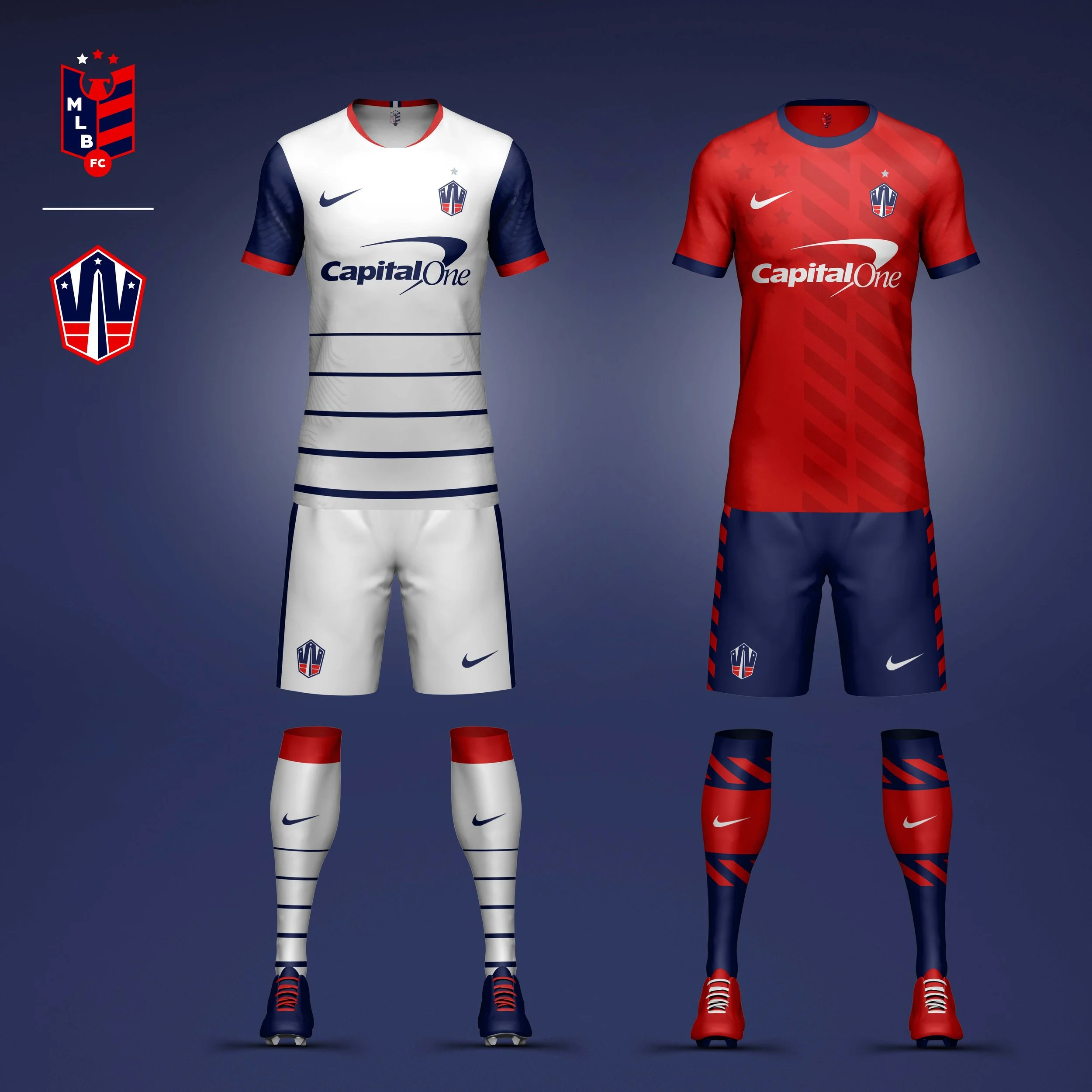
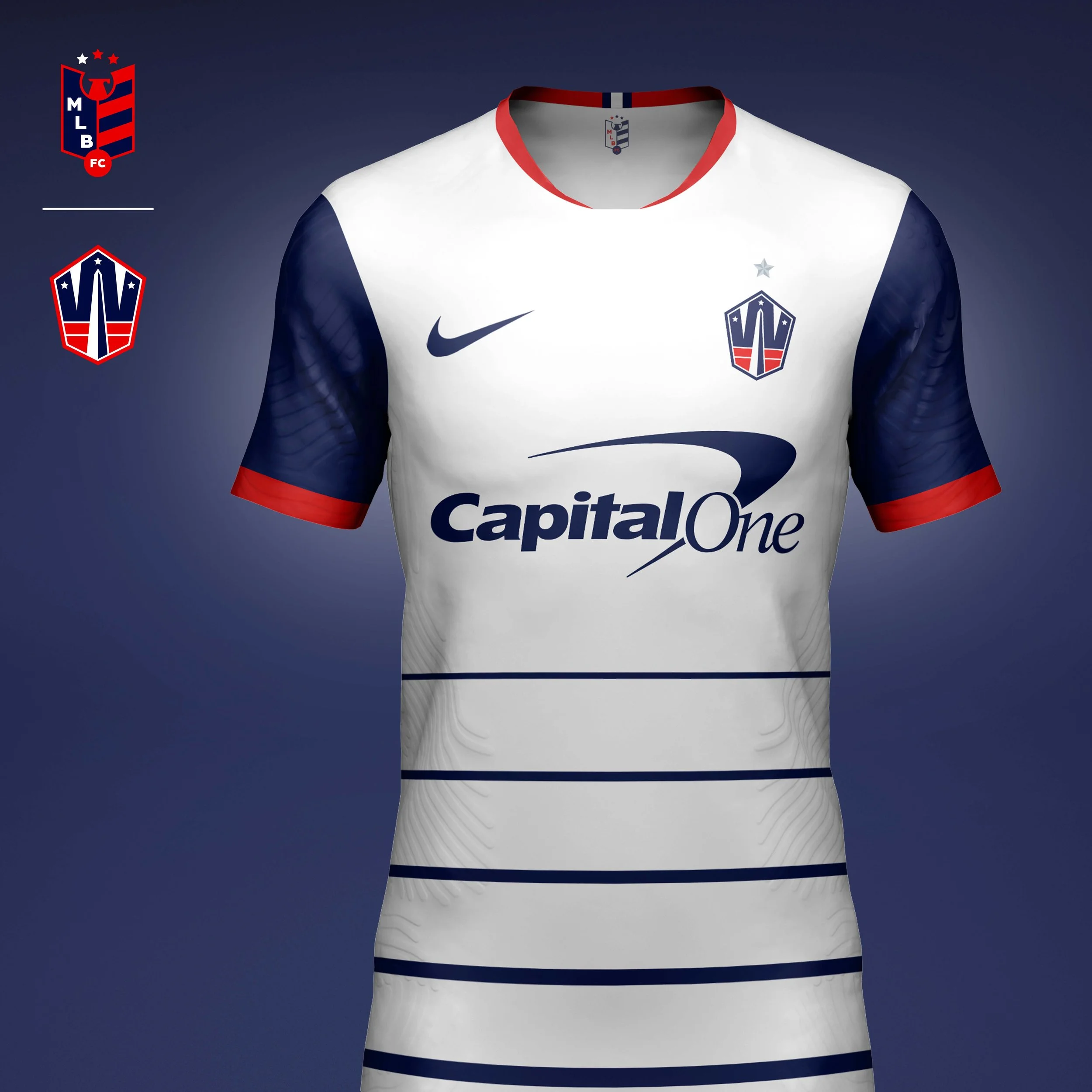
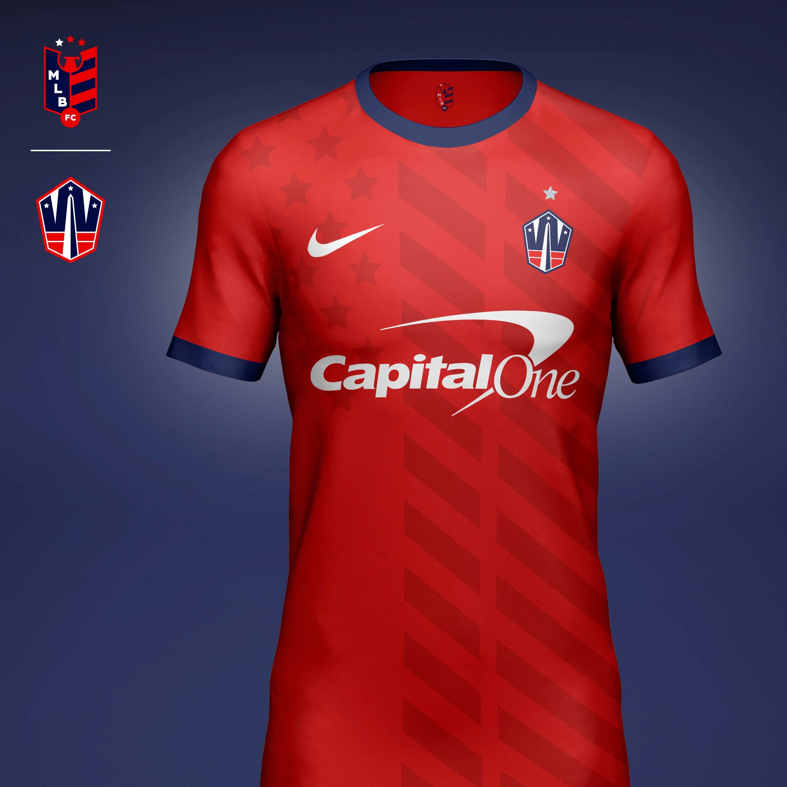
Washington Nationals
Crest
Few symbols are more recognizable than the Washington Monument. The Nationals crest places the monument within the negative space of a custom W, creating a mark that is unmistakably tied to the nation’s capital. References to the District flag further connect the identity to Washington’s civic heritage and local culture.
Home Kit
The home kit draws inspiration from the architecture and symbolism of the capital itself. Horizontal striping echos the ascending steps of the U.S. Capitol Building, while the navy, white, and red palette pays homage to the legacy of Washington baseball and the city’s long sporting tradition.
Away Kit
The away kit reinterprets the Stars and Stripes through a modern football lens. Tonal graphics, layered striping, and repeating patterns create a contemporary expression of American iconography while maintaining a sophisticated and performance-focused aesthetic.
AL WEST
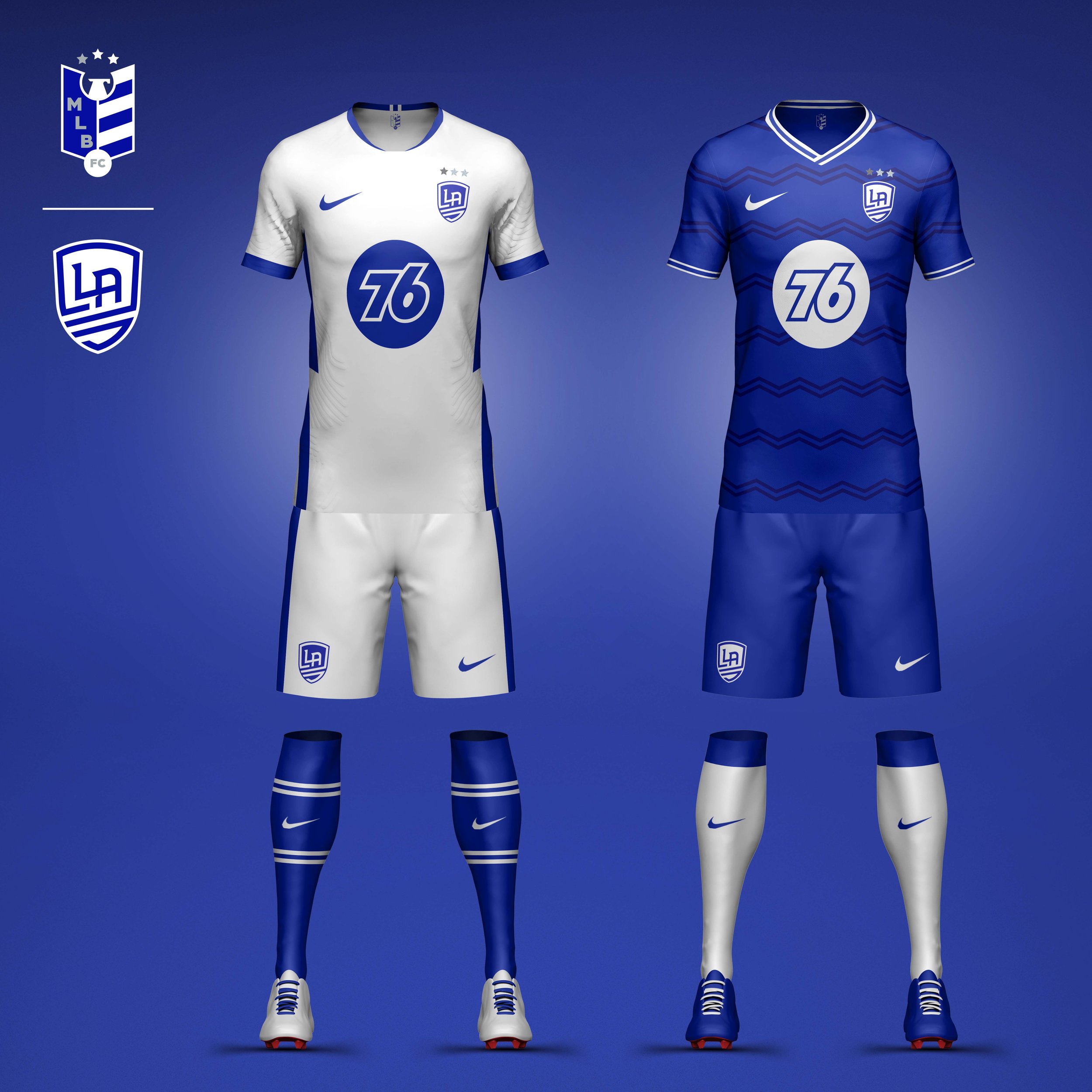
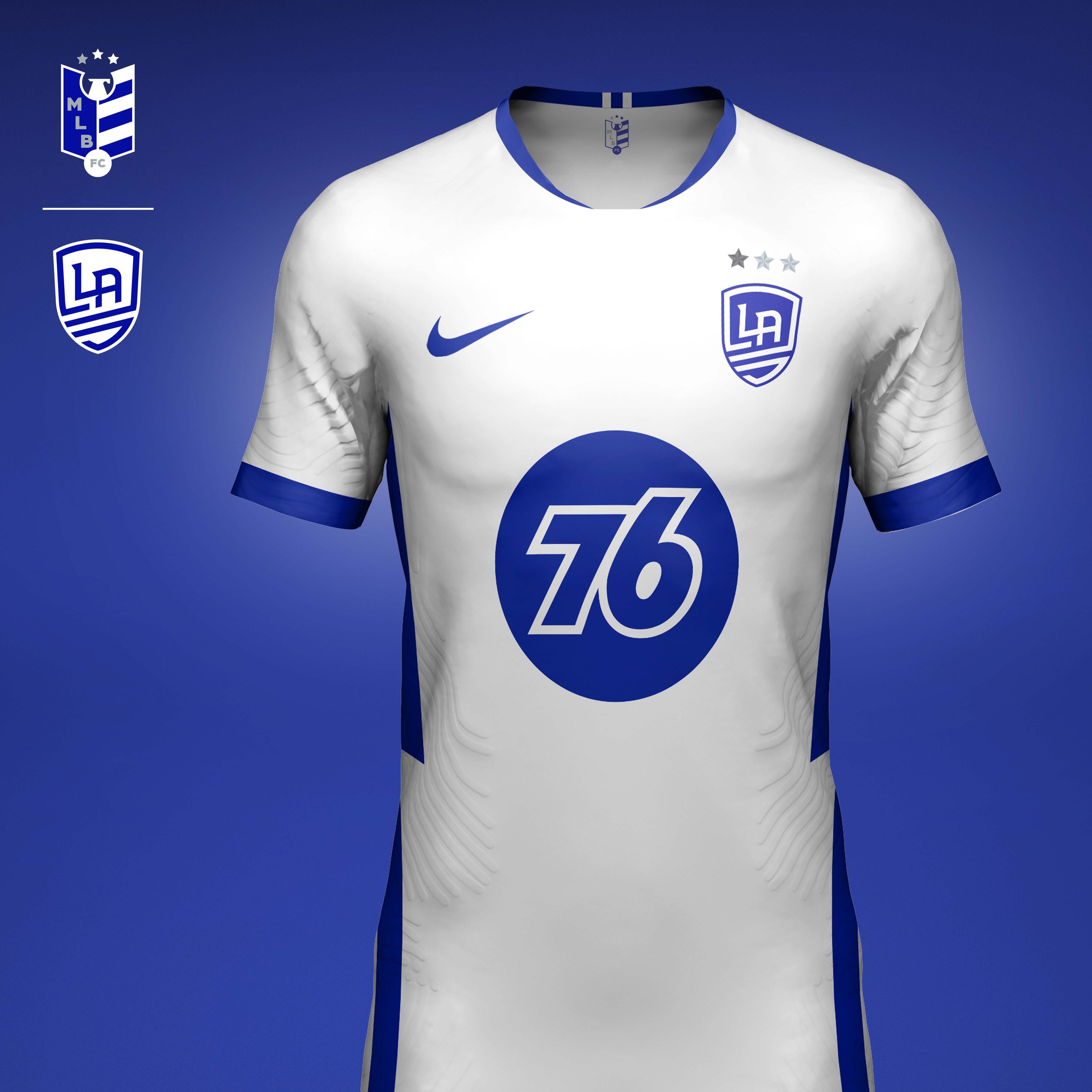
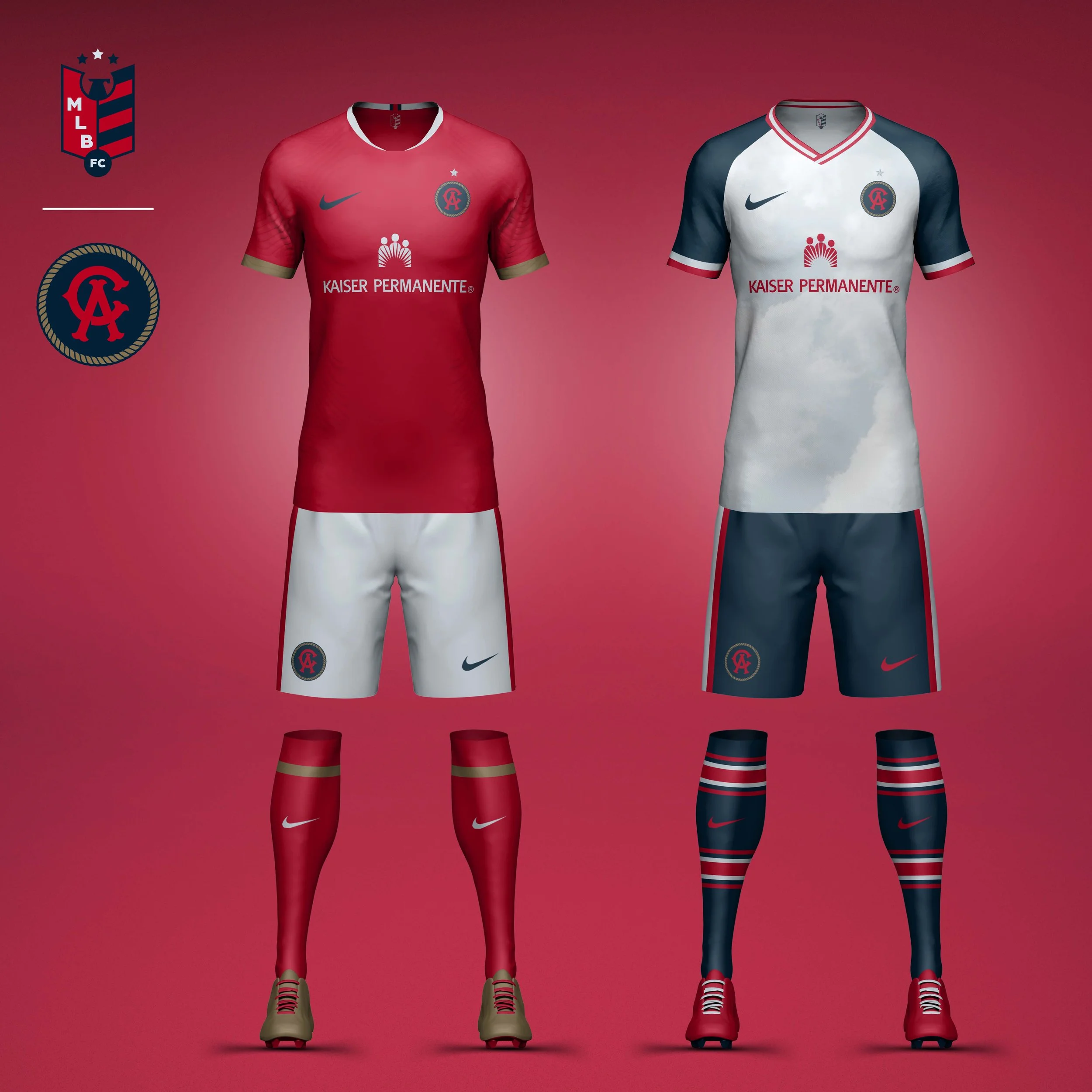
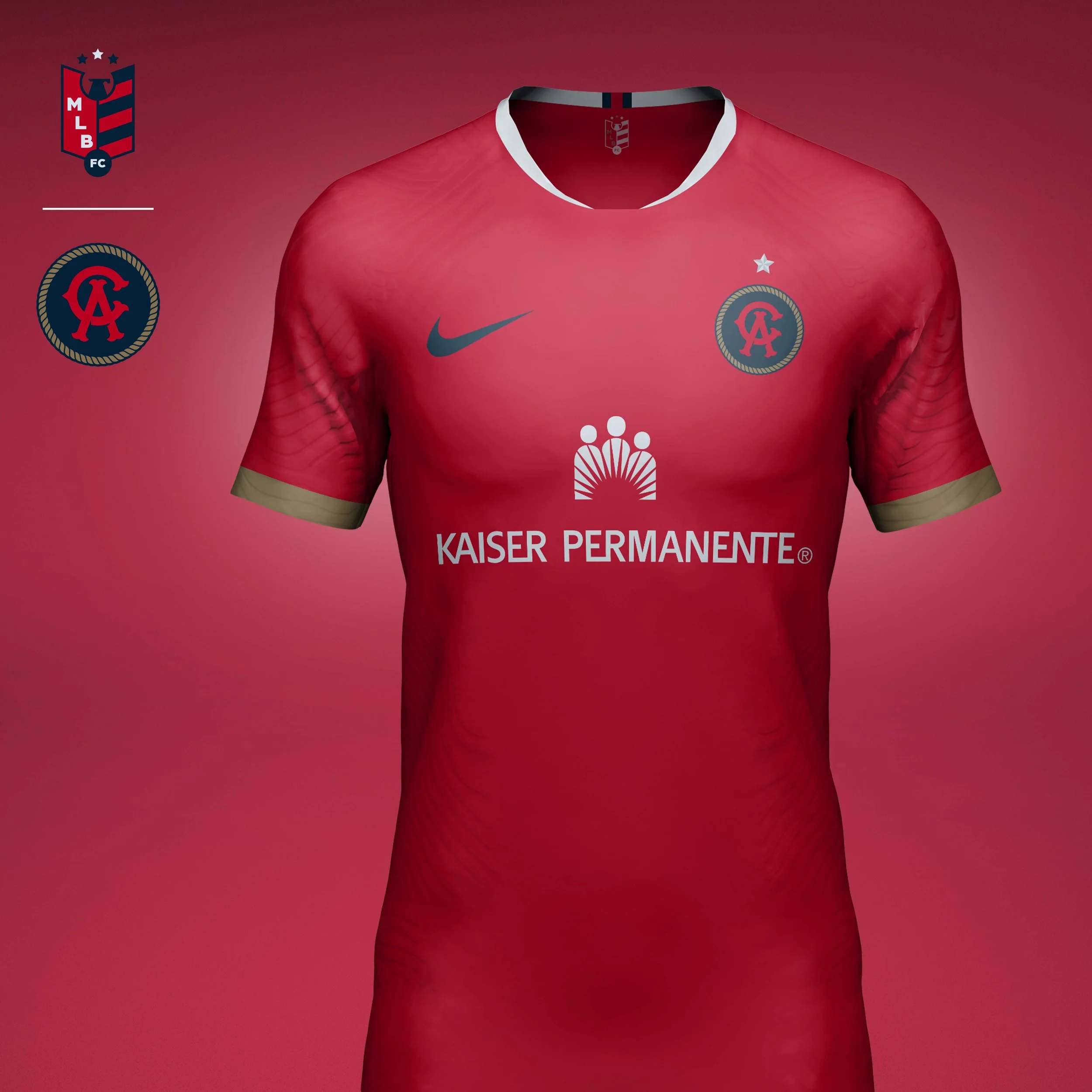
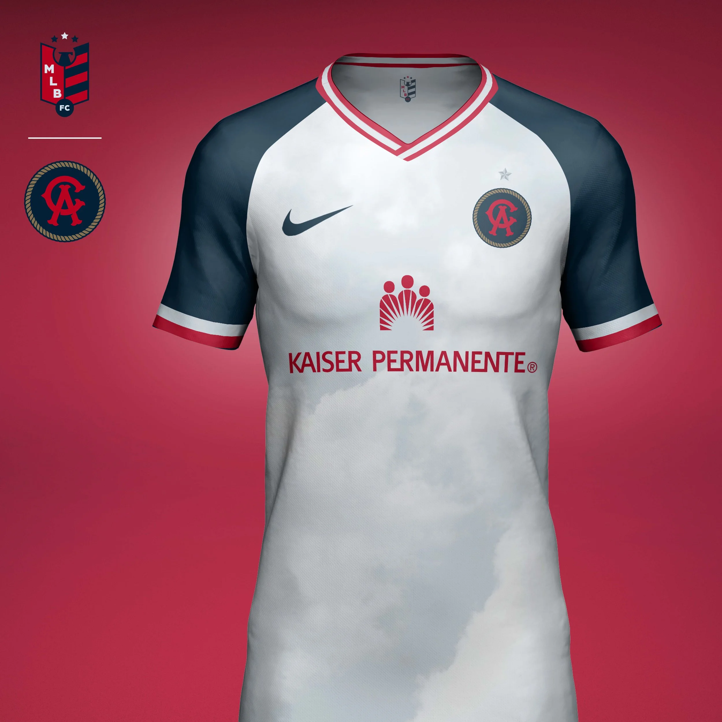
California Angels
I chose to take the Angels back to the name California Angels for two reasons: 1) I like that the monogram has two reads, both as the letter to start each name and the abbreviation of the state. 2) The Angels aren't located in the city of LA or even LA County, and could just as easily be associated with San Diego. The crest is encircled with a golden rope both a nod to the nickname "Halos" and the teams original owner, Western star Gene Autry.
Home kit is clean and modern in the team colors of Angelic Red and Heavenly White with subtle hits of Halo Gold on the sleeves and socks.
Away kit takes inspiration from the Navy, Red, and White jerseys from the 70s and 80s. The body of the jersey is highlighted by a heavenly cloud print.
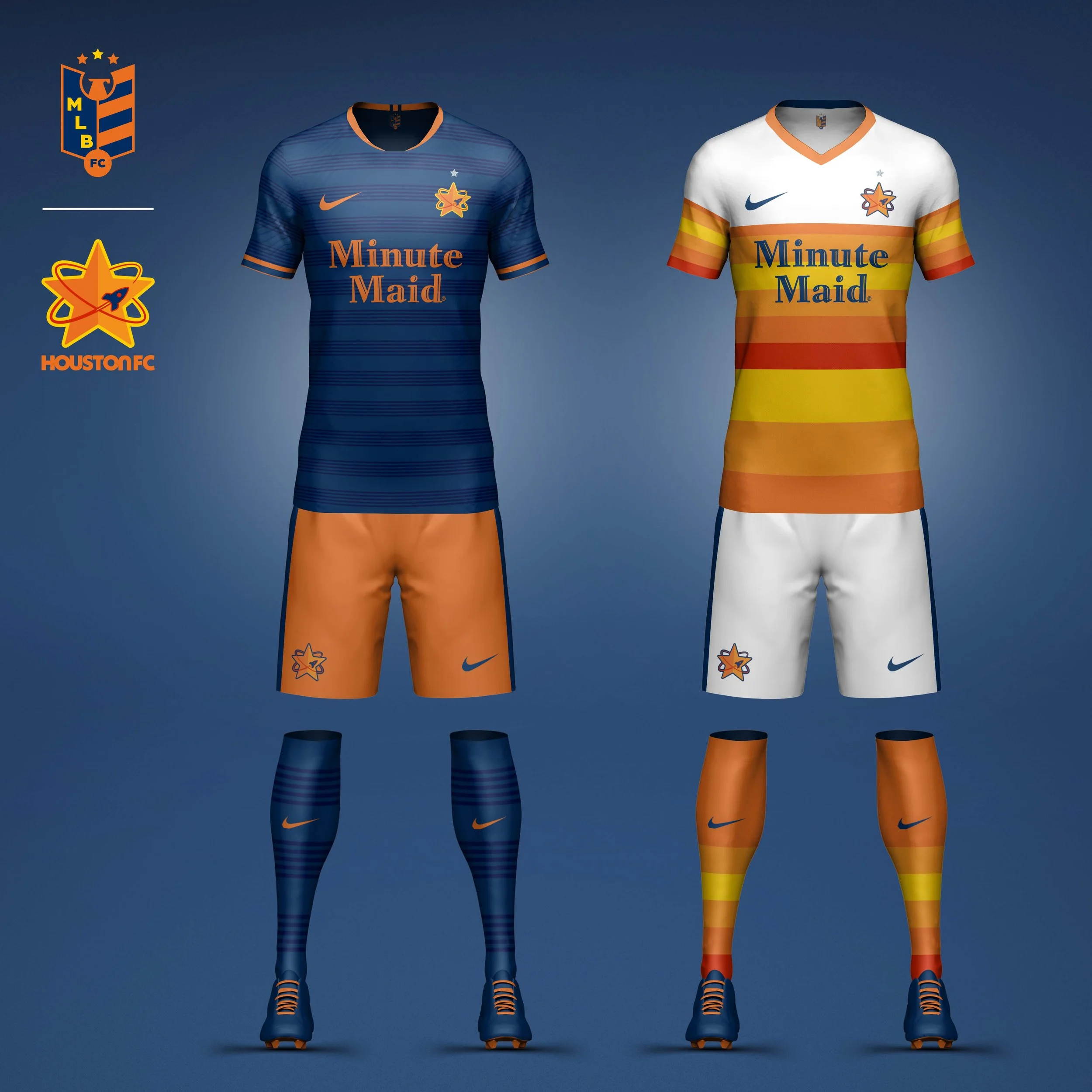
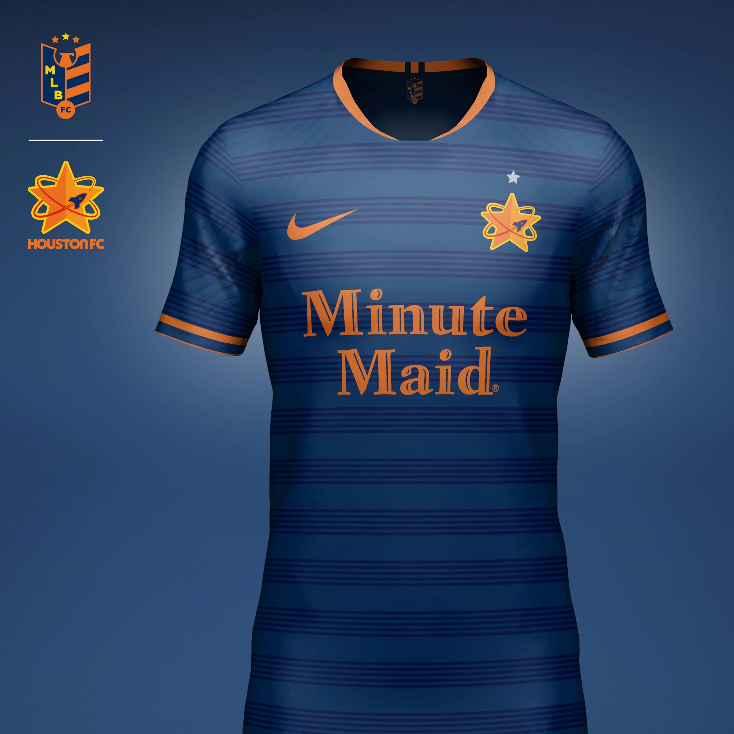
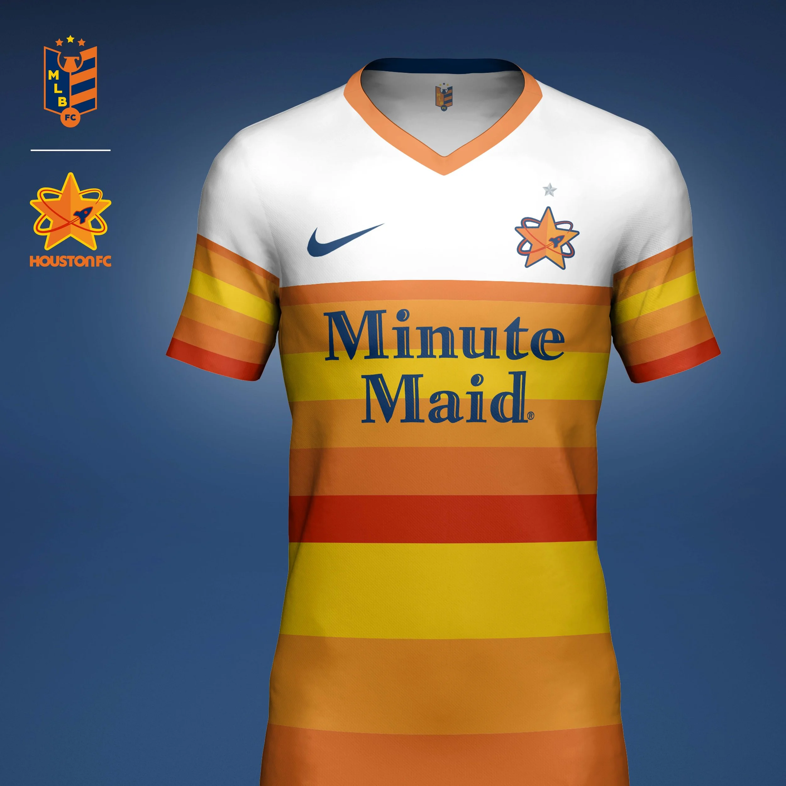
Houston Astros
I wanted to blend all generations of Astros logos into one by having a rocket ship orbiting the star that was used as the original and current Astros logo.
Home kit has a western flair with a subtle thin hoops. The lettering in the logo is removed and focuses only on the star.
Away kit uses the famous “Tequila Sunrise” jersey print from the Nolan Ryan era.
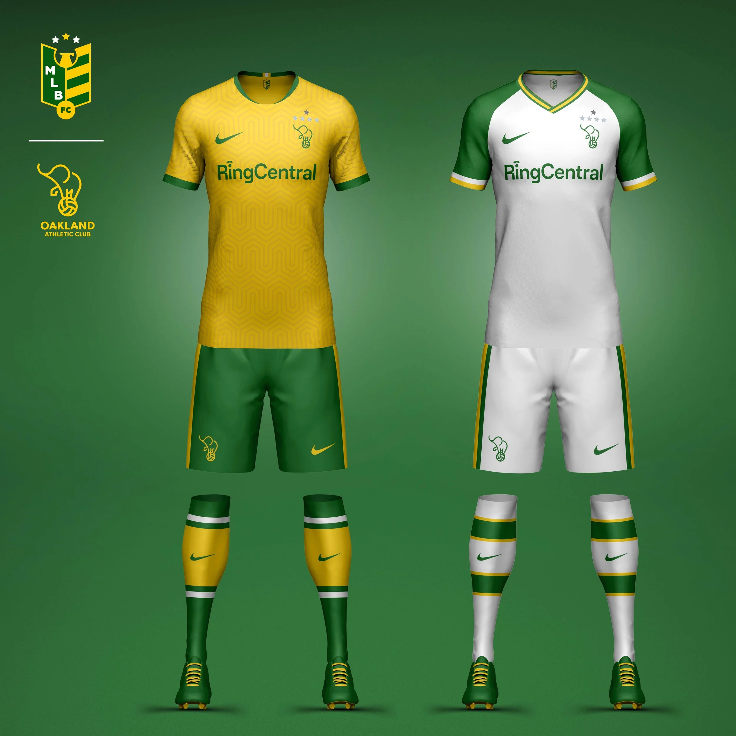
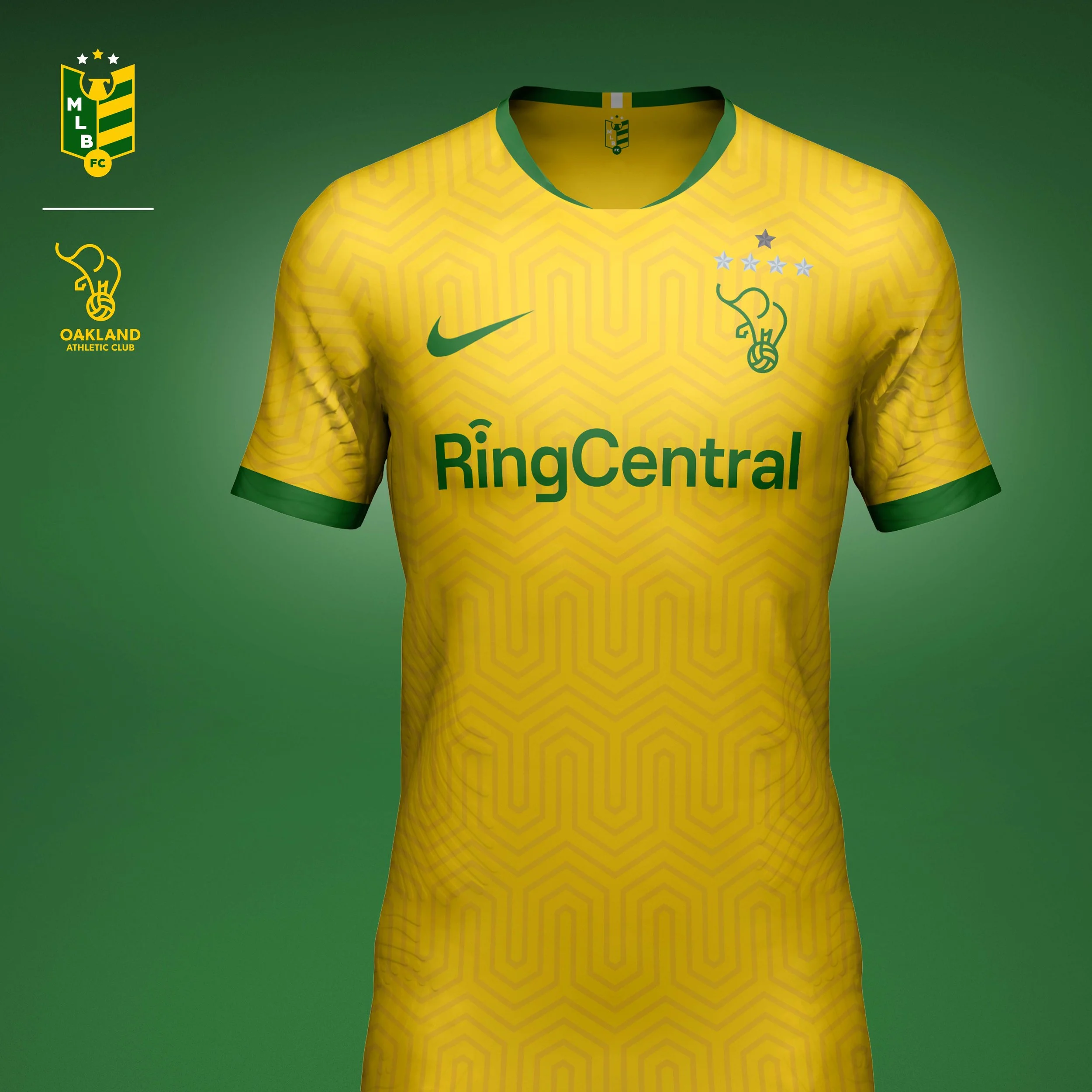
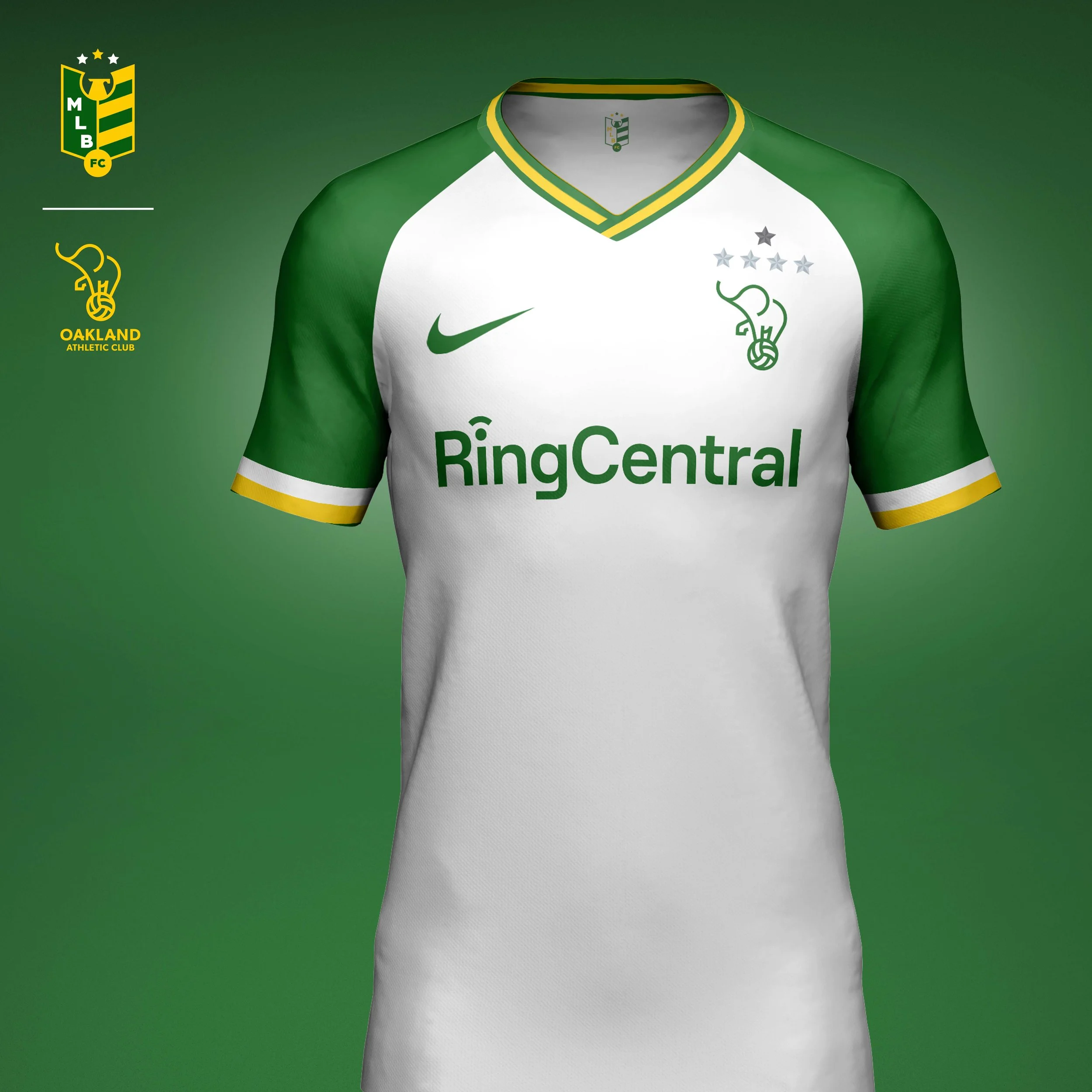
Oakland Athletics
Crest
The crest centers on the Athletics’ historic white elephant mascot, one of the most unique symbols in professional sports. Inspired by both the club’s secondary marks and classic football crests, the elephant is simplified into a clean geometric silhouette while retaining its instantly recognizable character. The mark celebrates a piece of Athletics history that many fans know, but few modern sports identities fully embrace.
Home Kit
The home kit pays tribute to the vibrant yellow uniforms that helped define the Athletics during the 1970s. A subtle geometric pattern modernizes the look while preserving the bold green-and-gold palette that has long distinguished the club from the rest of Major League Baseball.
Away Kit
The away kit leans further into the Athletics’ retro identity, drawing inspiration from classic road uniforms and vintage football aesthetics. A cleaner white base creates contrast with the home kit while allowing the crest, color palette, and heritage references to remain the focal point. Together, the two kits celebrate one of baseball’s most distinctive visual identities through a football lens.
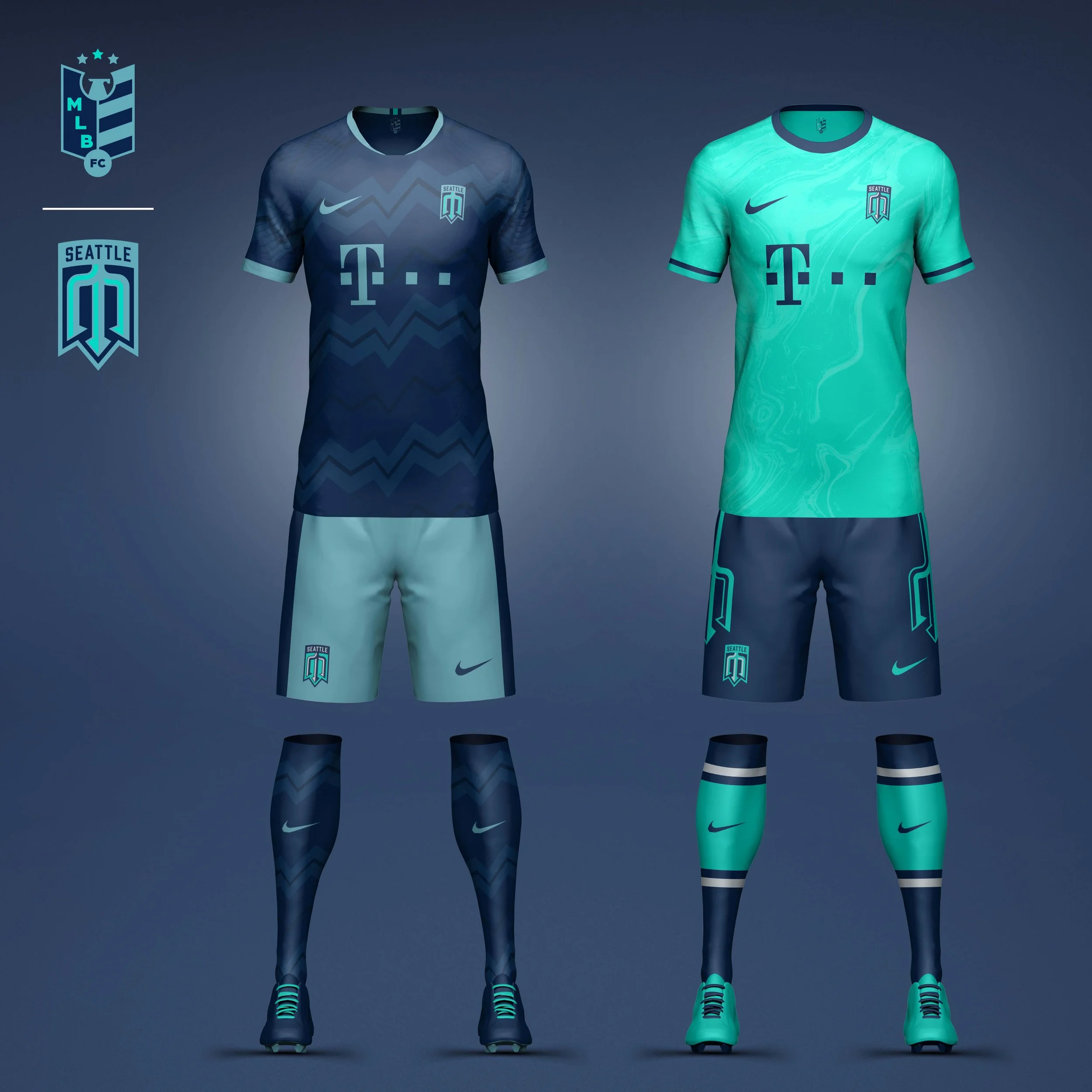
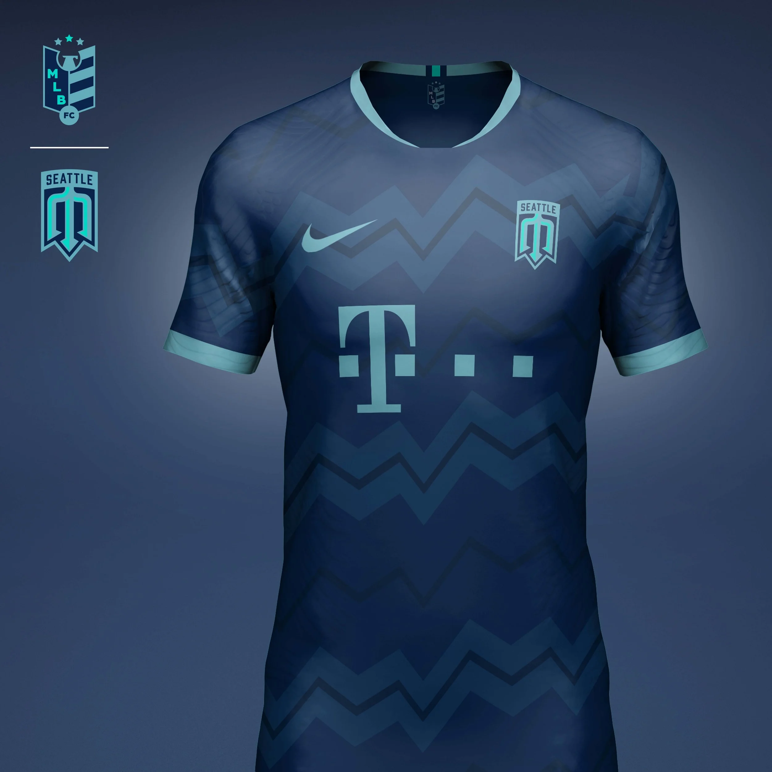
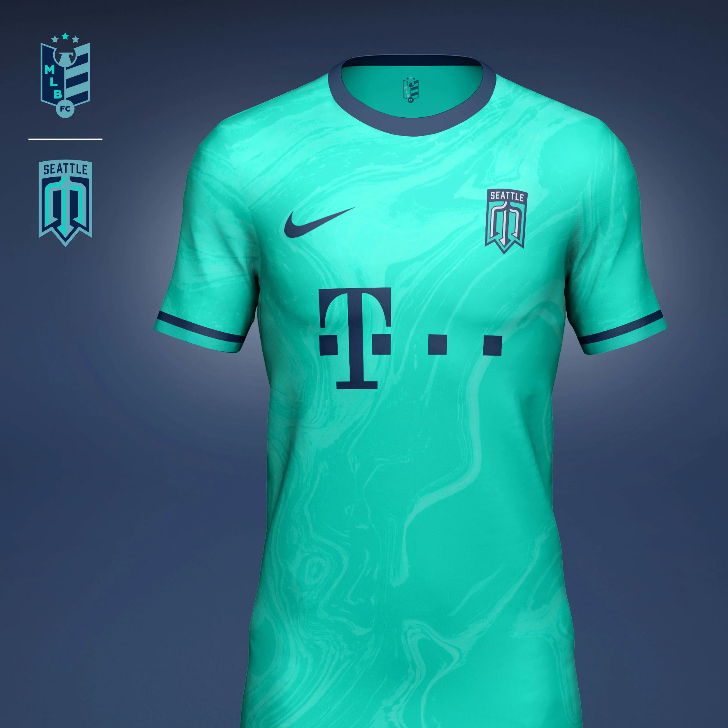
Seattle Mariners
The original Mariners trident logo is by far their most popular and a just a good piece of design. I decided to take that and modernize it with some added depth. I also decided to modernize their colors as well by changing the teal to a steely grey to better represent the color of the Puget Sound and adding a pop of electric teal as an accent.
Home kit takes the angles from the crest and turns then into a stripe pattern inspired by the surrounding Cascade Mtns. to the east.
Away kit takes elevates the pop color to the main kit color. The jersey features a watery print inspired by the Puget Sound to the west.
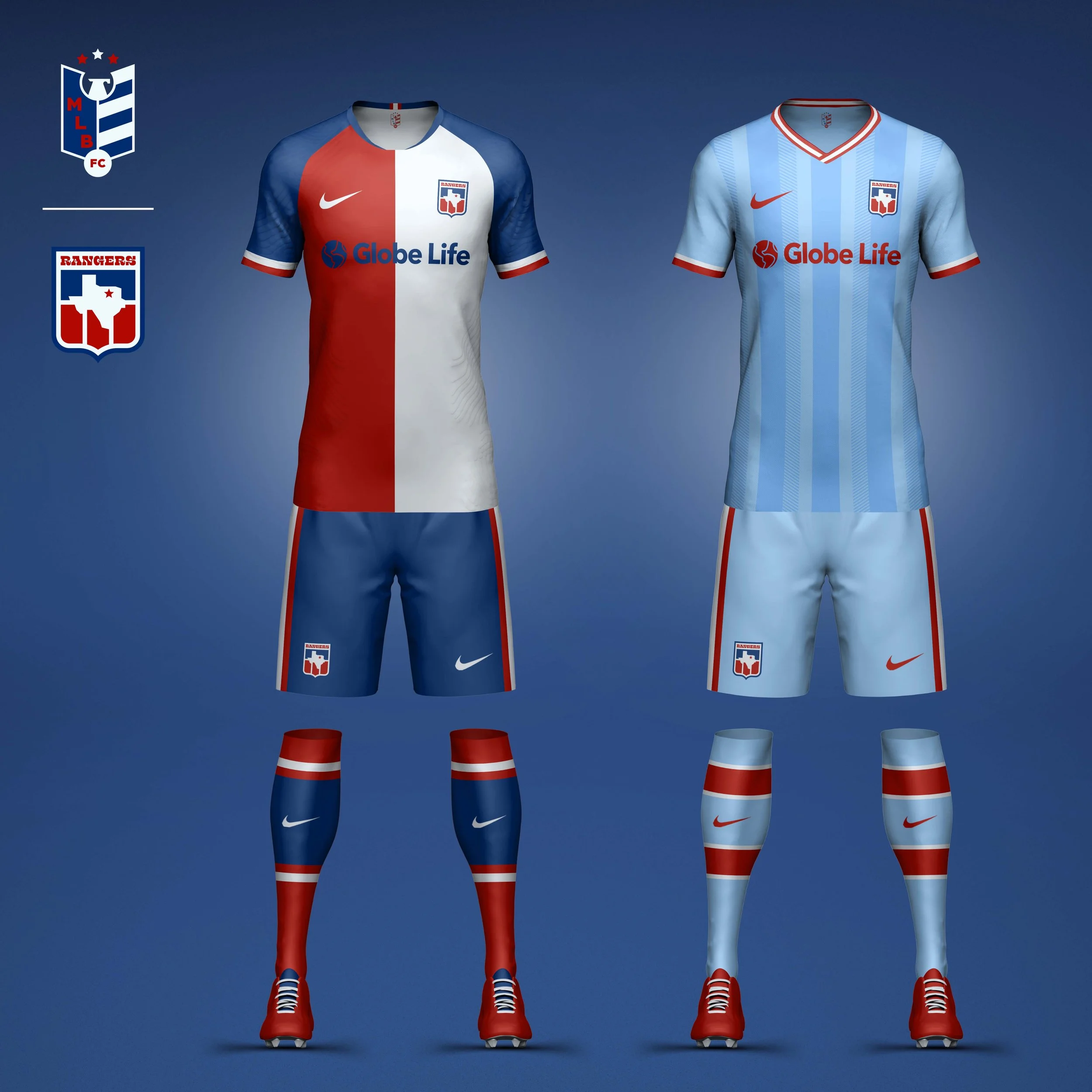
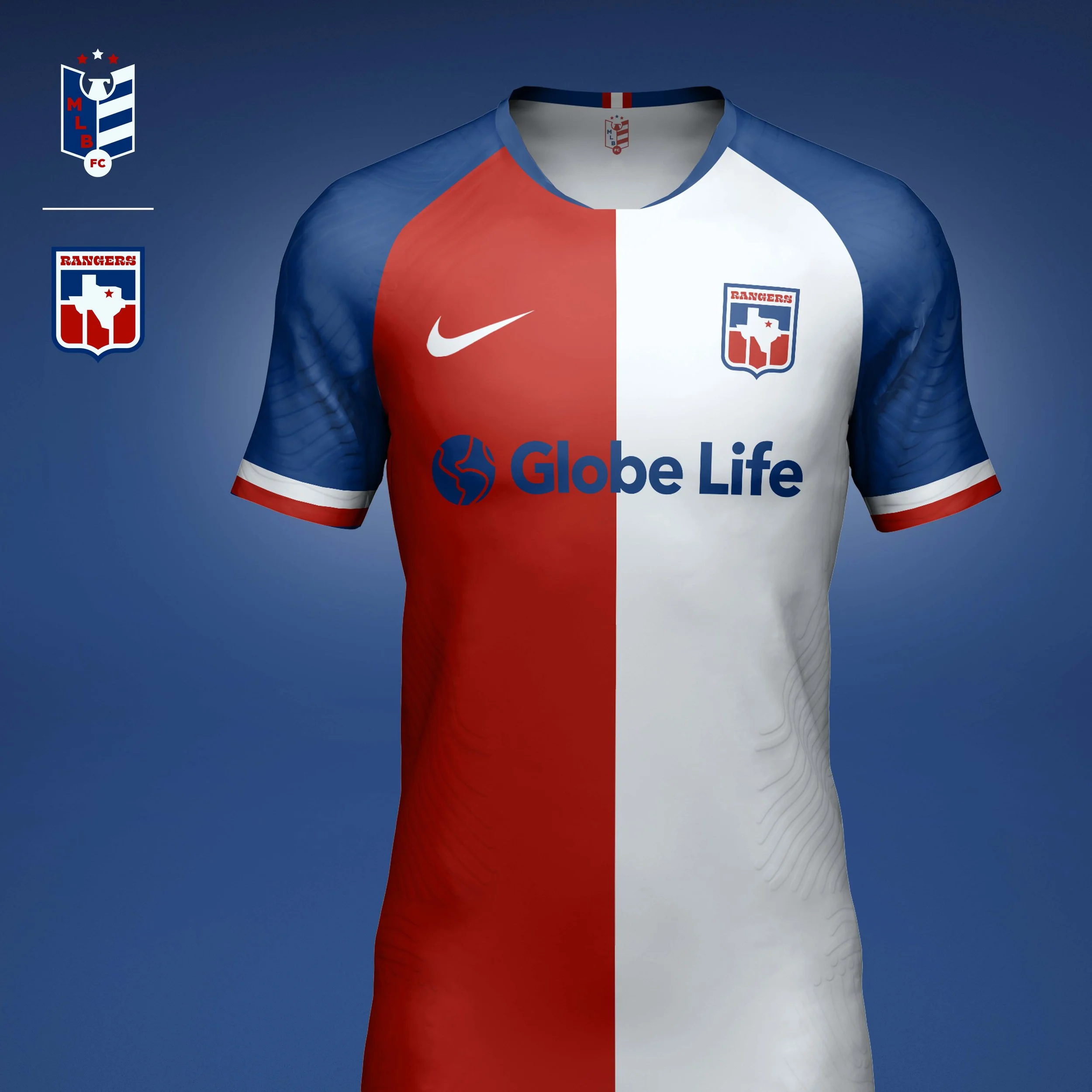
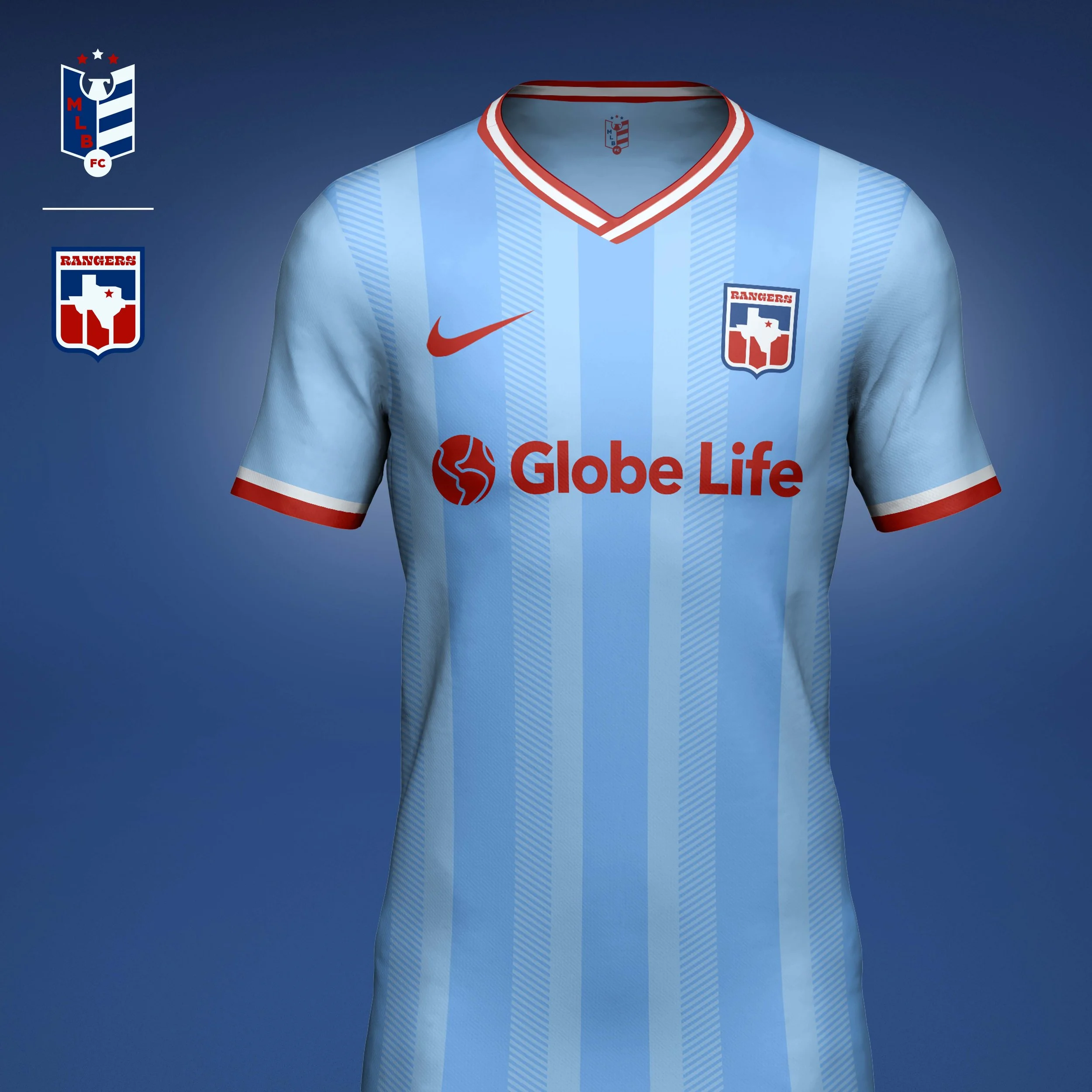
Texas Rangers
Based on an alternate Rangers logo, I cleaned up the geometry and have it a modern western feel with the type.
Home kit is inspired by the Texas flag with the two-tone split jersey and blue trim.
Away kit is inspired by the powder blue generation of jerseys. I added some depth to the jersey with a modern vertical stripe.
AL CENTRAL
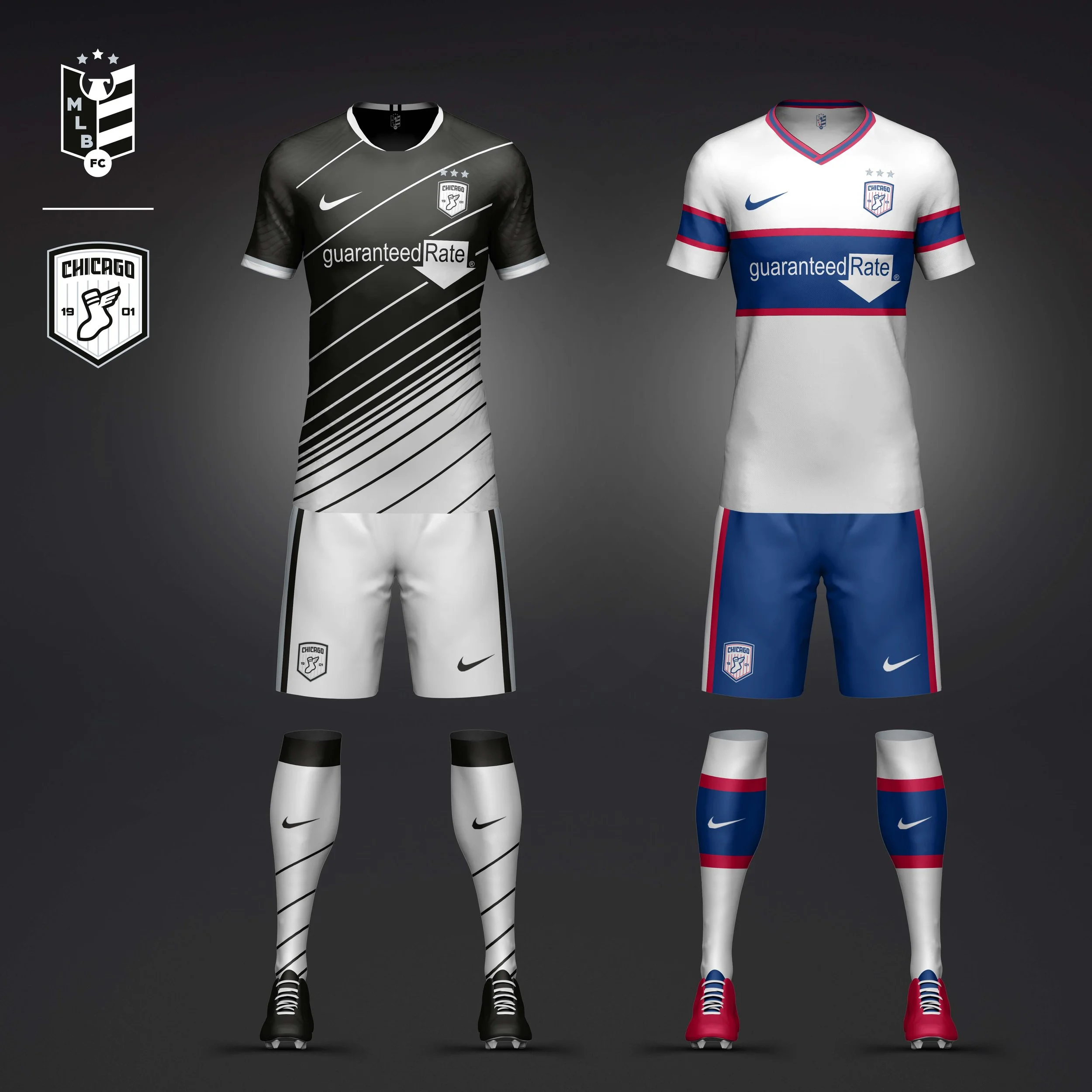
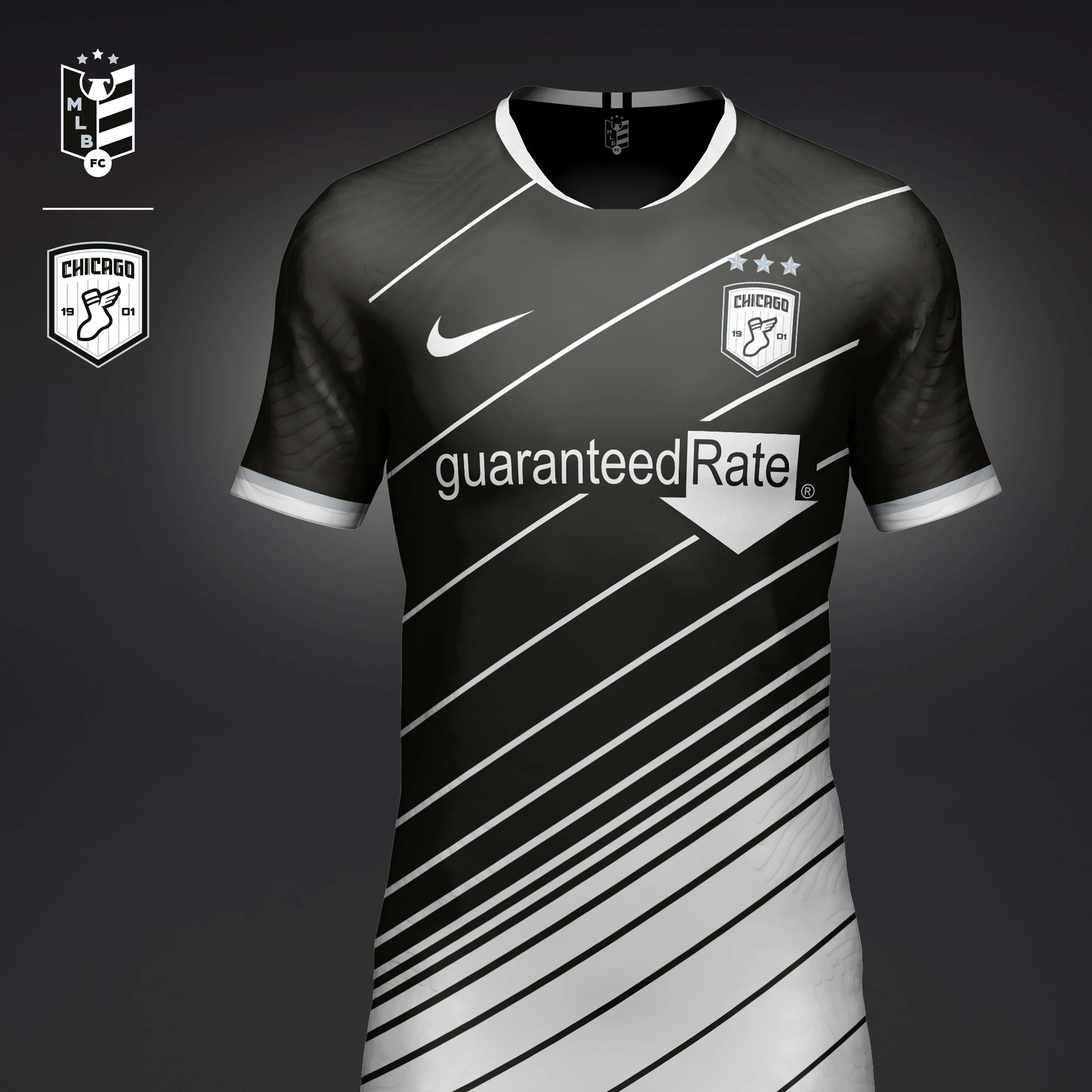
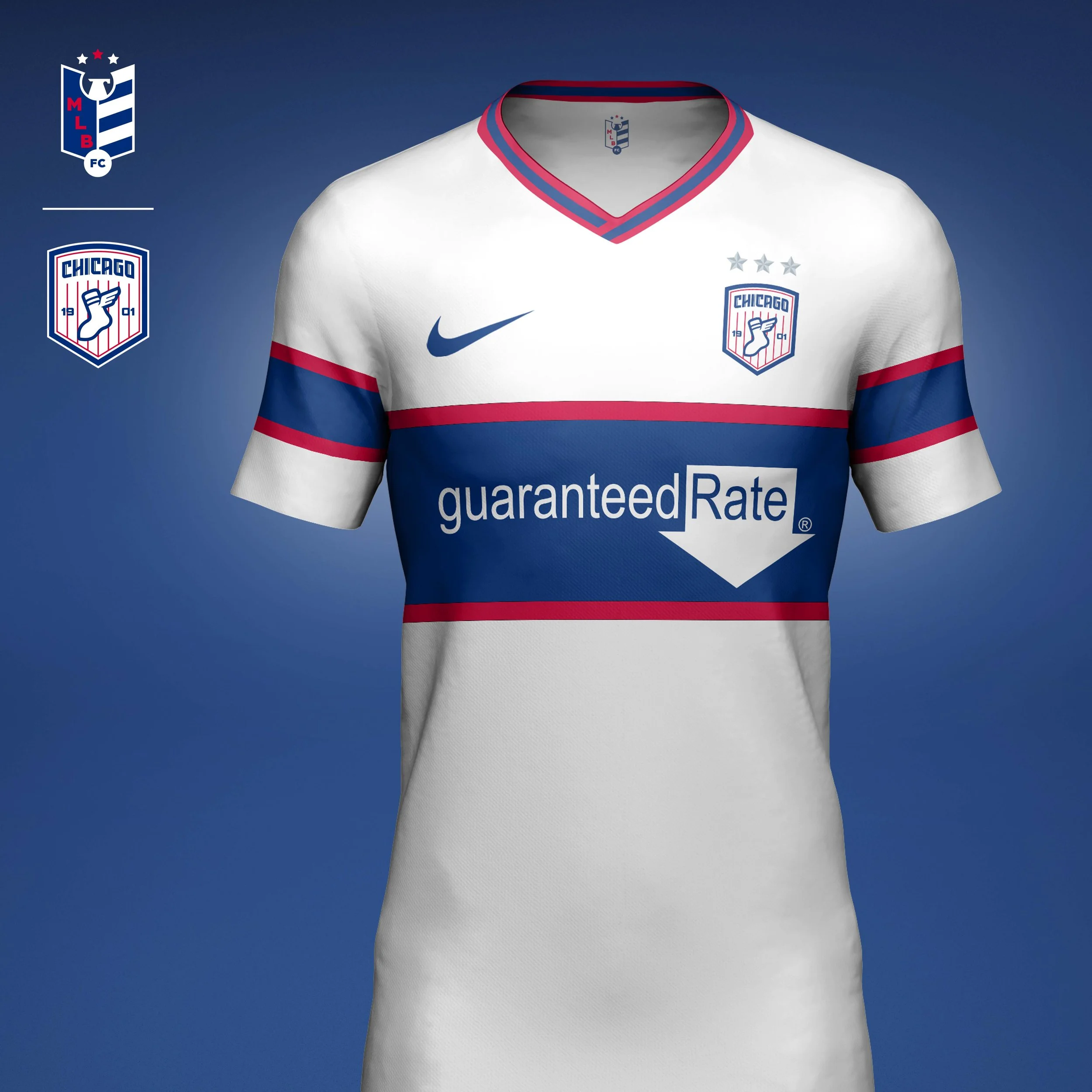
Chicago White Sox
The White Sox of the 1950s were known for their speed and earned the nickname Go-Go-Sox and often featured a winged sock. I wanted to include this bit of history into the crest, along with some subtle pinstripes to reference the teams iconic uniforms.
Home kit is a spin on the White Sox pinstripes and their black alternate jerseys. A linear transition from black to white helps fade the jersey into the shorts.
Away kit is inspired by the White Sox pullovers of the 80s with the bold blue stripe across the chest.
Cleveland Guardians
The crest shape is taken from the Cleveland flag. The four stars at the top represent the four different iterations of the team (Forest Citys, Blues, Spiders, and finally the team that grew into the Guardians). A diagonal line strikes through the C and G showing the dynamic forward momentum the team is focused on with the new name change. And the chiseled letters pay homage to the team's namesake statues "The Guardians of Traffic."
Home kit takes inspiration from the geometric patterns used on the Guardians of Traffic statues. I tweaked the teams colors, taking the red to more of a Nike Infrared and lightening the navy. I felt that with a new name came the opportunity to modernize the team's overall look.
Away kit pays homage to Cleveland's nickname and the first team name used in Cleveland, Forest Citys. The dark forest green is paired with neon green hoops that fade at the edges giving the kit a look of emerging from a dark forest and into the modern era.
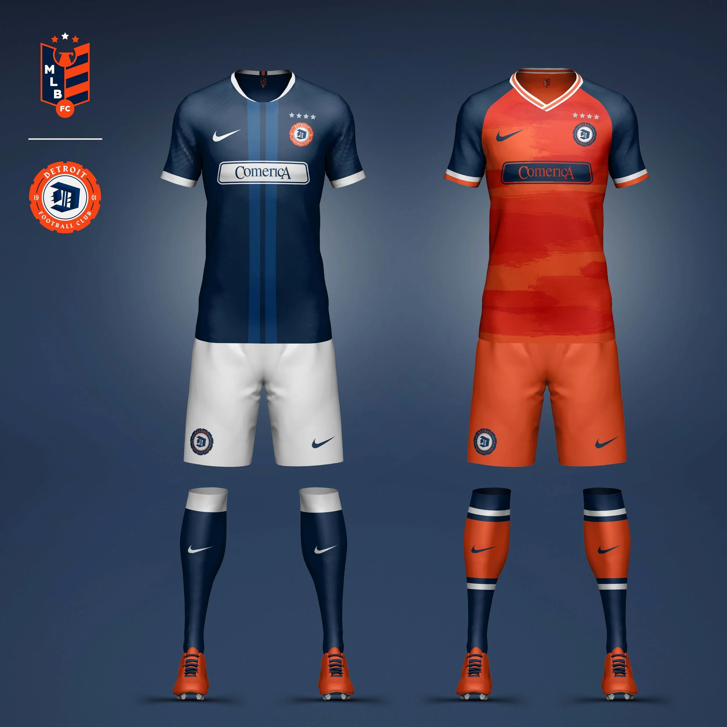
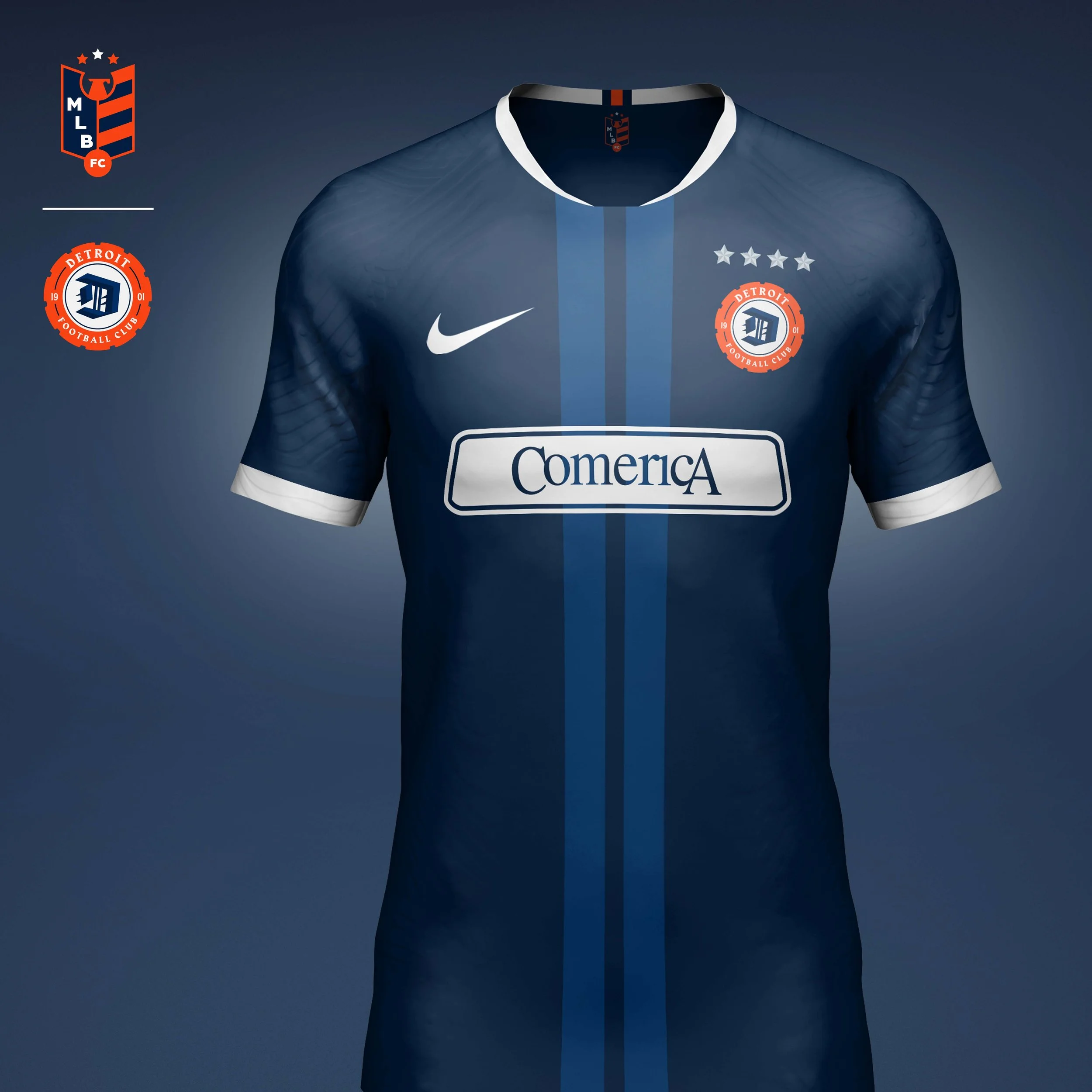
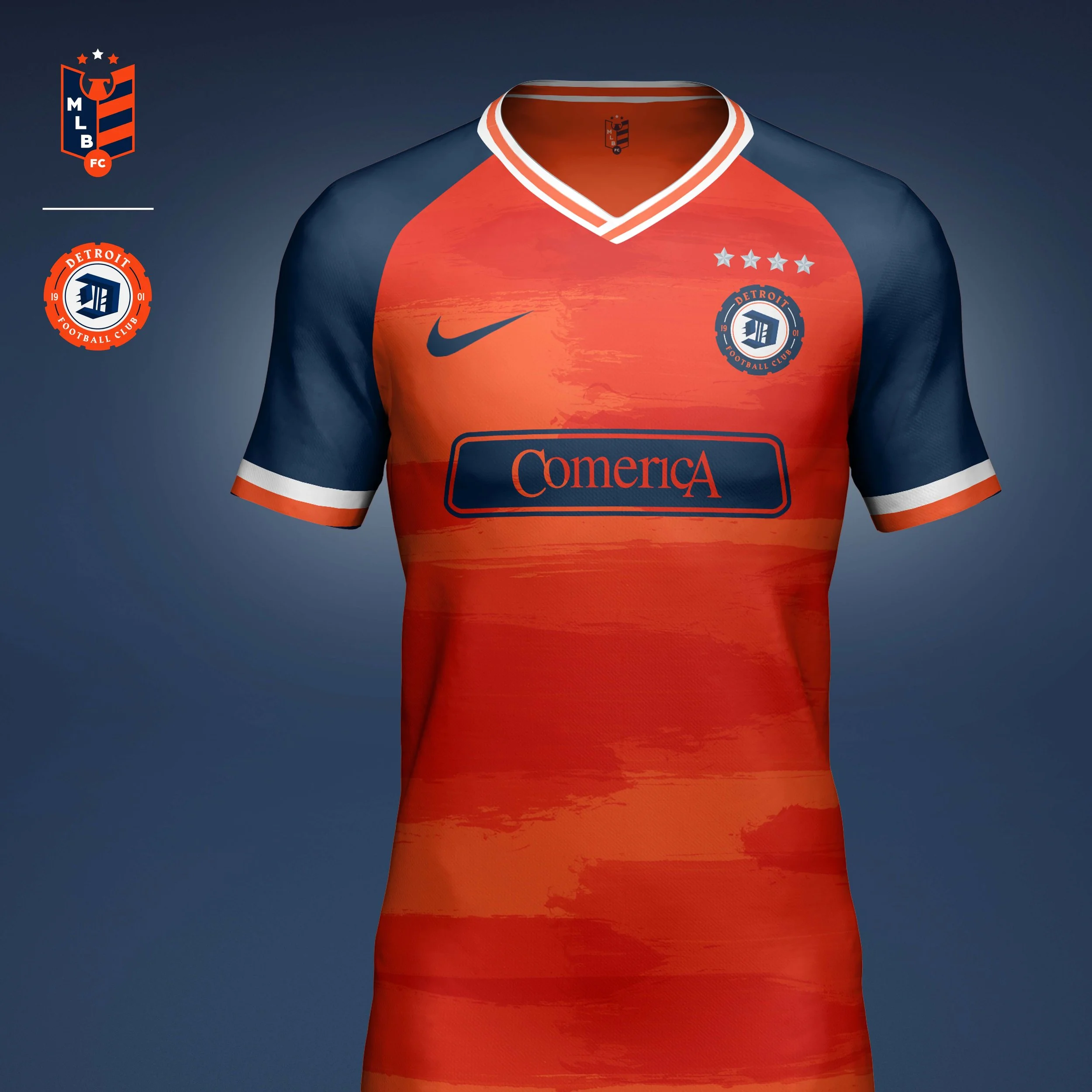
Detroit Tigers
A redesigned gothic D gives a more athletic and fierce stance to the letter. It sits inside a tire shaped crest as a nod to the Motor City.
Home kit has a very classic look to honor the heritage of the Tigers. A clean navy jersey paired with crisp white shorts. A thin racing stripe runs down the center as a nod to the team’s Motor City roots.
Away kit is on the more playful side of the Tigers identity. A bold orange kit features abstract tiger stripes made from energetic brush strokes that capture the coiled power of the tiger within.
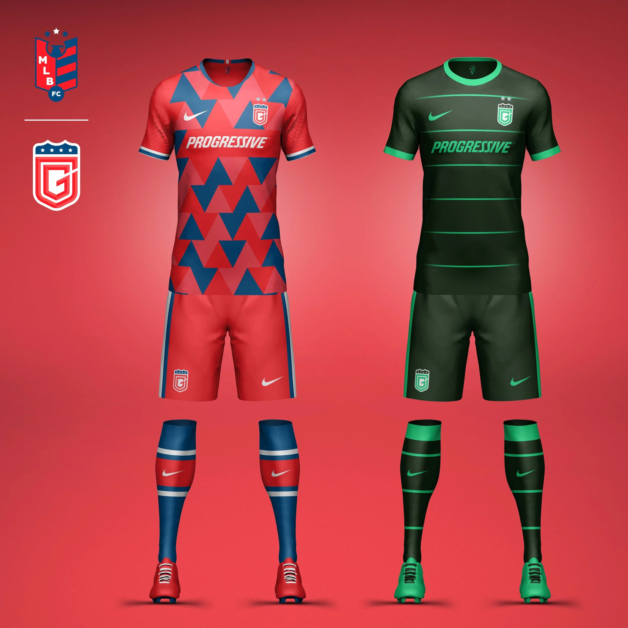
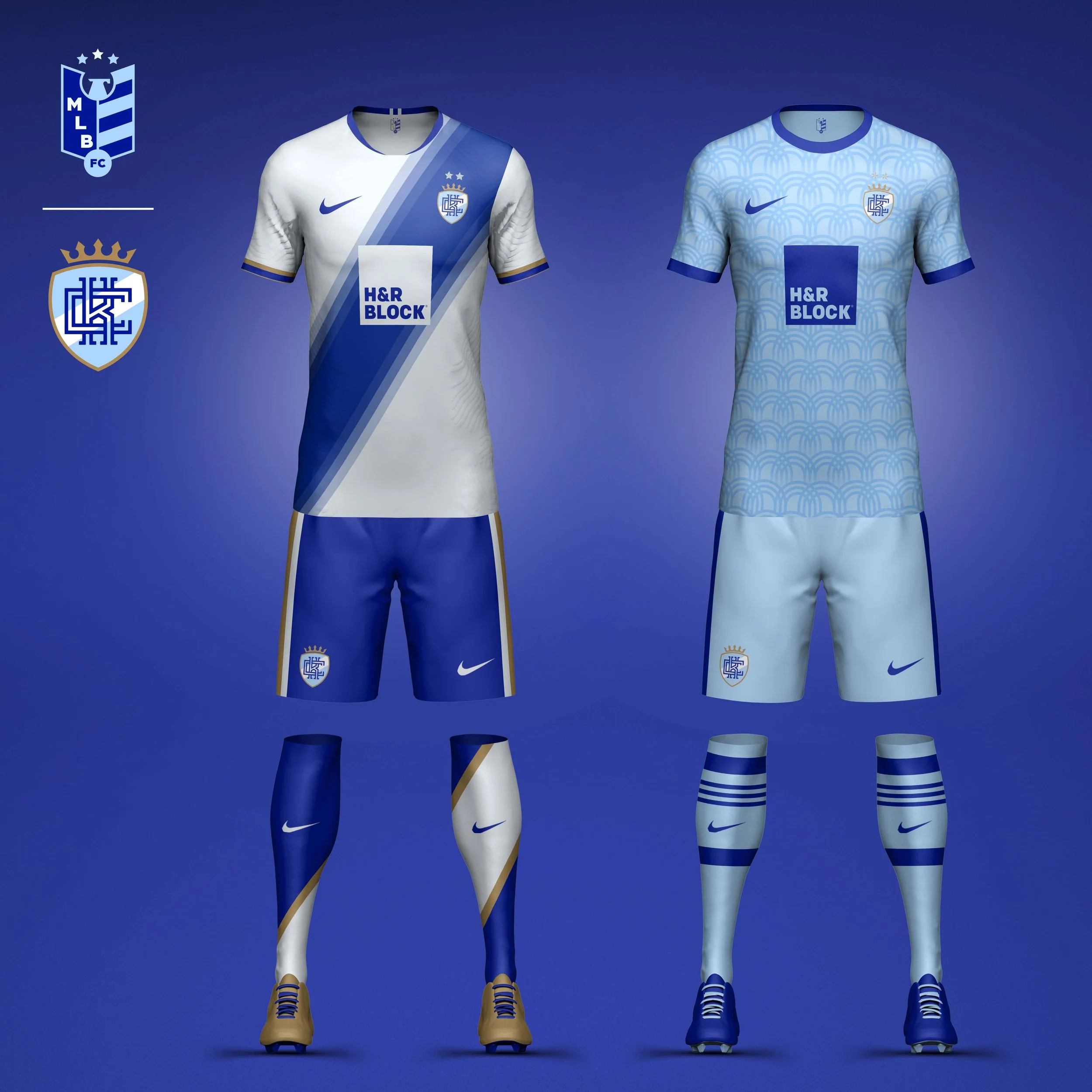
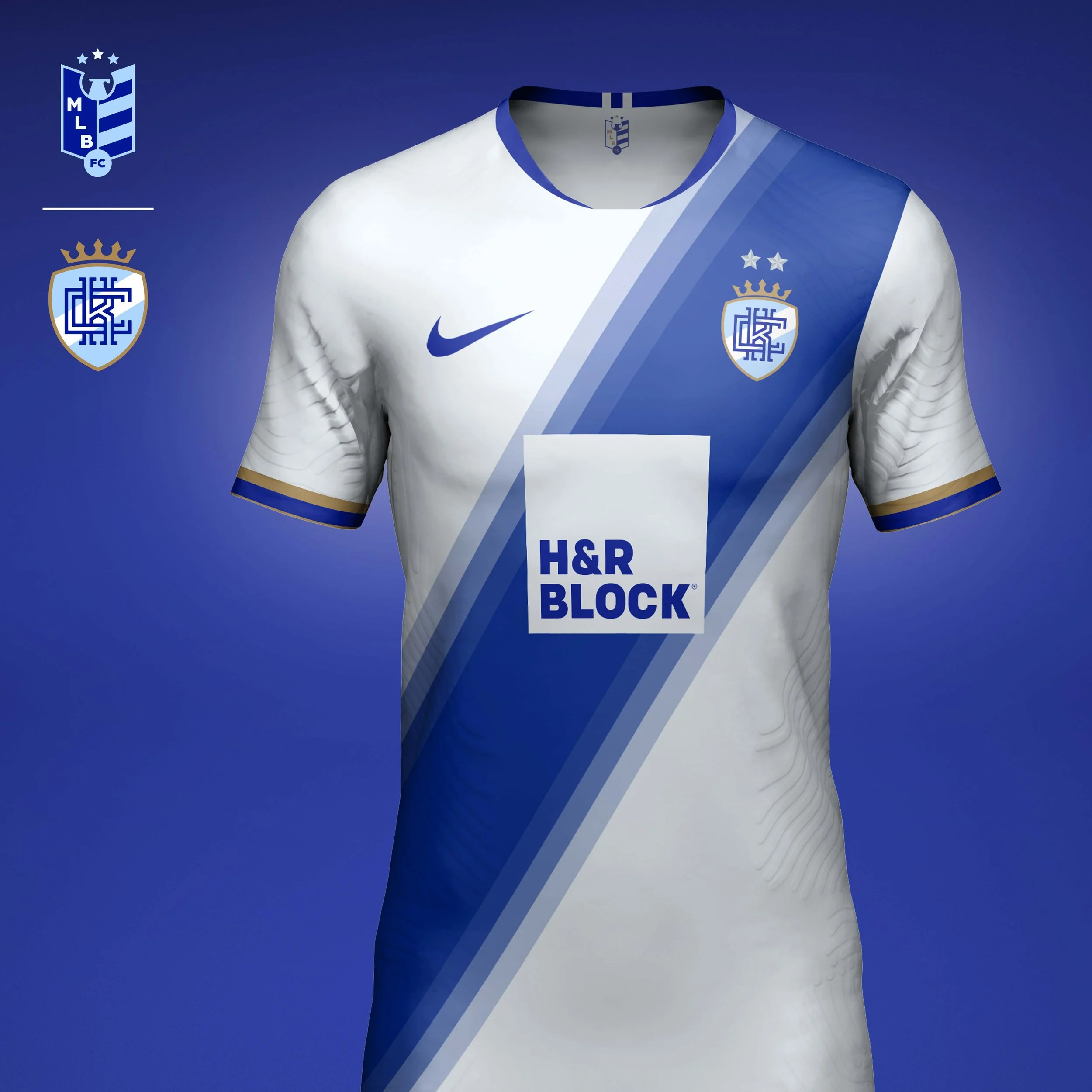
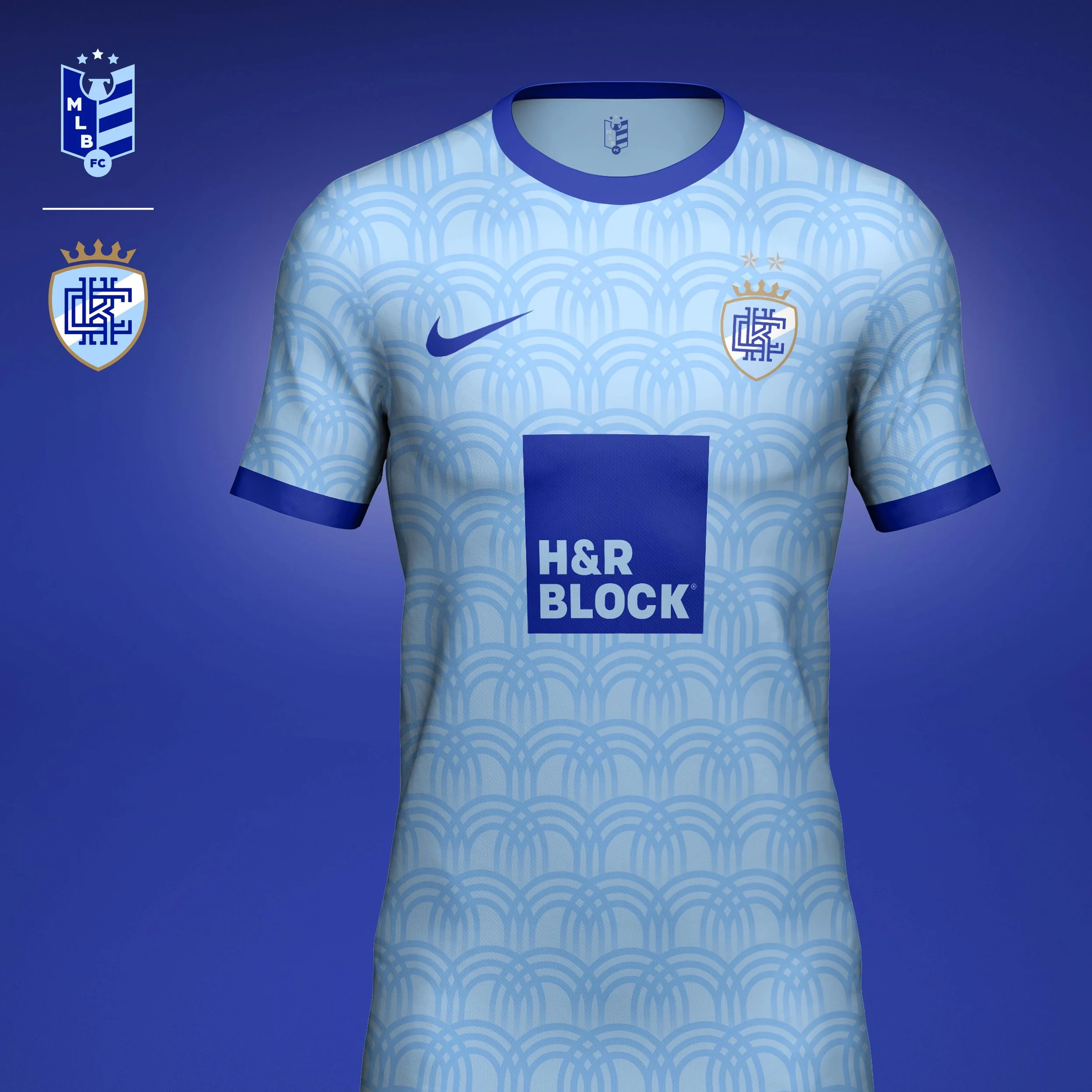
Kansas City Royals
The Royals already have a clean iconic logo that would lend itself to a crest, but I wanted to clean it up and modernize it a bit more. Changing the shape of the crest, giving the crown some more flair, and adding the stripe made the crest feel a bit more regal. I changed the monogram, interlocking the K & C to represent the ties the team has to its community of fans.
Home kit plays on the stripe on the logo, using the graphic element as a royal sash. Gold trim highlights the elevated look.
Away kit focuses on the Royals powder blue jerseys from the 80s. While other teams wore powder blues as well, no one owned it more than the Royals. The jersey features a fountain print inspired by the flag of Kansas City.
Minnesota Twins
A redesign of the Twin Cities monogram with an eye towards the outdoors and adventure vibe that Minnesotans exude. Keeping with the adventure vibe, the monogram sits in a crest shaped like a compass rose. The North Star tucks nicely into the counter space of the C in a bright Aurora Blue.
Home kit features an upward arrow print that's inspired by the Twins location as one of the most northern cities in MLB and Minnesotans identity of being the northern frontier.
Away kit is inspired by the Northern Lights which are frequently seen in Minnesota. The kit uses the team's secondary color, Midnight Navy, as the base and features the tertiary color, Aurora Blue, as the pop. Twilight Teal is added to the graphic to add depth the Northern Lights print.
AL EAST
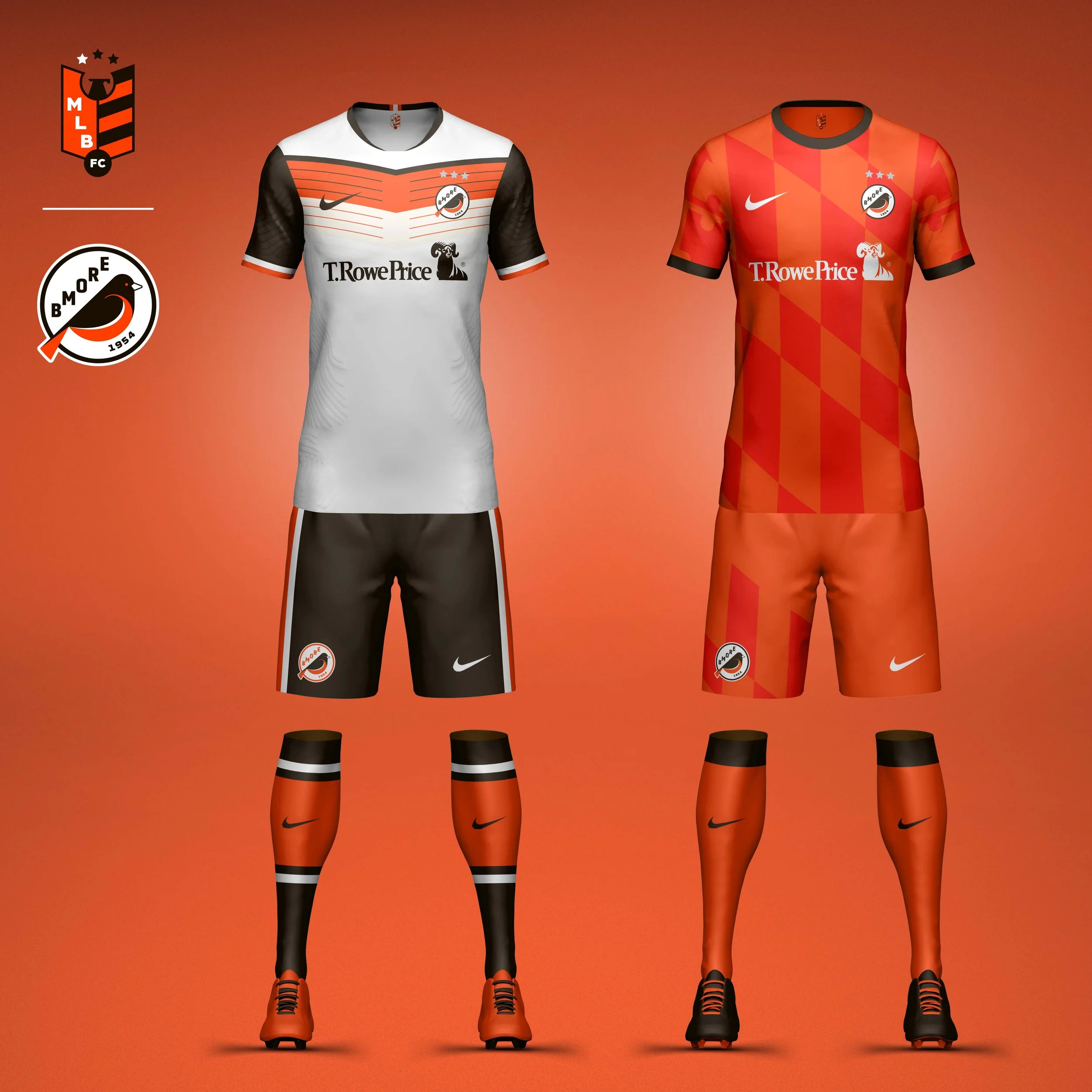
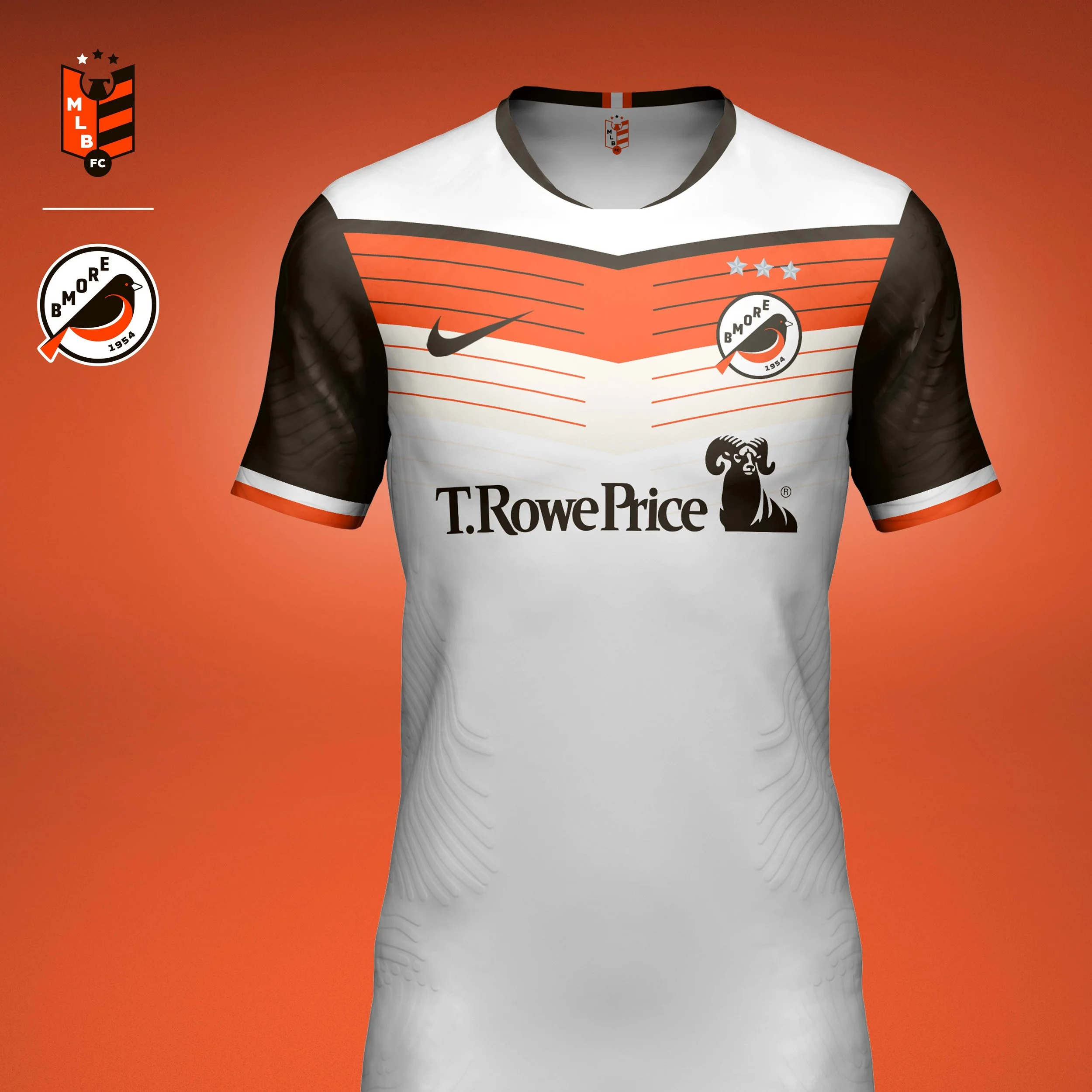
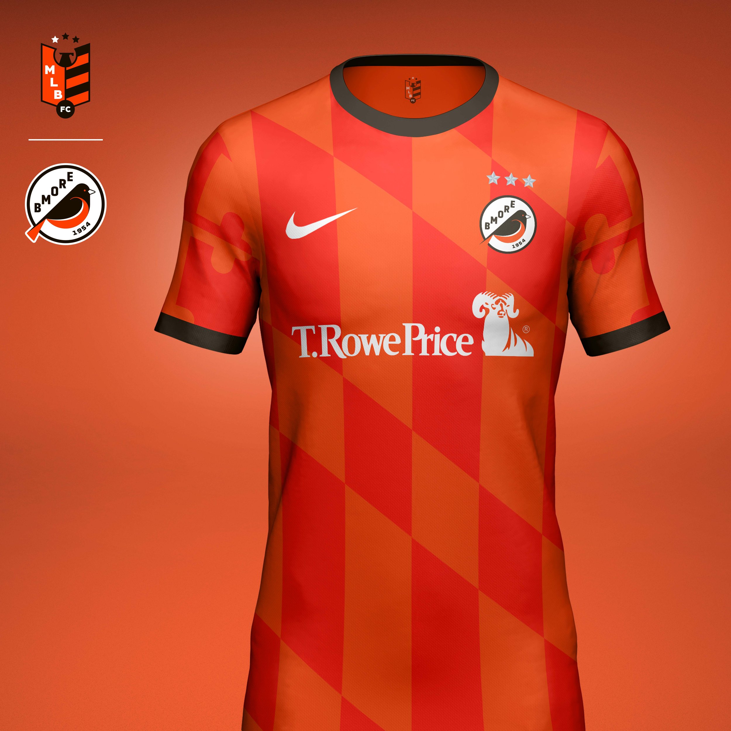
Baltimore Orioles
Crest
The Orioles crest simplifies the team’s beloved bird icon into a bold geometric mark design specifically for a football environment. The typography and color palette pay homage to the franchise’s early history as the St. Louis Browns, while the asymmetrical composition creates space for the city name to become part of the identity. The result feels modern while remaining unmistakably Baltimore.
Home Kit
The home kit takes inspiration from the distinctive markings of the oriole itself. Layered chevrons and tonal striping reference the bird’s plumage, creating movement and energy across the jersey while maintaining the clubs updated orange, brown, and white color palette.
Away Kit
For the away kit, I looked to one of Maryland’s most recognizable visual assets: the state flag. Elements of the Calvert and Crossland family crests are woven throughout the design, connecting the club not only to Baltimore, but to the broader history of Maryland itself. The monochromatic orange execution unifies the intricate graphics into a cohesive football kit while preserving the distinctive identity of the source material.
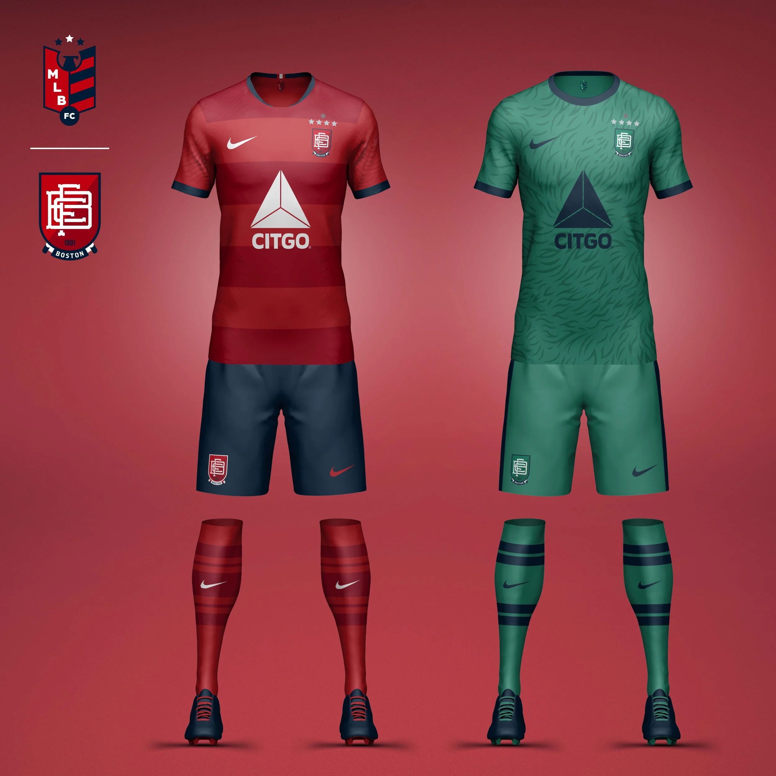
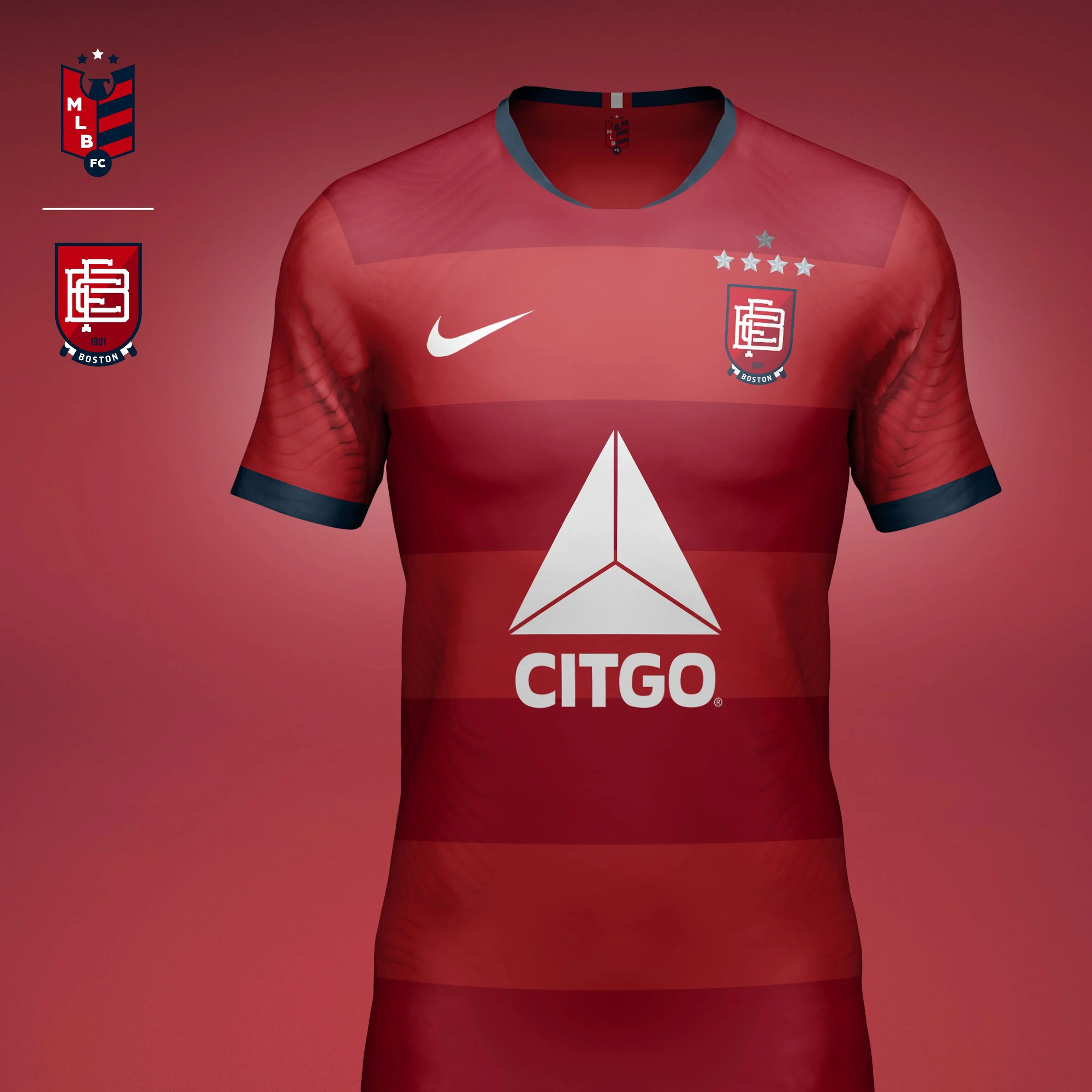
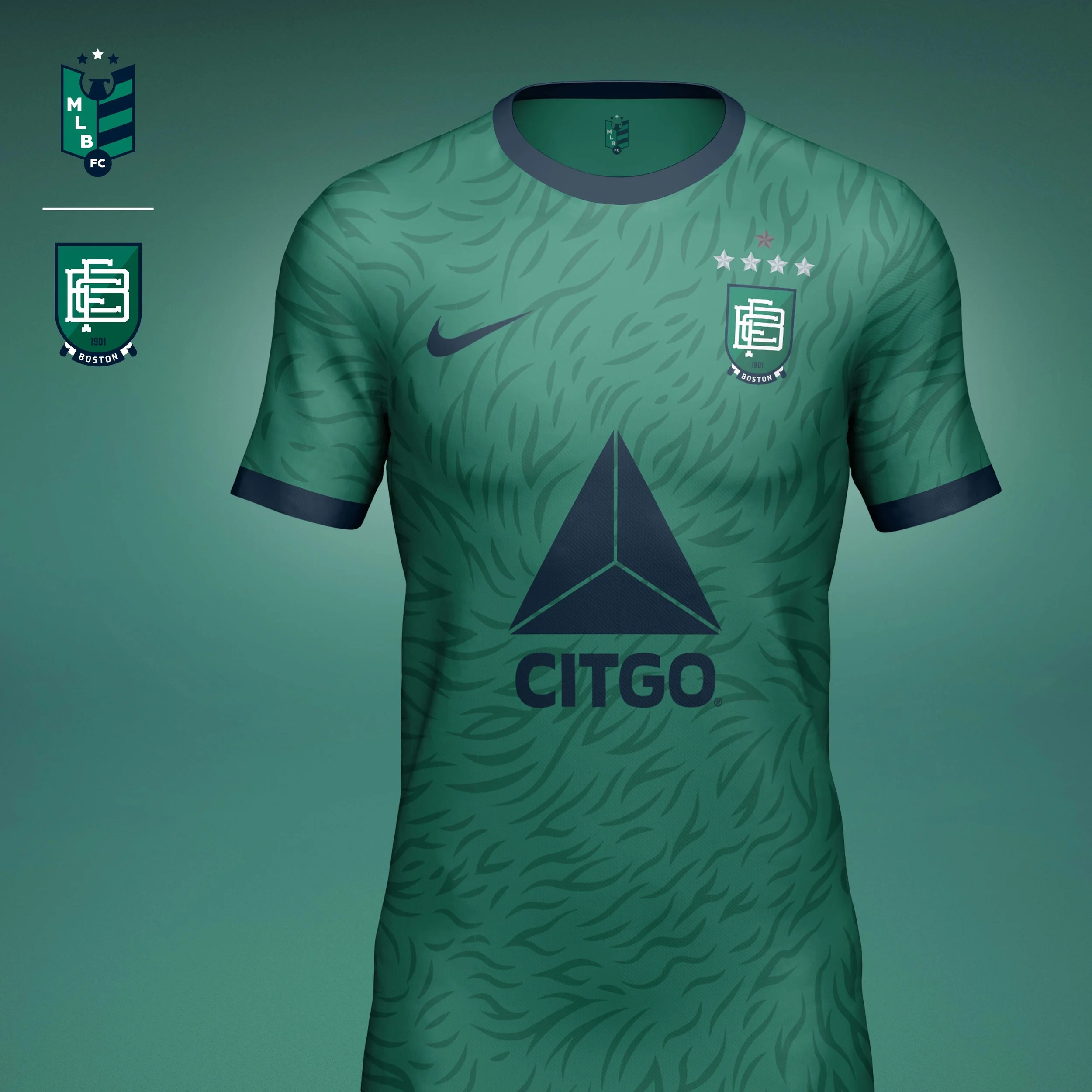
Boston Red Sox
Crest
The Red Sox identity draws inspiration from the club’s deep history and the vintage character of Fenway Park, the oldest ballpark in Major League Baseball. A custom BFC monogram references the typography found throughout the franchise’s visual history, while the shield and scroll elements borrow from the traditions of historic athletic clubs and football institutions.
Home Kit
The home kit embraces the club’s traditional personality through refined hoop design inspired by classic football kits. Rich navy trim, tonal striping, and understated detailing create a look that feels timeless while preserving the Red Sox’s iconic red and navy color palette.
Away Kit
While rooted in tradition, the Red Sox have always carried a personality distinct from their rivals in New York. The “Green Monstah” kit celebrates Fenway Park’s most recognizable feature through head-to-toe green palette inspired by the iconic left field wall and tonal graphic pattern that references the texture of the furry anthropomorphized mascot.
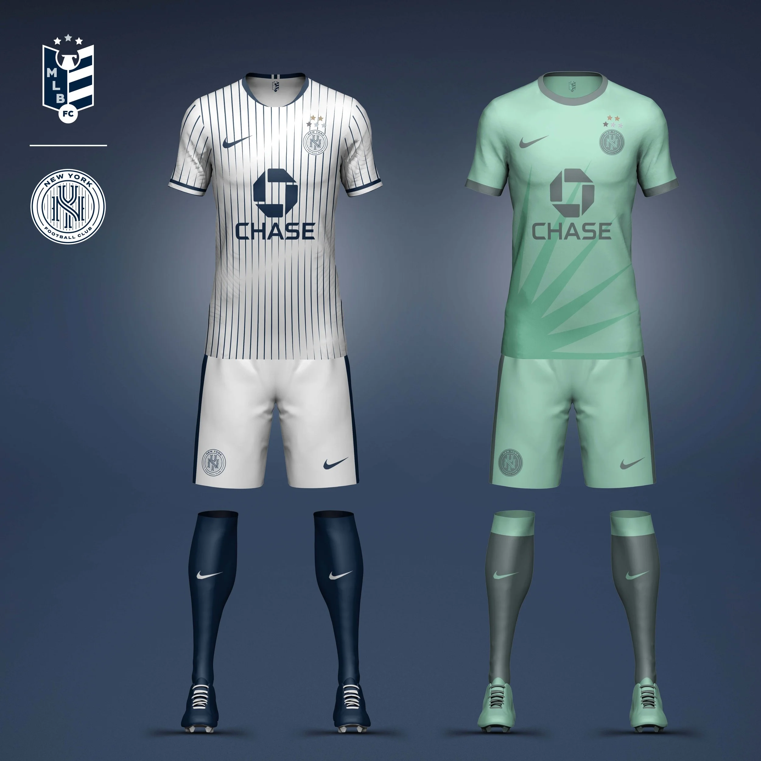
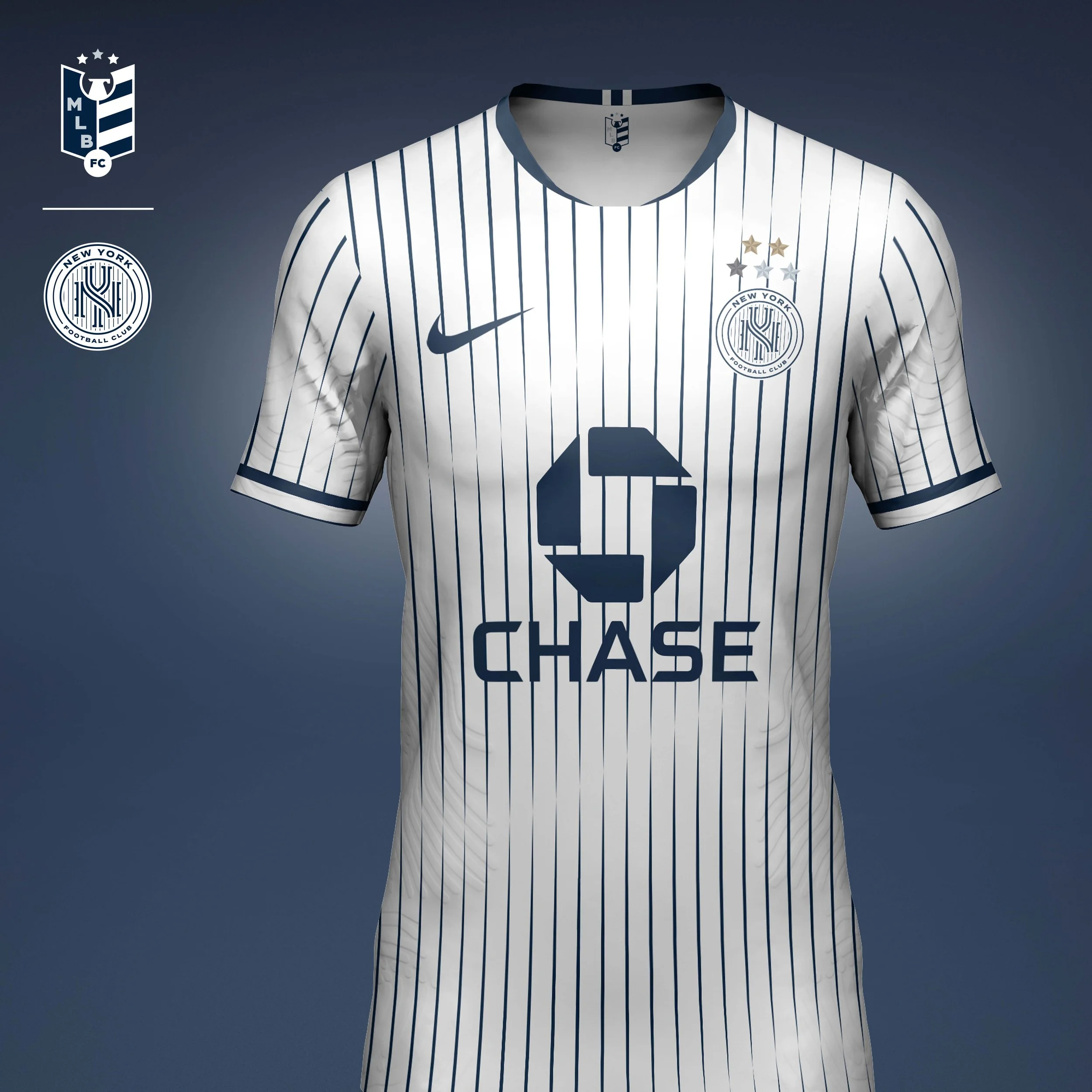
New York Yankees
Crest
Few marks in sports carry the weight of the Yankees’ interlocking NY. Rather than replace it, the identity reinterprets it through the lens of football culture. The monogram incorporates an inline detail inspired by both Yankee pinstripes and the graphic language of the New York subway system, while the circular crest format reflects the club’s global reach and enduring legacy.
Home Kit
The home kit builds on the franchise’s most recognizable asset: the pinstripes. A subtle wave pattern transforms them into a field of championship flags, referencing the club’s unparalleled championship history.
Away Kit
The away “Liberty Kit” shifts the palette to Liberty Green and Slate Grey, drawing inspiration from the Statue of Liberty and featuring tonal crown graphic that celebrates one of New York’s most iconic symbols.

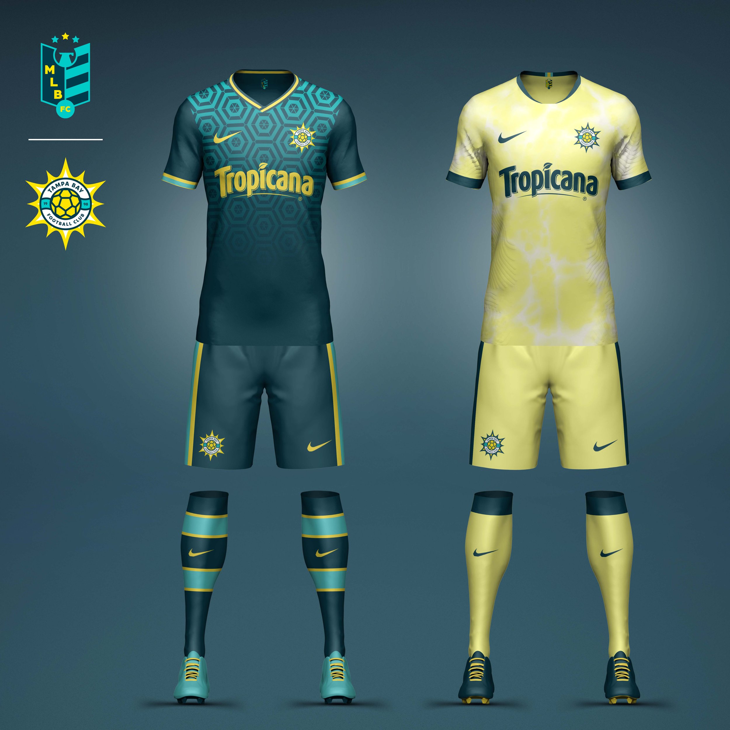
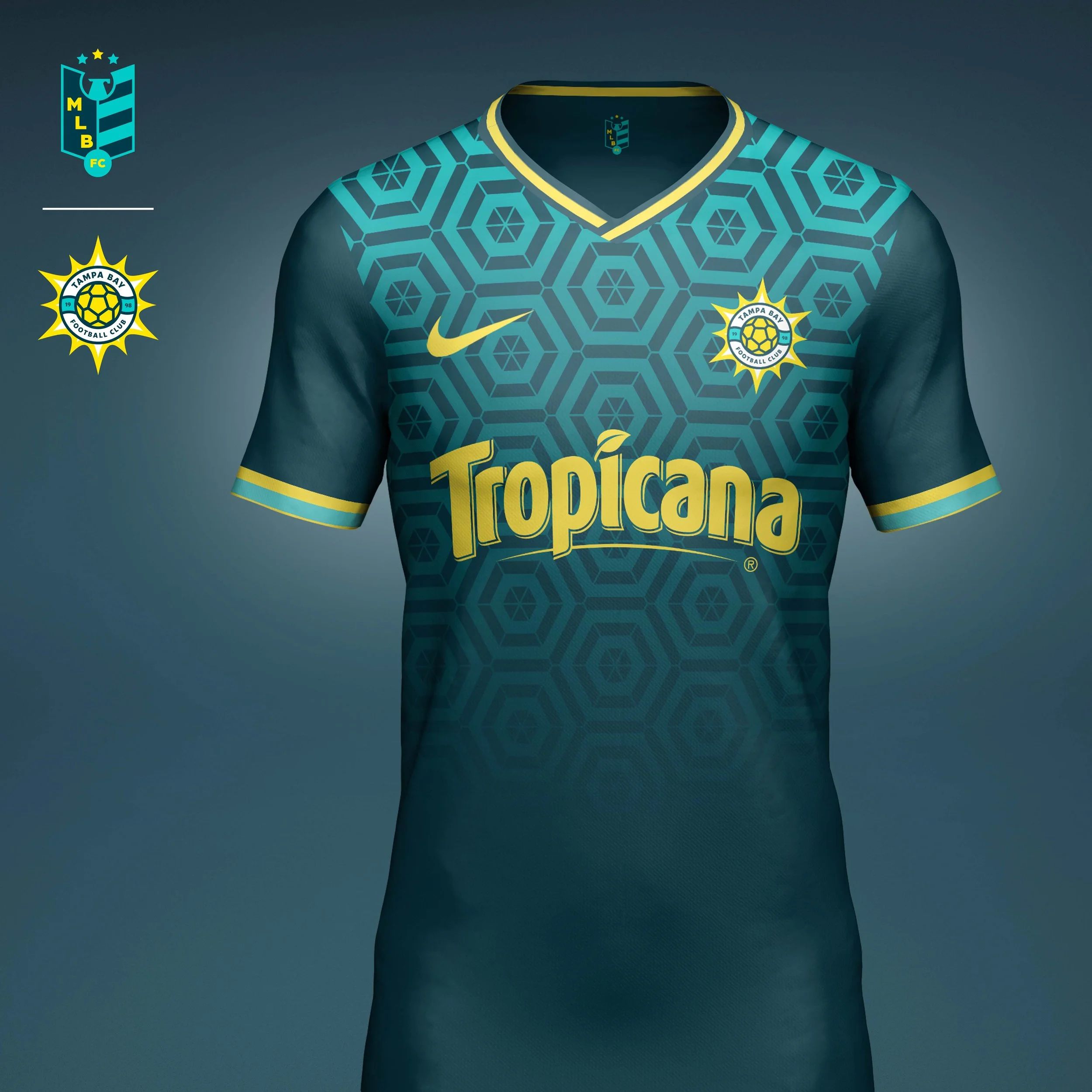
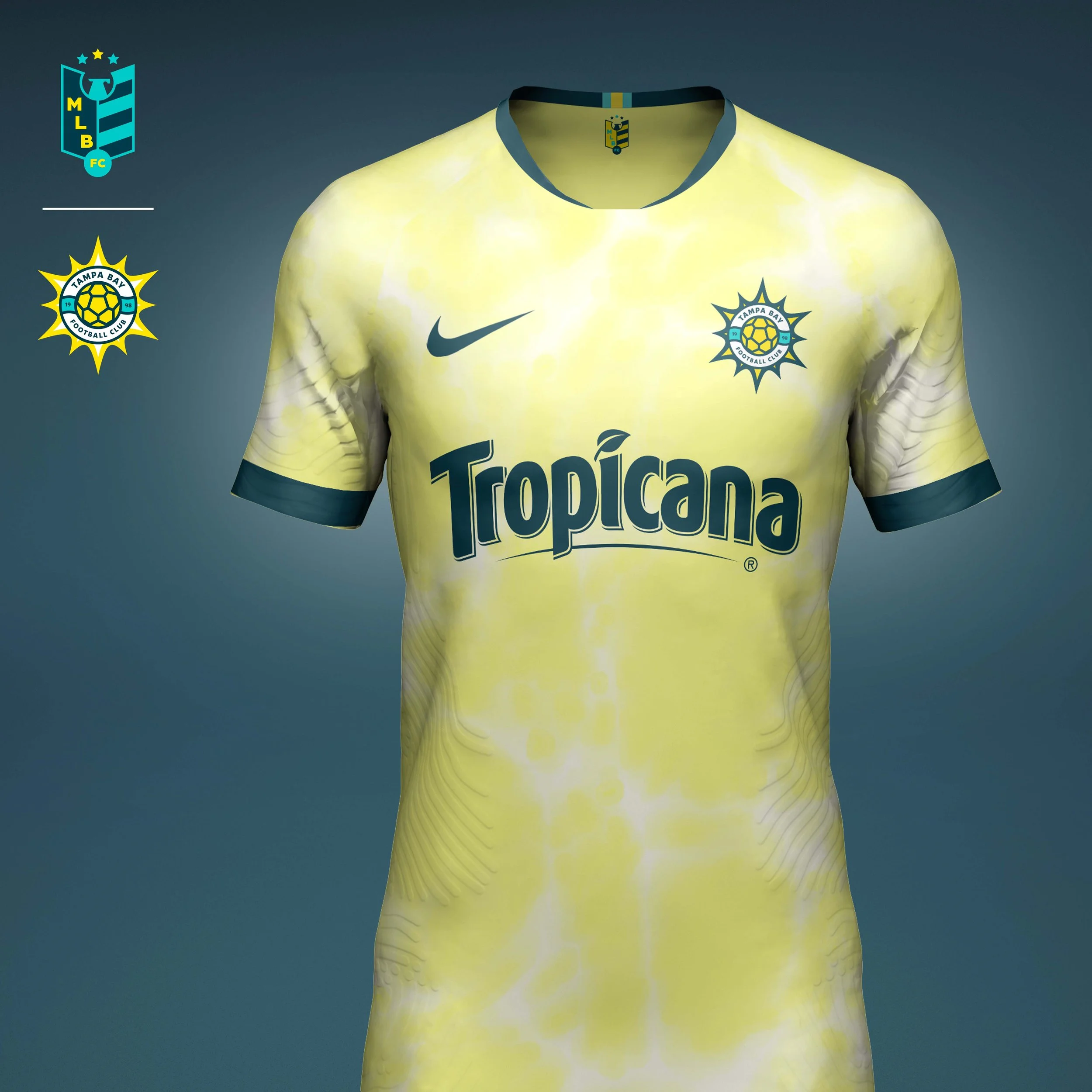
Tampa Bay Rays
Following the 2007 season Tampa Bay rebranded from Devil Rays to Rays, refocusing the brand on rays of sunshine rather than the manta ray. With that in mind, I wanted to bring that idea to life more than their current logo does. The roundel, which references life preserver rings seen on boats across Tampa Bay, bursts with that beautiful Florida sun. I also tweaked there colors, bringing more emphasis to the yellow, changing the navy to dark teal to, and bringing in a pop of aqua, both bringing more of a tropical vibe to a team from Florida.
Home kit is set in the new team primary color, a dark teal. The jersey features a Spanish inspired mosaic print in the aqua pop color.
Away kit is set in the secondary color yellow and features a water ripple pattern inspired by the many pools of Tampa.
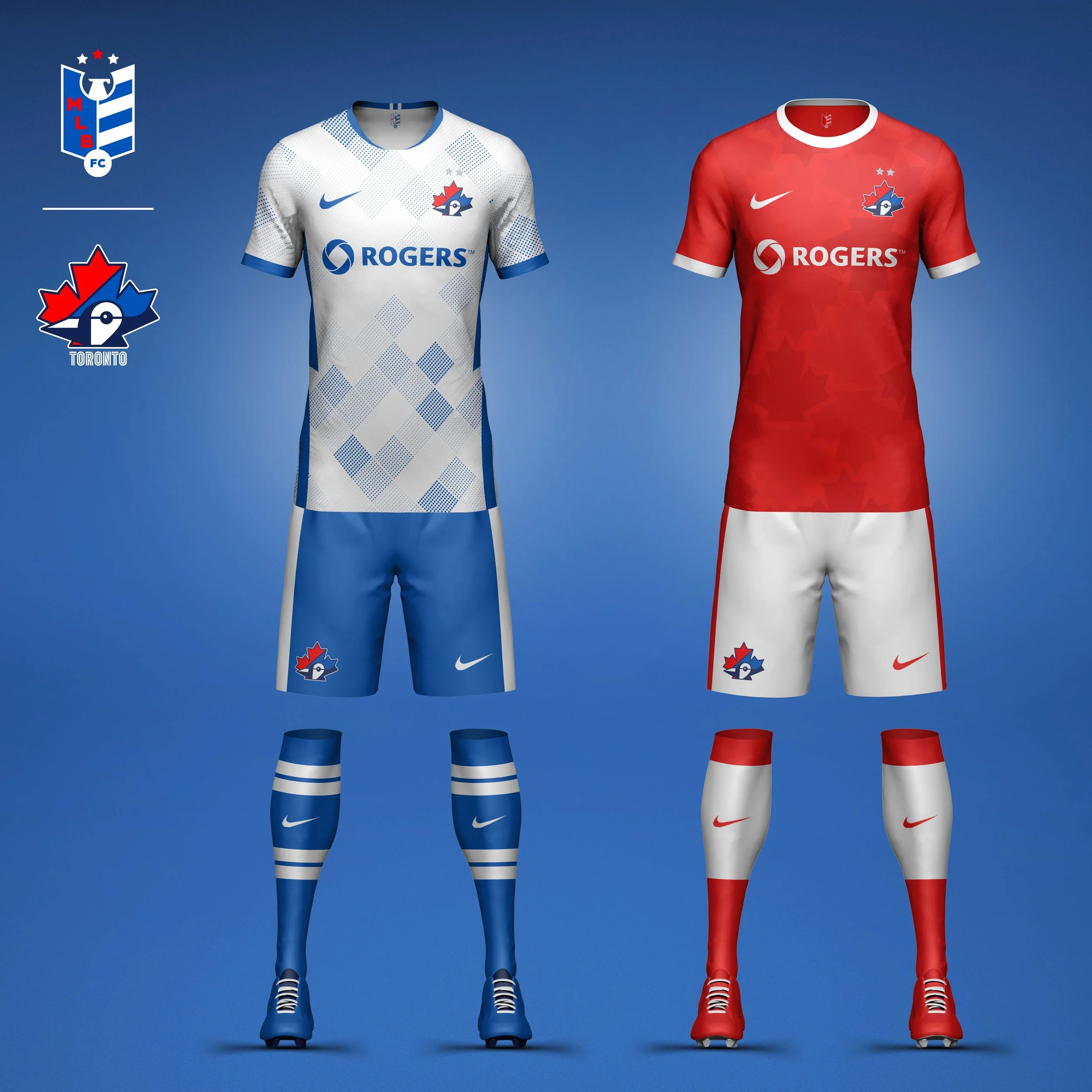
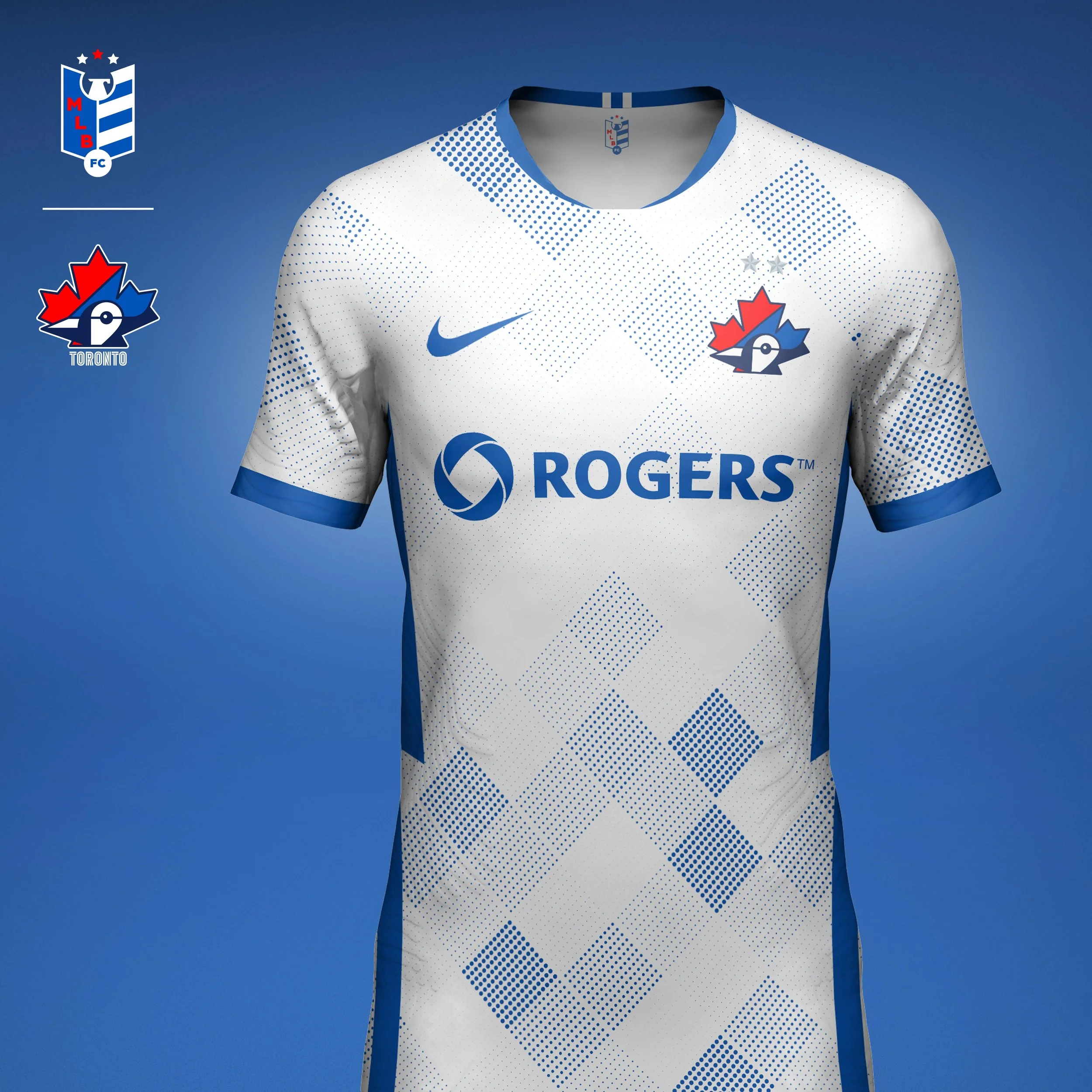
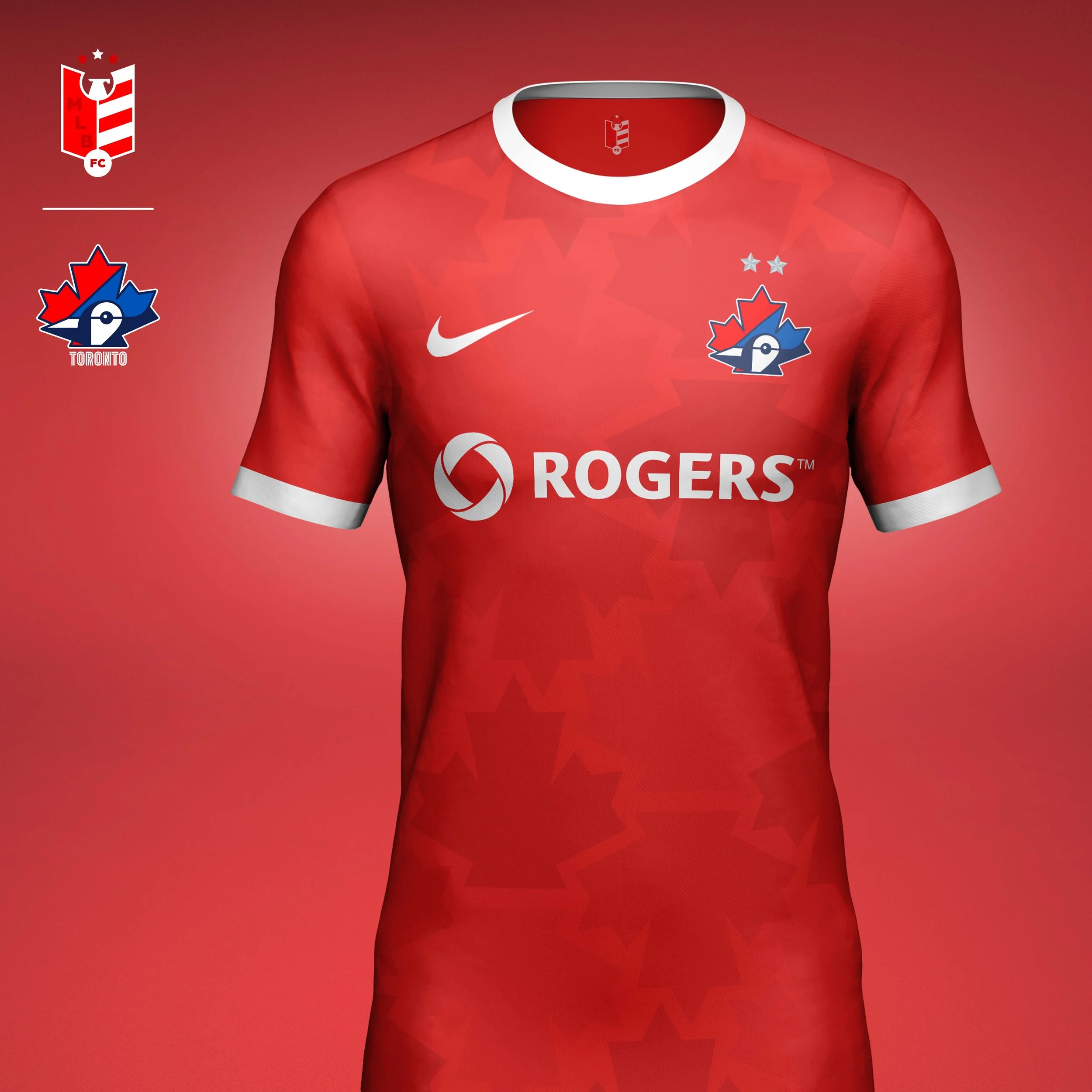
Toronto Blue Jays
The Blue Jays logo is already a beautiful piece of design, it was difficult to put my own spin on it. I decided to move the maple leaf from an element tucked in the Jay's ear to the shape of the crest itself. I redrew the Jay to match the geometry of the leaf. The type is a nod to the classic Blue Jays type from their World Series wins in the early 90s.
Home kit features a geometric print that represents the snowy north.
Away kits are red to represent that the Blue Jays are the only MLB team in Canada. The jerseys take the maple leaf from the crest and use them in the print. The kit is two-toned, featuring white shorts and a "Canadian flag" sock.